


How to create a SaaS homepage that converts
Is your homepage designed to effectively convert more visitors into paying customers?
Your homepage needs to have an impact by immediately informing and educating a website visitor about what you do as a business and how it will benefit them, as well as being an important opportunity to make a great first impression.
If the core elements of your homepage don’t provide the correct cues, to help your prospects make informed and deliberate decisions or how to find certain information on your site, you’re missing opportunities to effectively grow your user base.
These key elements are especially important for SaaS companies. Because your ability to deliver a seamless experience on your homepage sets an expectation for your services when they become a customer. And today’s savvy consumers understand that.
Whilst it’s not by any means an exhaustive list, we’ve outlined some of the most critical elements of a SaaS homepage below.
Let’s get started…
1. Value proposition in the headline and sub-headline
The headline your visitor sees is the most important copy on your homepage and can make all the difference between converting a visitor to a new customer or losing them to a competitor. That’s why every high-converting SaaS homepage needs an effective, clear headline. Within just a few seconds, a website needs to tell the visitor what’s on offer in simple words.
Your main headline needs to stand out, making your value proposition absolutely clear. To do this well, it’s ideal to focus on one single aspect of your business and split-test to see which aspects of your services appeals most to your visitors.
Similarly, the sub-headline should be a brief description that either helps reinforce the message in the main headline or provide additional information to further clarify what it is that you offer. To be effective, focus on a certain need or problem (pain point) for your target audience. Again, use simple words and refrain from using jargon or talking too much about you and your business – it’s about your visitor. Words like “We” or “Our” take away your visitor’s feeling of ownership.
ChartMogul’s homepage is a good example of a well delivered value proposition in a headline. Their headline and sub-headline are only 15 words in total and get straight to the point.
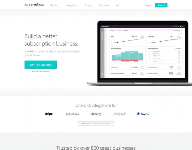
Image Source: ChartMogul
2. Clear call-to-action (CTA)
The best SaaS homepages have a clear call-to-action that is optimised to influence one very specific user action.
As soon as you give someone a choice through the use of secondary CTAs, the chance that they’ll choose an action you’d most like them to take starts to diminish. So you need to design your homepage with one primary conversion goal in mind. It simplifies the whole experience for your prospects whilst ensuring that the key business offer and next steps are reinforced appropriately and without any confusion. Everything on the page from your headline through to your CTA buttons should lead visitors to take the specific action you want them to.
This means that perhaps the most important step of designing a high-converting homepage is to determine EXACTLY what you want your visitors to do. Guide them every step of the way and don’t leave it to chance. Anything that gets in the way of convincing your prospects to make this decision should be avoided.
Of course, some SaaS businesses may need more than one CTA on the homepage for various reasons. In this case, it’s important to set a priority, hierarchy, or order of prominence for the primary conversion goal.
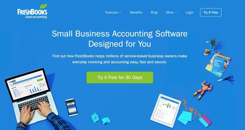
Below is a great example from FreshBooks that highlights one very specific call-to- action. It’s obvious when you land on this homepage that they want you to “Try it Free for 30 Days”.
This is displayed prominently in the call-to-action button on the main banner, as well as in the top navigation:

Image Source: FreshBooks
And it is reinforced at the bottom of the page too.
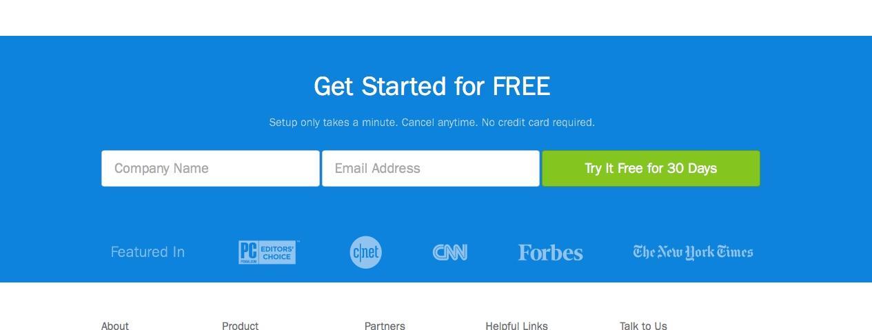
Image Source: FreshBooks
3. Multiple buttons for that CTA
Most marketers think about the color, themes, design aspect of their CTA rather than focusing on creating a purpose-oriented CTA – that align customer satisfaction with their business objective.
Your page should display CTA buttons that are strategically placed where it’ll be relevant for a visitor to make an informed (or emotional) decision. One good example of this is offering a live chat session to the audience to interact directly with the business in real-time.
Live chat software like Acquire helps to position CTA on your most visited web and mobiles pages. Helping you to engage with your most promising audience.
Another way is to offer CTA at the very bottom of your page (just above the site footer) which can be useful for information-driven visitors who take their time to read through to the bottom of the page before making a decision.
However, try not to overdo it. Generally, a CTA in the main banner, one in the top navigation and at the bottom of the page is adequate.
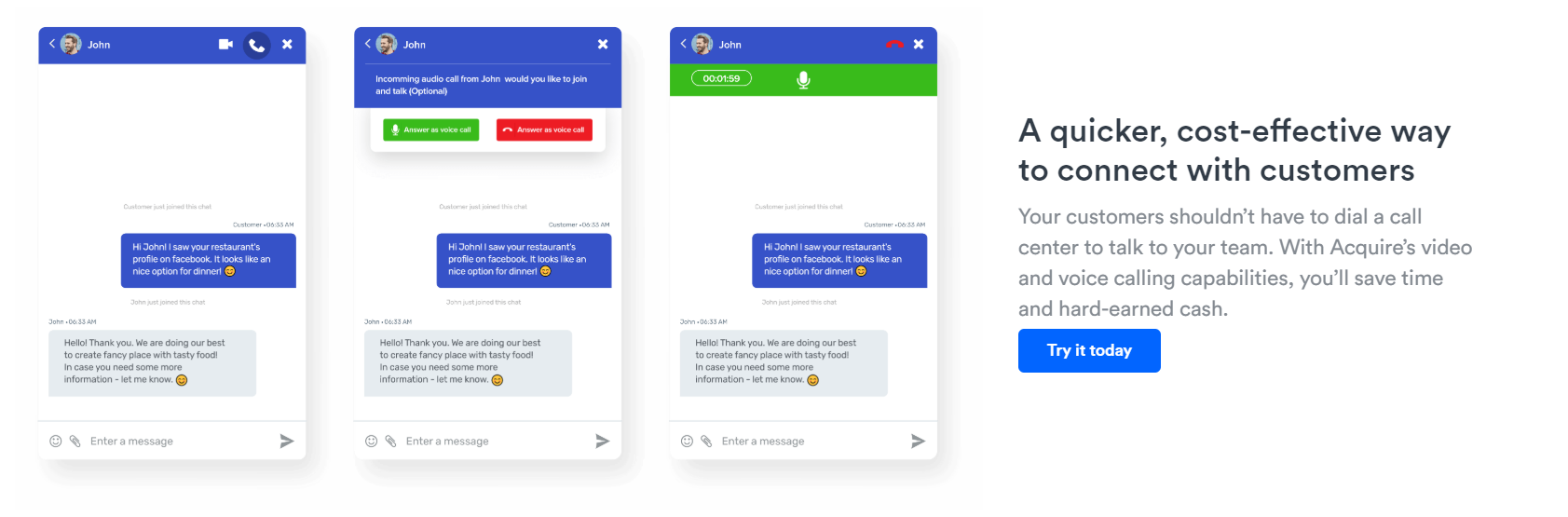
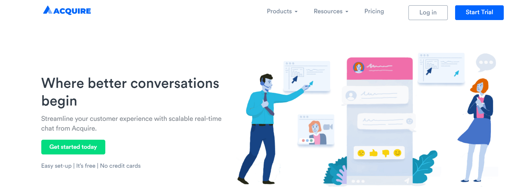
Image Sources: Acquire.io
4. Minimal distractions
The aim of your homepage is to effectively guide the user and equip visitors with the level of information or social proof they require, leading to a conversion. For that to happen, it’s best to reduce as many unnecessary distractions as possible on your site that may turn your visitor’s attention to something other than the action you want them to take.
So don’t have anything on your homepage that doesn’t need to be there. Keep it clean and simple with good use of white space, simple design layouts and concise copy. Remove anything that’s not necessary.
Some things to avoid are:
- Too many buttons: Your CTA buttons should be your visitor’s primary focus. Place them strategically, alongside key components of your copy and offer, rather than in as many places as possible, which can be counter-productive.
- Unnecessary/weak images: Whilst images are a vital component of a professional looking website, they should be selected with a purpose – to clearly communicate and reflect the objectives of your service, improve the consumption of the copy, and contribute to a better experience for site visitors. With this in mind, low-quality stock images or those that aren’t contextually relevant to your brand or services can be distracting and can hurt your credibility, and consequently conversions.
- Weak testimonials: Use testimonials from real customers describing how they have benefited from your software, and how their pain points were resolved. Be sure to include their full names, job titles, business name and locality where possible. Generic testimonials will not sound credible and can reduce trust with your prospects.
- Long paragraphs: Grab your visitor’s attention with clear headlines and concise, easy to read paragraphs. Dot points are also a good way to break down the benefits (not just features) of your services.
Let’s look at Evernote’s homepage: no extra buttons, one choice to make, and a good, high-quality-but-relatable image.
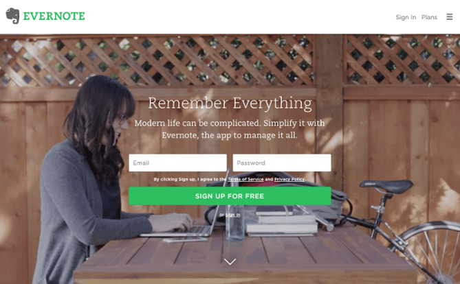
Image Source: Evernote
5. Hierarchy-based top page navigation
If you have too many menu items that don’t give visitors the information they need, they are likely to click away.
Plan out a hierarchy-based top page navigation that simply makes sense; a way to easily organise your site’s information so it’s easy to engage with. This hierarchy will also become your URL structure and navigation.
Here are some tips for making this happen:
- Make it logical: Each category should be specific and stand out from others. On this note, each sub-category must relate in one way or another to the main category under where it’s placed.
- Balance the number of subcategories within the categories: Whilst this may not be possible for all businesses to achieve, an ideal top page navigation is setup with a consistent number of sub-categories.
- The number of main categories: It’s ideal to have no more than 7 main menu items, so the navigation is uncluttered and easy to use.
As you can see in the photo below, when you Google Help Scout, the main categories come up in the search results with useful sitelinks (that’s also why a good structure is so important)
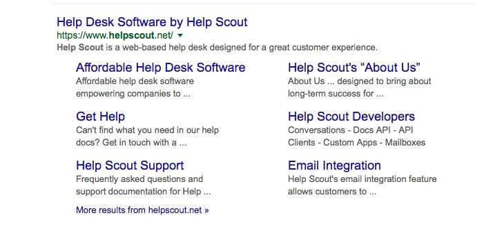
Image Source: Google
Now, on the main page, you can see they have 5 main categories and on the main category, “Product”, you can navigate 4 options.
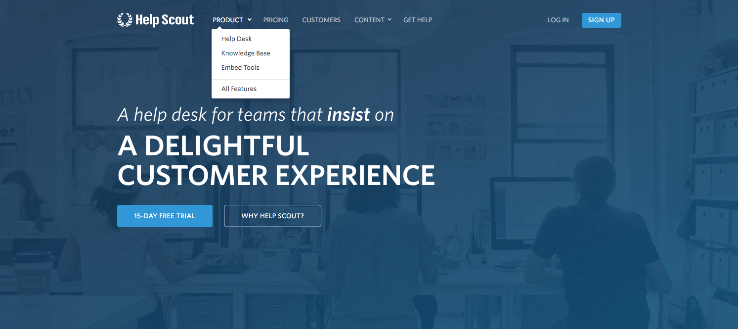
Image Source: Help Scout
6. Contact numbers, Live Chat and enquiry forms
Make it easy for a site visitor to make contact with you when they’re ready. Just as they would when browsing a shop in real life or in a meeting, customers and clients have questions they want answered before committing to a purchasing decision. So the correct placement of your sign up form, enquiries and chat options clearly will go a long way to improving conversions.
To do this, make use of Live Chat. Live Chat has become increasingly popular on websites for good reason. It’s easy for the customer to use, and it’s an instant form of communication where the visitor’s pain points can be addressed rapidly and with no “wait on the line” situations. No one likes, or has the time, to step out of work to be on the phone or wait a day for an email response.
Let’s observe Zoho’s use of Live Chat. You can see they have “Chat with us now” in the bottom right corner in a slide in window. This functionality prompts users on arrival to the site and makes them feel comfortable with asking for help.
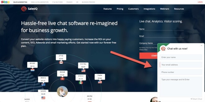
Image Source: Zoho CRM
7. Clean design
Clean design helps build credibility and professionalism for your brand. As an overview, a great homepage uses contrast, a well defined colour palette and clever application of white space.
There are other important elements to consider as well:
- Typefaces: Sans Serif fonts (with no decorative finish), like Arial or Verdana, are generally easier to read. The ideal size is 16px.
- Colours: A well defined colour palette allow for a clear visual hierarchy and contrast that draw in a visitors attention. Too many colours can be confusing or distracting and don’t allow you to strategically apply colour to increase conversions.
- Images: High-quality images are a must, but videos and graphics are important elements too. Giving your visitor alternate ways to engage with the information on the site not only improves credibility (and conversions), it also adds to the overall design.
- “F” pattern design: Eye tracking studies confirm that people scan the screen in an “F”-like pattern, starting and focusing on the top left corner of the “F”. This re-iterates the importance of where you place your main menu items and headline text on the page.
As we can see in the Asana homepage, they have chosen a softer colour palette for the background and use a stand-out colour for the CTAs.
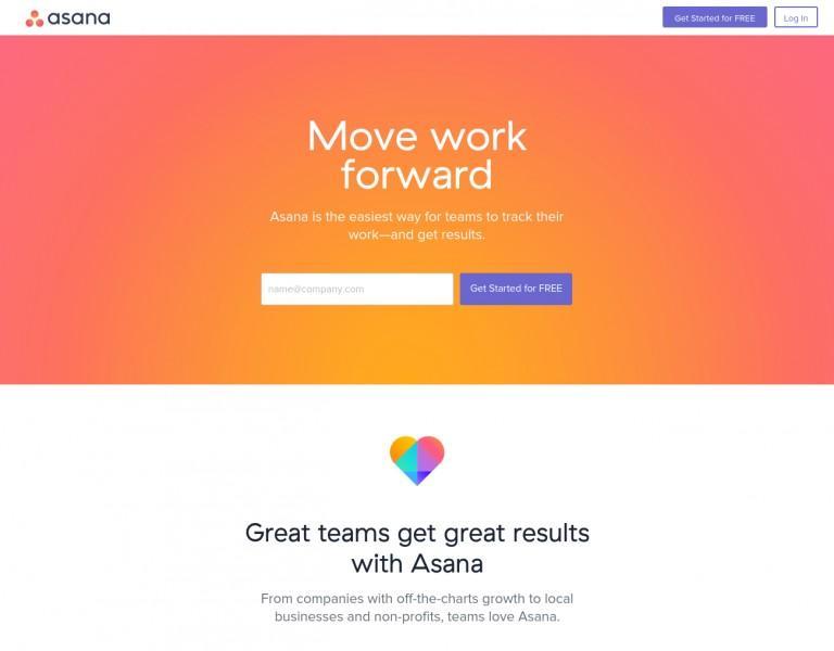
Image Source: Asana
8. Social proof
Social proof is crucial when looking to build trust with your prospects and differentiate yourself from the competition. It is also a strong force when it comes to influencing behaviour.
Look to include a few short quotes from customers on your homepage. Add a name and photo or video if possible, as it will develop more credibility.
Having a list of reputable, well-known brands who are already clients of your service, is also great social proof. You can add these icons at the bottom of the homepage to make it easily-recognisable for the visitor.
You can also leverage testimonials directly from social media posts. Here is an interesting use of this tactic from Typeform who utilise social proof from their Twitter account:
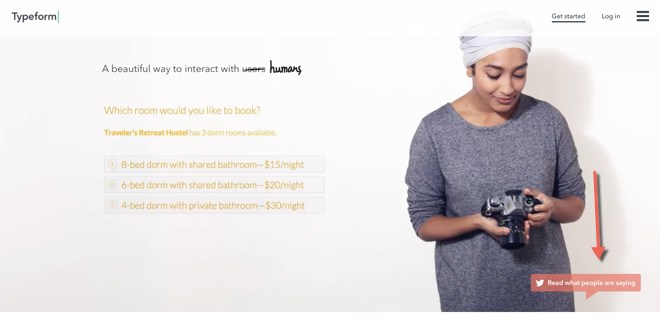
Image Source: Typeform
It pops out like this…
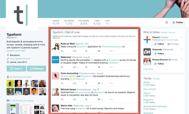
Image Source: Typeform
9. Features and benefits
Besides describing what you do and why you do it, you need to show how it’s going to matter to the site visitor.
What are the benefits visitors are going to get if they buy from you? How will you specifically solve their pains and challenges? That’s what you should focus on. Make sure the copy is written to inform your audience on each key benefit they will get from signing up.
Features should also be listed alongside the benefits. This will give people an idea of what your service entails, what it can do, its dimensions and specs. But don’t give too much attention to your features, it will sound like you’re trying too hard to sell and there’s no immediate reason of why it’s positive. Benefits affect visitors on an emotional level that audiences can relate to, a pain point that needs an immediate solution.
Below is the homepage of the project management software Flow, they have done a great job of positioning their key benefits alongside the pain points they solve for customers:
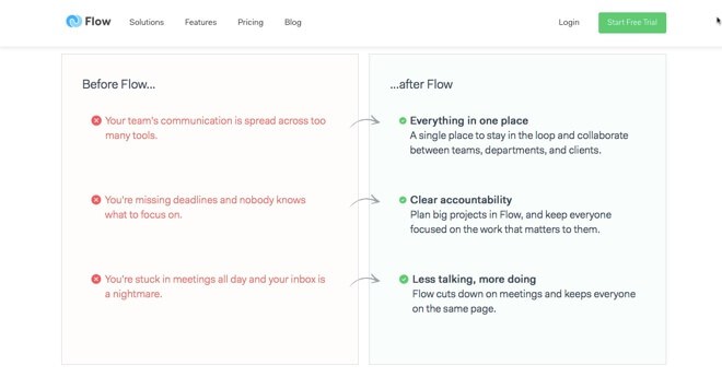
Image Source: Flow
10. Software or animated video
People retain about 50% of what they see, versus a tiny 10% of what they read. So a powerful video will make it easier for your visitors to consume the most valuable information your homepage is trying to convey, in a format that each user may be more open to using.
Effective use of video is another method of concisely positioning your software product to a site user, and complementing the copy, offers and claims. They help quickly explain how your software works, how you are different from your competitors, and how it will solve your visitor’s problems.
Slack features a video explaining its product and what it can do at the top of their homepage:
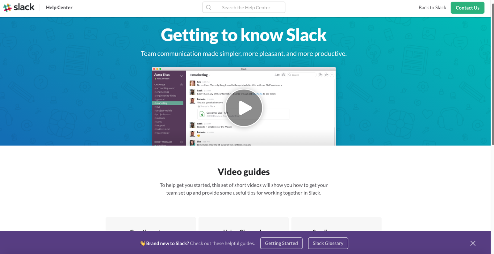
Image Source: Slack
11. Preview images
Images or photos of your software are there to showcase the best features of the software and provide visitors with a behind-the-scenes look. In combination, your video and visual content should help visitors experience what it would be like to purchase and use your software. All your images should be high-quality and contextually relevant to your services or offer:
Like this example from Typeform:
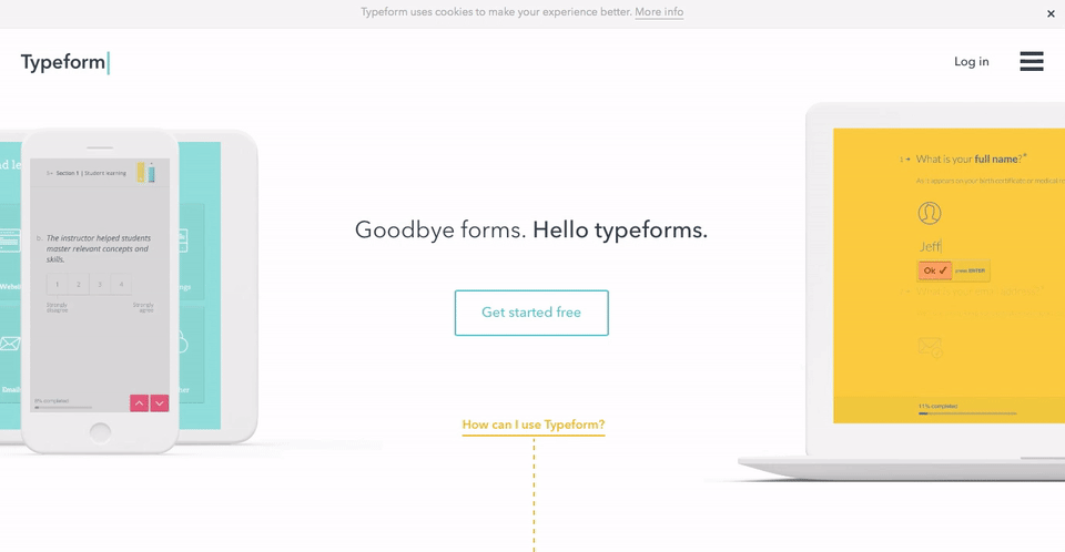
Image Source: Typeform
Wistia are another SaaS company who do a great job on their homepage of using a contextual image of what their software looks like:
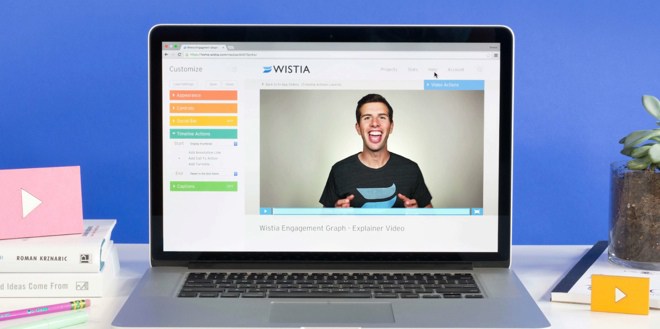
Image Source: Wistia
12. Mixed media and graphics
Media and graphics enhance the homepage experience by supporting your branding as well as providing contextual imagery for your most important copy.
In addition to images, there are multiple ways of incorporating graphics on your SaaS homepage:
- Header: A customised graphic as a header will make your page look professional and is an opportunity to highlight your branding. An effective header is simple, uncluttered, has an easily readable font and layout.
- Breaking up text and enhancing information: Use graphics to break up the text on your page and give the brain a rest. This makes the copy more digestible and not overwhelming for the site visitor. It also provides a clean, well designed experience that can boost credibility. Use it to your advantage by adding graphics that support your message.
LiveChat features a simple but informative graphic on their homepage.
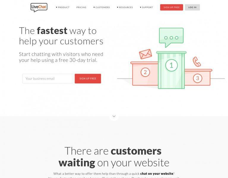
Image Source: LiveChat
Conclusion
An effective SaaS homepage is extremely clear about what it wants a website visitor to do. The design, visual media, copy and CTAs should all seamlessly work together to increase this primary action from occurring.
Here are the key points I want you to leave with after reading this article;
- Understand that the first message on your homepage is the most important, so make your value proposition clear and as early as possible on the page
- Know exactly what you want a visitor to do, and encourage them to take that action with strategically placed CTAs and supporting copy
- Use clear navigational cues and a simple content hierarchy to structure your site and help visitors find the information they need
- Leverage proof and evidence to illustrate how your software will directly benefit your prospects and help them alleviate a pain or challenge they face
- Deliver your message accompanied by clean design; using a defined colour palette, white space and contrast
After seeing the 12 elements of some of the world’s best SaaS homepages in action, how does yours match up?
If you run a SaaS business and want some more advice on optimising your homepage, get in touch with us here at Webprofits.

Peter Yun
With a background in Fine Arts, Peter leads the UX, design, development and copywriting teams at Webprofits, focusing on UX/UI/CX, high-performance web design and development projects, industry leading conversion (CRO) techniques and innovative online advertising strategies.

Great Post!
Here you shared nice core clues which are really helping us to make my homepage design superb.
Thanks for sharing!!
Excellent publication. Thanks for the input. greetings from Chiclayo, Peru
[…] you sell a SaaS subscription , your target conversion will likely be a free or paid trial (though, in rare cases, you may be […]
Thanks ,for sharing useful information !