


How to create forms that convert
Web forms are a commonly overlooked feature of websites and landing pages that can have a big impact on conversion rates. The copy, layout and design of a form is important, and can be the difference between getting or losing a lead. Despite the impact forms have, they are rarely changed or tested, leaving a big opportunity to improve overall conversion rates.
In online marketing, there is unfortunately no ‘perfect’ form; there is always room to improve conversion rates through constant split testing. You can, however, get a head start on your quest for the highest converting form by following a few simple and easy to implement best practices and proven techniques.
Headline
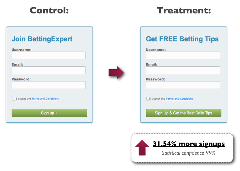
Every form should have a clear, easy to read headline which conveys value and relevance. It should immediately show any visitors the benefit of filling out the form. A lot of forms have the headline ‘Enquire Now’, yet this is the action of the form and not the benefit to the visitor for carrying out that action. To test this best practice advice, BettingExperts.com tested changing the headline and button copy and experienced a 31.54% increase in signups.
Sub-Header/Bullet Points
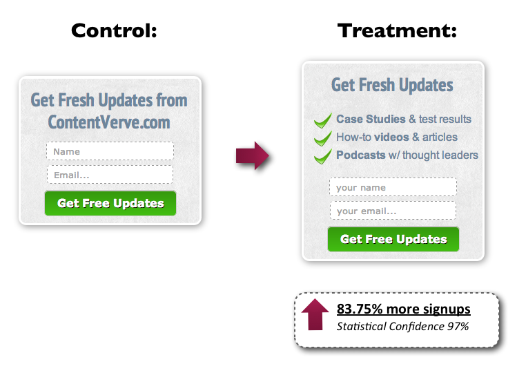
In addition to a clear header, it is important to reinforce the key benefits of your offering just before a visitor has to enter their details. This reinforcement helps to reduce anxiety that people have related to forms, whether that is a fear of being called, a fear of receiving spam or any other fear. To test this best practice advice, ContentVerve.com tested a form with and without the key benefits; the form with the additional copy increased signups by an incredible 83.75%.
Buttons
The colour of your button is a big factor in form conversion rates. In our experience, a clear and easy to read button that has a colour which contrasts the rest of the webpage (ie. a red button on a white background) is most effective.
Equally important to the colour and design of your button is the copy of the button. Just as the phrase ‘Welcome to my website’ seemed to be included in every website years ago, buttons with generic copy such as ‘Submit’ are still extremely common and have been proven to lower conversion rates.
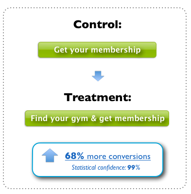
To set yourself apart, it is important that you provide relevance to your button and describe exactly what benefit the person will receive by clicking. So instead of having a button with the text ‘Download Now’, you could change the button to say ‘Get Your Free Brochure’, which describes exactly what the person is going to get when they click the button. This best practice advice was tested by a gym that already had a high converting button copy but wanted to improve. By making the button even more relevant, they managed to increase conversions by 68%.
Form Fields
Generally speaking, the lower the number of fields that your form includes, the higher the conversion rate will be. So take a close look at your form and eliminate any fields that you don’t really need. A lot of forms contain fields for information which can easily be gathered on a follow up phone call or email. It is almost always better to have more leads with less information than less leads with more information, so be as harsh in culling your form fields as possible. This best practice advice was followed by Norway’s leading online beauty shop and resulted in an increase in registrations of 11%.
Privacy Policies
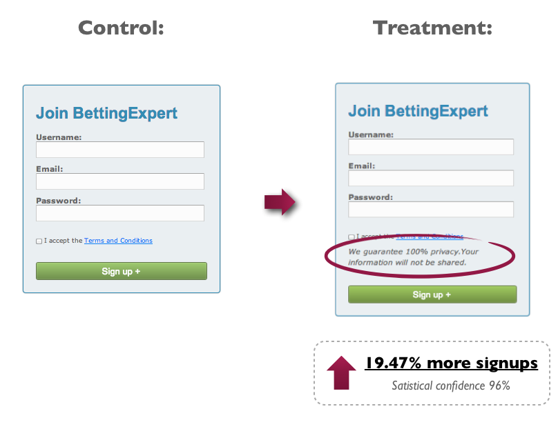
Including a privacy policy on your form is another best practice technique that will, when done correctly, help to reduce people’s fear that they will receive a lot of spam after filling out the form. The text of the privacy policy is important, with some tests showing that a privacy policy with the word ‘spam’ in it will make visitors think about receiving spam just before submitting and actually hurt your conversion rate. BettingExpert.com tested adding the following privacy policy to their forms: ‘We guarantee 100% privacy. Your information will not be shared.’ Their signups increased by 19.47% as a result.
Captcha Codes
In our experience, you will have a higher conversion rate if you do not use a Captcha Code. However, if you are targeted by spammers, there may come a point where you need to add this to your form. Make sure any codes used are very clear and easy to fill out for people, as you may end up losing actual leads otherwise.
Once you have updated your forms with this best practice and proven advice, you will be well on your way to increasing your conversions. However, the main point we need to stress is that even after you have implemented a form which follows these best practices, you can still test and improve every aspect of the form. This testing should be given as much prominence as testing other aspects of your website or landing page. If you do follow our advice and have some interesting split tests to share, please let us know in the comments below.


Yes I can see this to be helpful and will looking into making a change