


Case study: Where should your button link to?
Through many years of split-testing we have found that the key to a successful “above-the-fold” section of a website or landing page is a well-written headline and a strong call-to-action.
But where should the call-to-action button link to? That was what we wanted to find out.
What we tested?
We were tasked with optimising the conversion rate of a landing page for eHotelier.com that focused on converting prospects to join their email database. And we wanted to find out where we should link the main call-to-action.
Here’s what we tested…
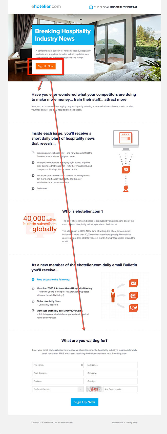
- Original – The ‘Sign Up Now’ button took people directly to the form at the bottom
- Variation 1 – The ‘Sign Up Now’ button took people directly to the start of the content
- Variation 2 – We removed the ‘Sign Up Now’ button completely to make sure it was actually worth having the button
Here’s the landing page…
The result?
Sending people just a few centimetres down the page to the beginning of the content increased email signups by 22.6% at a 95% confidence rate. The second variation where we removed the button altogether also improved the conversion rate by 14.5%.
The lesson
We first assumed that for a simple sign-up with little commitment such as an email subscription it would be better to link people directly to the form to speed-up their signup process. What we found from this test is that getting people to read the sales copy before they get to the form is better than sending them directly to the form, most likely because they are have been sold on the benefits of subscribing.
Can we do the same for you?
Quite simply, yes we can. We have years of experience optimising the performance of websites and have built up a huge arsenal of best practices to ensure the greatest chance of success when launching a new design. But we won’t stop there. We constantly look for new ways to increase your conversion rate even further by continually chasing the next successful split test.
If you would like us to help you optimise the performance of your website (and online marketing) then click here to get in touch.


So place the button at the bottom of your benefits text then?
Hey Mark,
It all depends on the page and every market differs but we find its best to have a clear headline with optionally a pre/sub-headline and/or bullet pointed benefits and a call to action button.
Check out some of our latest landing page designs for ideas, they are all converting highly and are being continually improved: http://bigly.co/yrg
Thanks,
– Duncan
[…] a call to action button into the banner area (check out this article for […]