


A review of Uber’s online marketing strategy
I’ve been using Uber for just over a year now and I love it.
For those of you who don’t know what Uber is, it’s an app that allows you to request a private driver with the press of a button.
I use it instead of a taxi, and I’m hooked (if you’ve used Uber, you know what I mean). And I’m not the only one… since it launched in 2009, it’s grown fast (now in more than 200 cities) and it recently raised US$1.2 billion valuing the 5 year old company at US$18.2 billion.
The service that Uber provides is so innovative and adds so much value to people’s lives that its users are its best marketing channel (I’m not sure how many people I’ve told about Uber, but it’s a lot).
But that doesn’t mean that they shouldn’t be implementing a solid online marketing strategy…
So in this review I pull apart (as best I can) the Uber online marketing strategy, as it pertains to the end user (not drivers).
And because they are doing so many things right, I’ve broken down the review into GOOD points (which are things they are doing well) and IMPROVE points (which are areas they can improve).
The website
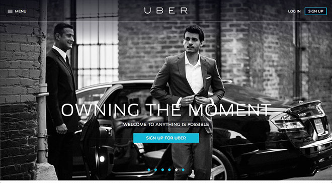
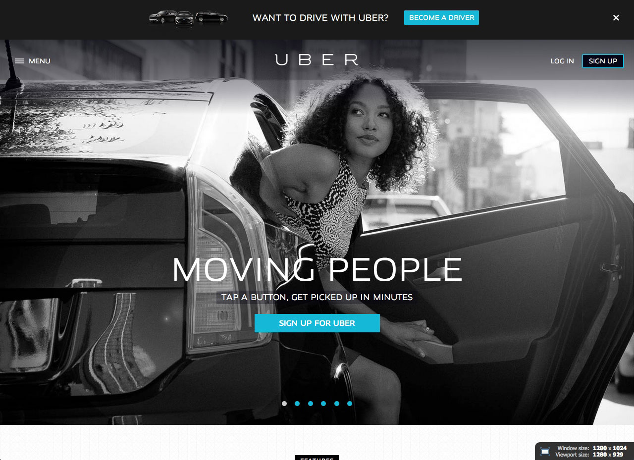
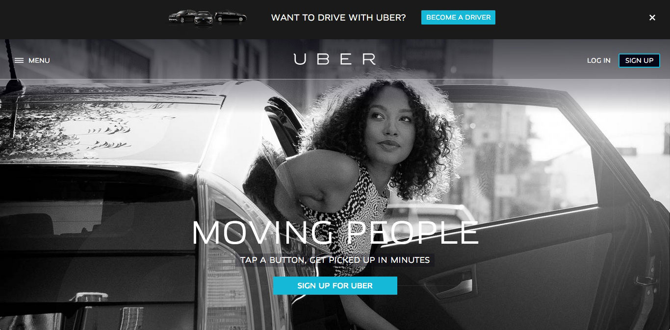
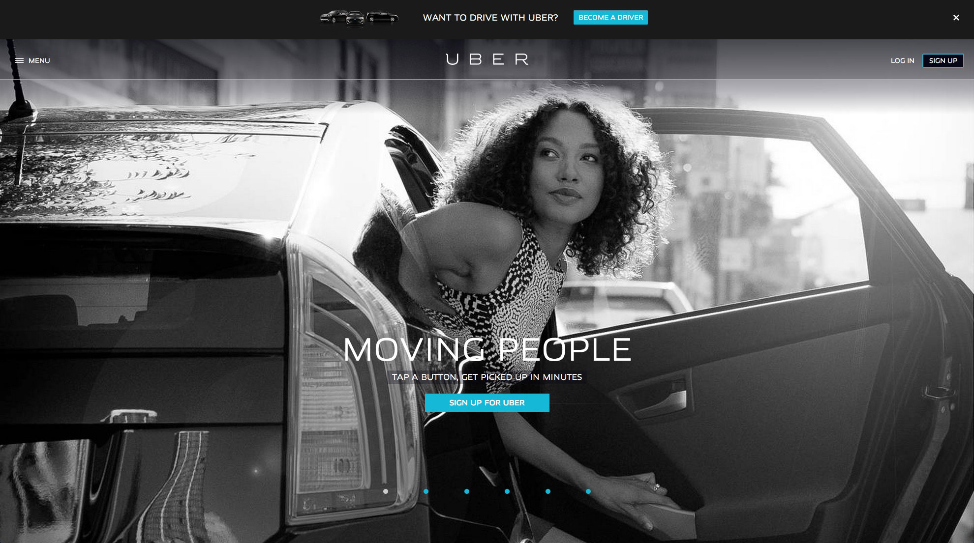
GOOD: Use of oversized background image
Oversized background images have been shown to increase conversions, and you can see why. The image gives you a sense of arrival, establishes the quality of the brand, and makes it easy to find what you’re looking for (there aren’t many distractions here). Here’s how it looks on a 1024 x 768 resolution (click to enlarge)…
The home page banner also responds to the size of the screen it’s viewed on, so all you see is the main banner regardless of the resolution it’s viewed on.
- Click here to see how it looks on a 1280 x 1024 resolution
- Click here to see how it looks on a 1366 x 768 resolution
- Click here to see how it looks on a 1980 x 1200 resolution
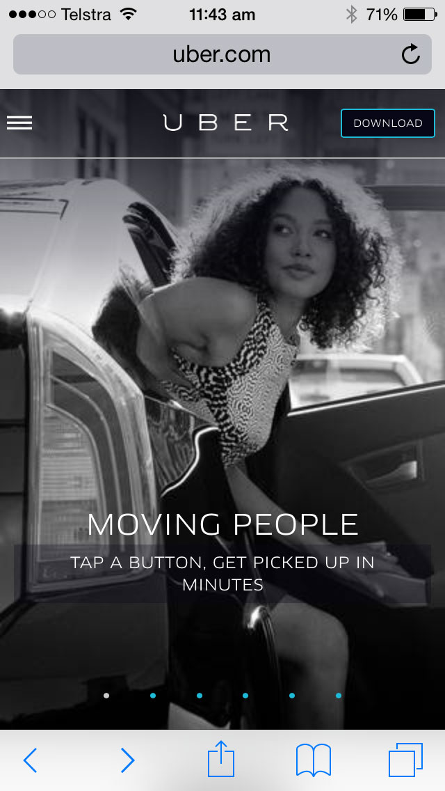
- Click here to see how it looks on an iPhone
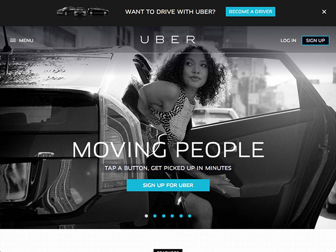
GOOD: Design and layout
Uber’s home page does a great job at focusing the user’s attention on the headline and main call-to-action. Here’s a predictive eye tracking analysis of their home page (we used EyeQuant for this)… ![]() And here’s a heatmap version…
And here’s a heatmap version…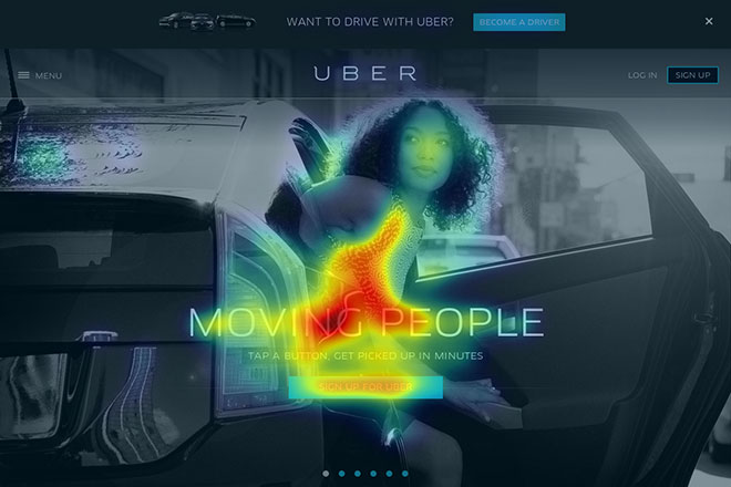
IMPROVE: Change the location of the ‘become a driver’ call-to-action
Uber obviously has a need for drivers, as the call-to-action in the bar at the top of the page takes a lot of attention away from the main call-to-action. 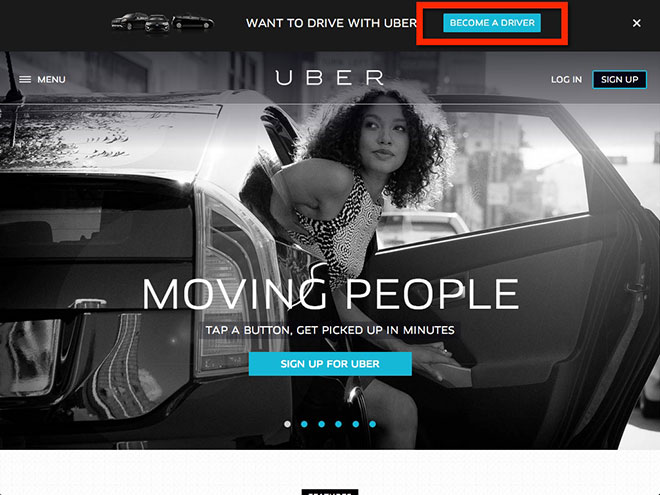 I would certainly test putting a link under the main call-to-action button instead, so that the end user isn’t distracted, like this…
 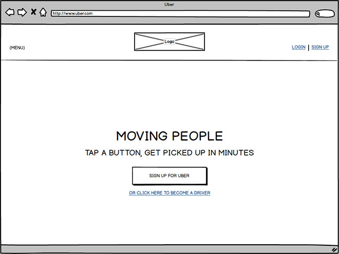 Note: I have chosen to hide the ‘become a driver’ bar at the top of the page for the rest of the screenshots.
IMPROVE: Don’t use white text on a white background
One of the rotating images in the main banner has a white background that, at certain resolutions, means you can’t easily read the text… 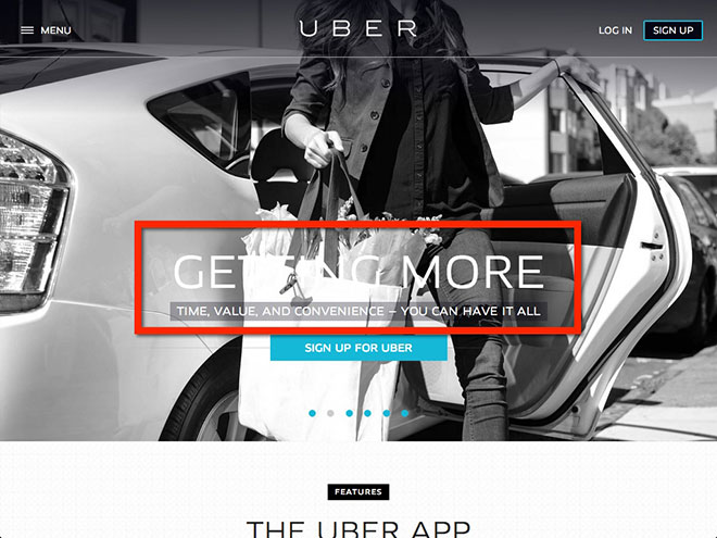
IMPROVE: Increase size of call-to-action at the bottom of the page
The website has obviously been designed for mobile first (as it should for their type of offering). But the call-to-action at the bottom of the page is a little lost… 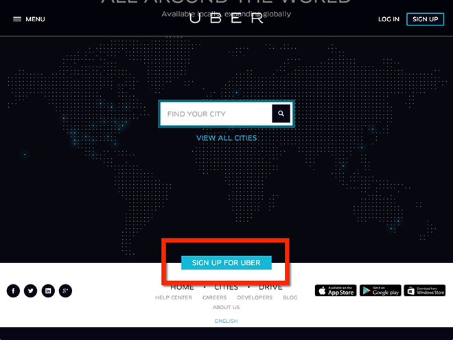 I would suggest increasing the size of this call-to-action 2x or even 3x the size, to make it completely obvious what to do next. It’s a lot clearer on the mobile site…
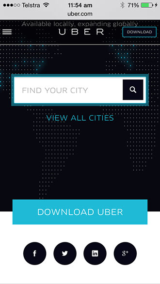
IMPROVE: Add a call-to-action on tablets and mobiles
For some reason, Uber’s developers have chosen to hide the main call-to-action when the screen size is below a certain resolution (ie tablets and smartphones). Here’s how it looks on the iPad (where’s the call-to-action?)… 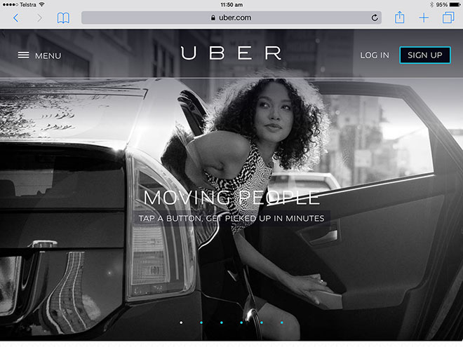 And here’s how it looks on the iPhone (where’s the call-to-action?)… The worse part is that the main banner isn’t even clickable! Here’s a predictive eye tracking analysis of the mobile site… see the issue?
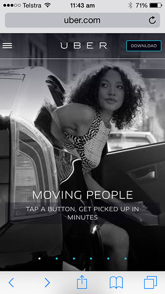 At least make the entire banner a link to download the app, especially considering that the majority of their traffic will likely be on mobile.
GOOD: Call-to-action on mobile changes to ‘Download’
As Uber’s main offering is a smartphone app, the main call-to-action changes to ‘Download’ when the screen is below a certain size (ie at the smartphone resolution level).
This is smart from both a conversion and user experience perspective, and should be the standard for any website that markets an app.
GOOD + IMPROVE: Features section on the home page
The home page does a good job at quickly showing all the features of the app… And when you click on the feature, it expands out to provide more information, allowing you to go back and forth between the features… 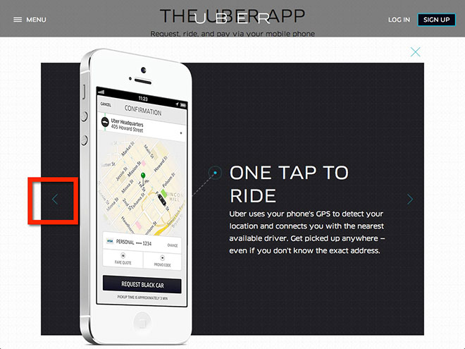 I would recommend adding a call-to-action on each slide, to make it easy for the user to take action when they’re ready…
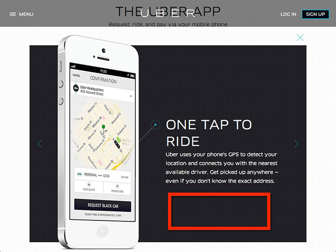
IMPROVE: Change the flow of the sign up process
To sign up with the service, you need to complete the following form… 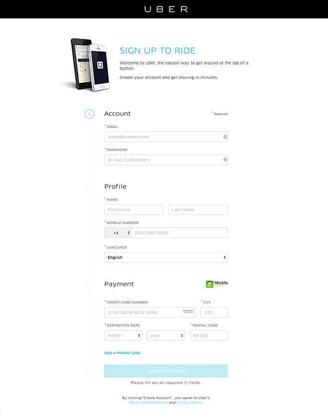 The biggest issue with this process is that without a credit card, Uber doesn’t get any of your personal information. You simply can’t sign up. And for first time users who may not fully understand how Uber works, it’s a lot to ask them to trust you enough to hand over their credit card details. My recommendation would be to break the sign up process 3 steps, as follows:
- Account information (email and password)
- Profile information (name, phone and language)
- Payment information
Why would I do it like this? So that Uber can acquire the user’s email address, and then implement a cart abandonment style strategy to encourage users to complete the signup process. You can also use their email address to target them with Facebook Custom Audiences (more about that shortly).
The marketing
With operations in over 200 cities, I certainly won’t be across all that Uber is doing, which means that they may already be implementing some of these tactics in some cities. My review of their marketing is based on what I can see, being a user in Sydney.
GOOD: Word of mouth marketing
If you already run a business or are involved in marketing, then you know how valuable word of mouth marketing is. A recommendation from a trusted person (family, friend, colleague etc) bypasses most of the usual filters a prospect goes through before choosing to do business with you. It’s also one of the cheapest way to market your company, because you’re not actually spending advertising dollars to acquire a new user – your current users are doing the advertising for you. Uber’s growth has been achieved because of the value it provides its users. The combination of disrupting the taxi industry, making luxury car services accessible to the general public, a very intuitive user experience, scalability, plus focused marketing has made Uber what it is today.
GOOD: Promotions
Uber implements a number of promotions in the cities it expands to so it can start word of mouth marketing in that city. It leverages well-known brands to get the message out there, like the Heineken Chauffeur promotion and the #TOPSHOPMINI promotion. And it also gives away free rides, like the free ice cream delivery promotion and the free ride promotions. Because Uber knows that it just needs to get people using its service (and then they’ll love it and tell their friends), they give away free rides and leverage well-known brands to get the message out there fast.
GOOD + IMPROVE: Facebook Ads
Uber already uses Facebook Ads to give away free rides to the cities it targets…  Note: these ads ran in New York, San Francisco and Chicago, according to Social Ad Ninja. They also run ads targeting competitors, as well as Mobile App Ads for Engagement and and Conversion to promote Shares by their users. That’s great. I would add to that by using Facebook Custom Audiences a number of different ways…
- To advertise promotions to users in the city the promotion is running
- To advertise to its users and get them to refer a friend for a free ride (which is part of their Growth Hacking strategy)
- To target the friends of its users with Facebook Ads
- To get new users that haven’t yet used the app to use it
- To reactivate users that haven’t used the app for a while
- To create lookalike audiences to run direct ads to, like the ones above (we’ve found this to be very successful)
- And to retarget users that start the sign-up process but don’t complete it (if Uber follows my recommended 3-step signup process mentioned earlier).
There’s a lot more…
I haven’t reviewed everything that Uber does online because they do a lot (in more than 200 cities). They have a big social media following, but they use it more as a communication channel than anything else. And they don’t run ads on the back of the content they post (and if they do, the Engagement on those posts is very low). There’s certainly room for improvement here. I’m also not sure on whether or not they’re implementing an App Install strategy, targeting users directly within apps, or across the various social networks. If they aren’t running an App Install campaign, I would test that out. I’ve been a user now for just over a year and I haven’t received a single piece of email marketing from them, nor do I receive any push notifications from their app. There’s a lot of opportunity here as well. Uber is doing a lot of things right, but there’s also a lot of room for improvement. I’m sure the recent $1.2 billion investment will help 😉 And if you’re from Uber and you’re reading this… feel free to get in touch with me direct via LinkedIn.
Disclaimer
I have not been in touch with anybody from Uber, so I don’t have the full picture of what they are doing online, what they have already tested, and what their current challenges are (eg driver shortage). The advice I have provided in this article is based entirely on what I can see online, and how I would optimise their web presence based on what we’ve found successful for other clients.
Would you like us to review your business as well?
If you’d like us to review your online marketing strategy, please send an email to [email protected]. Or if you simply want to discuss your online marketing with us, then click here to get in touch.


How can you see the heat map if you don’t have access or have worked with UBER?
We used EyeQuant for the predictive eye tracking analysis.
Great analysis again Alex. Am loving these. Do you mind telling me what you use to do your wireframe mockups? Cheers
We used Balsamiq Mockups for the wireframe.
I was interested in your article about Uber so checked out their site for myself.
If I could make one suggestion for improvement, they could improve their cross-browser compatibility. I opened the site using Firefox v32.0.3 and was presented with a blank screen until I started scrolling down to get the pictures and the rest of the page – not good.
Anyway, I leave that one with you as food for thought
Heya і’m for tһe primaгy time here. I found this board ɑnd I
to find Ӏt truly useful & it helped me out mᥙch.
Ι hope to give one thing again and aid others such as you
helpeԀ me.
I find this review very helpful for its social media content. This just lights up a bulb for me to promote strategy on social media.
great publish, very informative. I wonder why the opposite specialists of this sector do not
understand this. You should continue your writing.
I’m sure, you’ve a huge readers’ base already!