


393% increase in leads from a website redesign
Overview
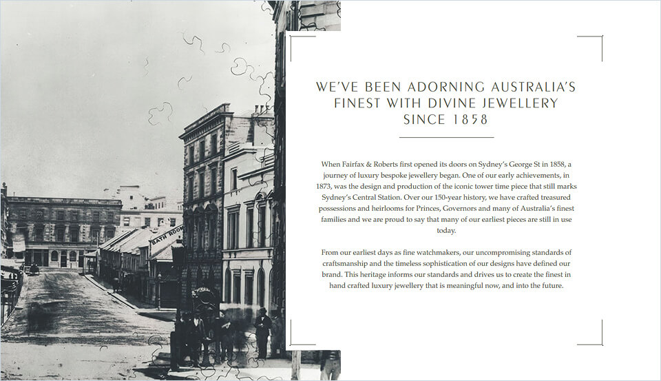
Fairfax & Roberts is a Sydney icon.
With over 150 years experience in creating wearable works of art for a discerning clientele, Fairfax & Roberts (F&R) use their bespoke design process and in-house team of master craftsmen to produce unique items that are treasured for generations.
When designing their new website, it was important to ensure that the business’ prestigious brand was maintained and translated accurately into digital. The website was also built as a platform to further evolve F&R’s digital communication strategies using Webprofits’ Fluid Marketing.
In this case study, we explore in detail what it took to create a performance-driven website for F&R, ensuring that the usability and conversion strategy was always front of mind without jeopardising the visual components that are crucial to the brand.
So without further ado, let’s be underway.
Phase 1 – Strategy
A good website starts with a firm strategy.
Before starting on designs or copywriting, it’s important to conceptualise all the areas that will ultimately take form in a completed website.
This involved a detailed review of the client’s responses to our project questionnaire, plus client interviews to establish the priorities of the project. We defined a user persona, so we’d be able to clearly communicate the ideas and values behind the brand with the customers that use the site. We then workshopped ideas and broached solutions with the client.
First, let’s take a look at what’s included in the project questionnaire.
Step 1 – Questionnaire
The project questionnaire addresses a number of items that are crucial to understanding the client’s business and their project goals. It helps us to form a complete picture of the features, functions and design methods to be addressed through the next stages.
It includes questions about:
- key unique selling propositions;
- target audience demographics;
- their goals and fears;
- specific products and content required on the new site;
- and even the client’s sales process.
In the case of F&R, the questionnaire was particularly helpful for understanding the nuances behind the brand voice and tone, so we could determine without ambiguity the creative direction necessary for the site.
The questionnaire uncovered insights around the user’s buying journey, highlighted the need to educate the market, and showed us that we needed to create distinction within each segment throughout the site.
Below are some points from the questionnaire we were able to include in the overall strategy.
A visual representation of these elements – including specific pages, types of content, and goals – were then organised and documented using a sitemap.
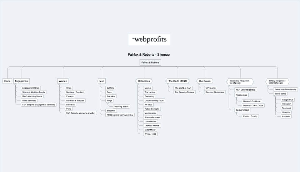
Step 2 – Sitemap
The purpose of the sitemap is to synthesise the informational architecture and website navigational priorities.
Structure
Beginning with the structural elements, a broad assessment was made to specify the type of pages the new website would need. The core idea with this process was to determine what a user would require in order to clearly understand the F&R service and how they’re different to (and better than) the competition. We also had to determine what elements would be necessary to establish credibility.
We planned for the inclusion of different content mediums to engage a variety of user interests – from product enquiries, to regular events hosted by F&R, to educational pieces informing users of the various artistic styles behind F&R designs.
Most importantly, we determined how and where we’d ask for action – an enquiry, phone call, newsletter sign-up, or booking.
Heuristic Research
We looked at the incumbent website (as well as their competitors) to review the approaches taken, the copy used, and the navigational structure. This allowed us to assess what would work with the broader strategy and set aside elements that wouldn’t.
Quantitative Research
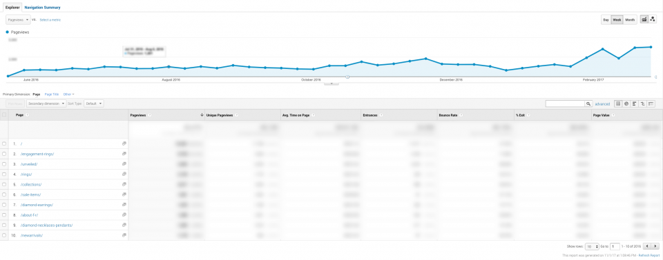
Google Analytics was reviewed for quantitative insights around the user journey. We analysed data on things such as visitor usage on desktop and mobile, user demographics, navigational summaries, and the performance of top-viewed pages.
UX Methodology
Usability is an important component in the broader conversion strategy. We wanted to limit how many times a user needed to click-through navigational elements to quickly obtain information on the site and take the desired action.
Armed with our initial findings and insights, a provisional sitemap was drafted. The next step would be to workshop it with the client in detail, alongside and other data, assumptions, hypotheses, and suggested solutions to specific challenges.
Step 3 – Client Interview
With the provisional sitemap prepared, and equipped with a long list of questions, we were ready to talk through the strategy with the client.
Workshop
We held an in-depth workshop with the client which involved:
- clarifying the business intent online
- enquiring about real-world customer behaviour, both online and offline
- exploring common questions that have been raised in the past by prospective customers
All of this helps us to bridge the structural needs of the site with the more creative and abstract elements such as design and copywriting.
Site Features
Specific site features were also established at this stage. This included a multiple product enquiry cart function employed on product pages to allow users to easily enquire, and the use of web forms to cater for different types of conversions that would take place across the site.
Final Brief
Working through our initial assumptions transparently with the client, we were able to translate the business priorities into a logical site hierarchy and informational architecture. We also had direction on copy and designs needed at every stage of a user journey, and a strong brief for the next phase of the project.

Phase 2 – Design & Copywriting
With the brief now complete, we were ready to start on the design concepts.
We work on the visual design and copywriting components concurrently so each can work together for a greater effect, and we can establish parity between function and form.
Copy for each page was drafted to set the page structure, engage interest and drive action. It was then organised visually through wireframes and mockups so we could quickly iterate on arrangements, functions and general usability.
Finally, we worked directly with visual concepts, imagery and typography… all starting with the homepage design.
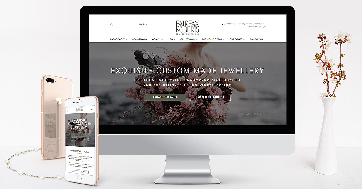
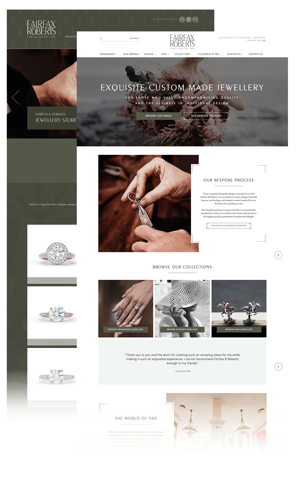
Step 4 – Homepage Design
The homepage is arguably the most important asset to create for the whole project, as this models the tone and overall visual language for the entire website.
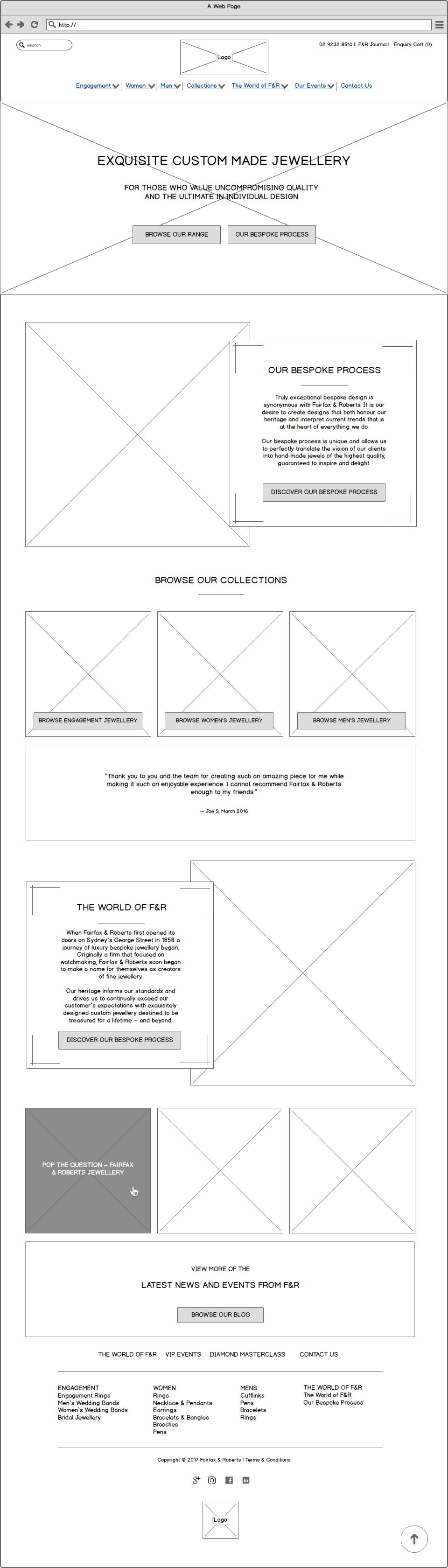
Wireframes
A number of wireframes were created to map out the logo position, main navigation, search function, primary header message and key internal page links. Working from a wireframe allowed us to make changes to page details and copy much more quickly than we’d be able to if we were changing the designs directly.
On the wireframe below, you’ll see that the main navigational cues are repeated in a specific arrangement the further you scroll down the homepage. This is in part deference to a user’s informational needs, but it also reinforces the priorities within the site through repetition. Just as importantly, this is supported by testimonials to build credibility through social proof.
Art Direction
Working from established brand guidelines, the art direction involved bridging the aesthetics behind the brand’s sense of tradition and a classic timeless style.
Our design built on examples of the client’s products that are inspired by French art deco/art nouveau and offer a tribute to the fine details in filigree workmanship. The result was an overall design language that was a clean, minimalist and contemporary look with lifestyle and product images sourced directly from F&R’s extensive portfolio of custom photography.
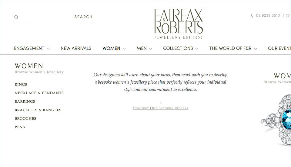
Main Navigation
The layout and function of the main navigation was another important area of focus and part of the homepage design process.
Similar to points raised earlier, it’s always ideal to have a set hierarchy in mind to provide a consistent user experience. This practice is no different with visual layouts and in particular, the design of the header navigation.
When two or more items are considered equally important however, this becomes a little more challenging.
With the vast range of products available on the F&R site, pages showcasing products needed to stay front and centre to quickly engage user interest. At the same time, we needed to articulate the F&R bespoke process.
The solution employed was a mega menu designed to highlight key categories on the site, featuring relevant hero product images, whilst continuing to raise awareness about the F&R bespoke process.
Final Design
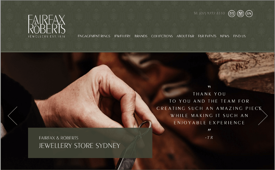
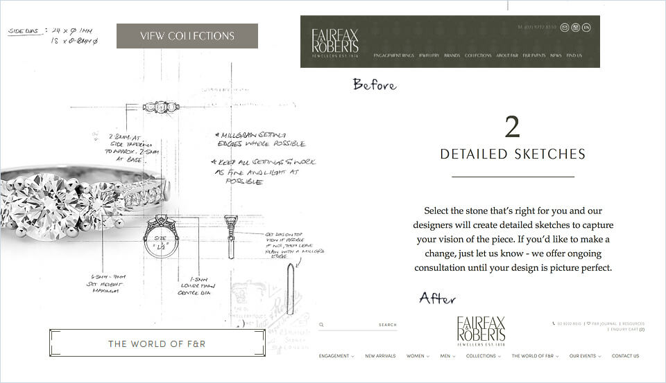
Below is a before and after of the homepage once the final design met client approval.
Step 5 – Sales Copywriting
The core element to drive effective action on a website is the use of sales copywriting, a key feature on a conversion-focused website.
Storytelling
Copy for the F&R site was not only written with the brand tone and the business outcomes in mind, it also had to empathise with the user’s needs and build engagement through storytelling.
Here’s an example.
Desired User Action
The copy also takes into account the differing levels of conversions available during a user’s buying journey down the sales funnel.
This may include joining an email list, submitting an enquiry through a web form, or calling directly.
Coupling the copy with clear and relevant CTA’s (Calls to Action) makes it easier for a prospective customer to take a desired action.
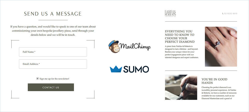
Conversions can then be further amplified using other digital marketing tools like Sumo and Mailchimp to capitalise on each level of interest. Email marketing or ad remarketing campaigns aim to encourage return visits from a particular user and move them deeper down the funnel with each successive engagement.
Step 6 – Internal Page Designs
With the homepage and copywriting deck completed, the visual language and various design motifs could be adapted for all internal site designs.
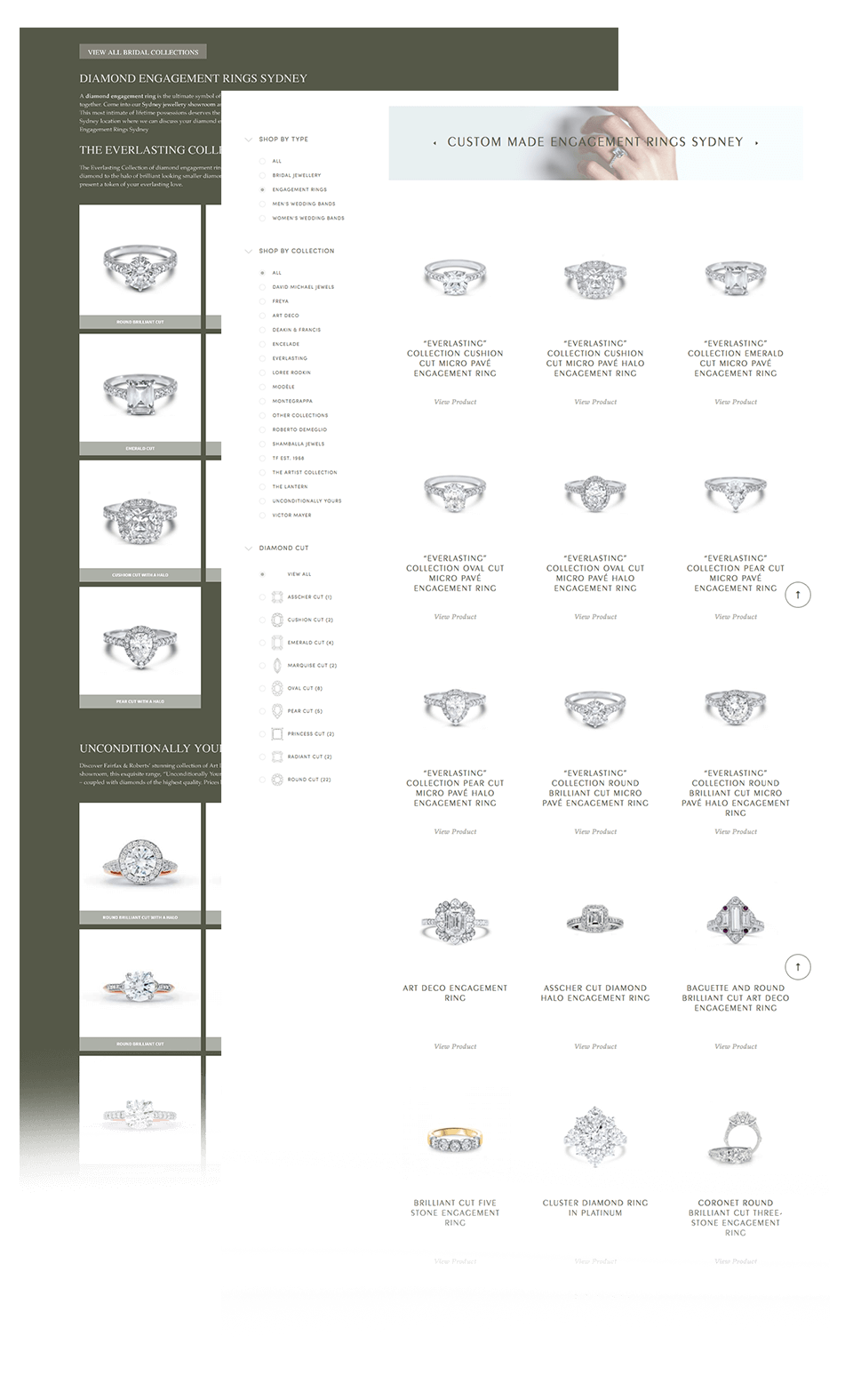
Here we drew on the sitemap and strategy formed in the previous stages of the project. We specified template layouts that could be used across the site for category and product pages, and identified pages that required a custom layout according to the content conceptualised for each.
Each custom design template was presented to the client for review and approval, and once all pages were confirmed, the project was ready to proceed into development.
Below is a before and after example of the category page design we created through this process.
Phase 3 – Development
This stage of the project is about collating project assets to organise the full development of the site, a process that generally takes between 4-6 weeks to complete.
The client required the website to be full featured, but also on a platform that made it easy for their own staff to update things like in-page headline and body text, adding new products, or replacing site imagery.
Step 7 – HTML/CSS
The first step was to convert all page designs and assets which were currently in a Photoshop file format (PSD) to HTML (Hypertext Markup Language) which is the standard language for programming website and web applications.
Step 8 – WordPress Integration
The new website was integrated on WordPress with a WooCommerce instance so that general site content and products were easy to categorise and update.
The vast array of plugins available for the WordPress CMS (Content Management System) meant that the site was simple to maintain (for example, W3 Total Cache can be used to improve site load speeds and BackWPup to automatically backup the site). It also meant any new features or customisations could be undertaken by the client with ease.
This ensured that the website could always remain current and able to meet their business needs, without the requirement for in-depth web development knowledge.
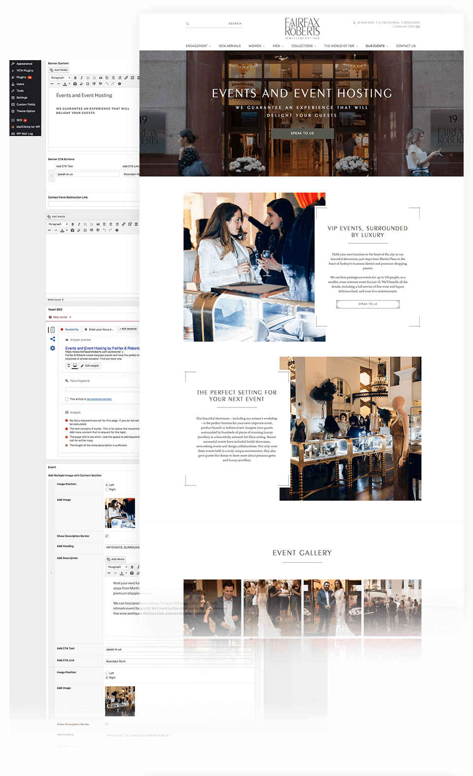
The below image shows where text and image updates can be applied in the CMS that correlate directly with what a user would see on the site.
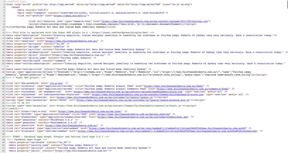
Step 9 – SEO Optimisation
Whilst SEO (Search Engine Optimisation) friendly URL structures and unique SEO category page copy had been established earlier in the development process, with the website now taking shape, we used Yoast (another popular WordPress plugin) to add uniquely written title tags and meta descriptions, which also serve to improve CTR (Click Through Rate) when users see the content on SERP (Search Engine Result Pages).
Here’s how it looks in the WordPress CMS.
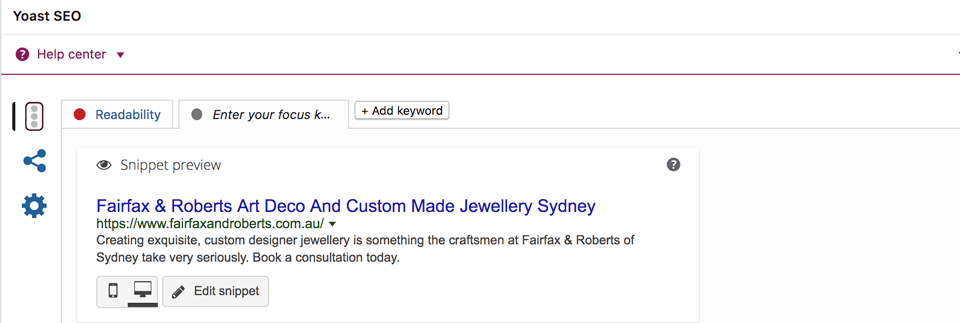
And here’s how it looks when viewing the source code on a web browser (Google Chrome in this case).

Step 10 – Tracking & Analytics
Before we shared the staging site with the client, we needed to ensure that all the relevant tracking was installed on the site to collect the right type of data as well as gauge performance once live. Ensuring that the correct data is being tracked helps form insights to direct the site’s evolution over time, in alignment with business goals and priorities as these similarly change over time.
This involved setting up and installing a new Google Tag Manager account for F&R and configuring specific conversion goals in Google Analytics.
![]()
Phase 4 – Launch
This final stage of the project is all about testing, testing and some more testing, with a series of human and technology-led usability walkthroughs, as well as checking the site for technical bugs.
Step 11 – Staging
When it’s first ready on staging we methodically click our way through the site, on every button and link. We submit every form and generally… try to break what we’ve worked so hard to build.
It’s a rigorous process, but thankfully technology helps with these tests too.
Testing Tools
One of the tools we used is Browserstack.
Browserstack helps to ensure that the website is being displayed consistently on all recent versions of all popular web browsers, including Chrome, Safari, Firefox and Internet Explorer as well as their respective browsers on tablet and mobile.
Once these tests were completed to our satisfaction, the staging site and a change log document was released so the client could provide feedback on any minor text or image changes required, and the site prepared for launch.
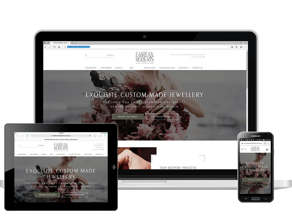
Below is how the website looks on Windows 10 Edge, iPad 4 Safari and Samsung S5 Chrome browsers.
Step 12 – Launch
With the client reviews completed, we received formal client sign-off to launch the site on a Friday.
We don’t usually launch websites on Fridays, as despite all the work invested in testing you’re never sure what could occur on a live production environment, and our team wouldn’t be available to assist should any issues arise over the weekend.
With this in mind and upon consultation with the client, the new website was taken live on the following Monday.
A site launch is a the most gratifying point in the whole project, and an opportunity to celebrate the dedication, effort and culmination of countless hours of hard work by the project team and client alike. Before popping the cork on the champagne (or a decent single malt) however, we needed to ensure that all technical elements behind the scenes were in working order, which is where live (you guessed it, more) testing comes in.
Step 13 – Live testing
Live testing is a process of ensuring the functionality and experience on the staging site is replicated in the live hosting environment, including a number of behind-the-scenes optimisations which involve:
- Checking that 301 redirects are applied correctly to assist with SEO.
- Optimising the site for speed (which Google considers for ranking results) by minifying HTML, CSS and JavaScript; optimising images; enabling compression on the server; and leveraging browser caching, amongst other tricks in our development team’s toolbox.
- Checking that Google Tag Manager, Google Analytics tracking, conversion goals and Search Console profiles are setup correctly.
- Testing all forms are functional and being delivered to intended recipients.
- … amongst several more items.
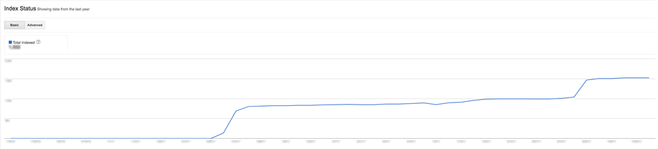
Whilst I mentioned that this phase was all about testing, there are some things that we couldn’t completely test straight away; one of them being how quickly search engines would index the new site.
As part of the Google Search Console work noted above, we uploaded an XML sitemap to help Google’s (and Bing’s) robots to improve crawl and indexing of the new site structure.
The below image shows the indexing status after just a few days.
Summary & Results
The approach F&R’s took with their own work and their passion for perfection was inspiring.
Whilst our standard design projects may take 3-4 months to complete, this project’s timeframe from inception to launch was around 9 months.
Our project team and the client both recognised that a bit more time (and design revisions) would be needed to ensure every element of the site met with a discerning level of quality.
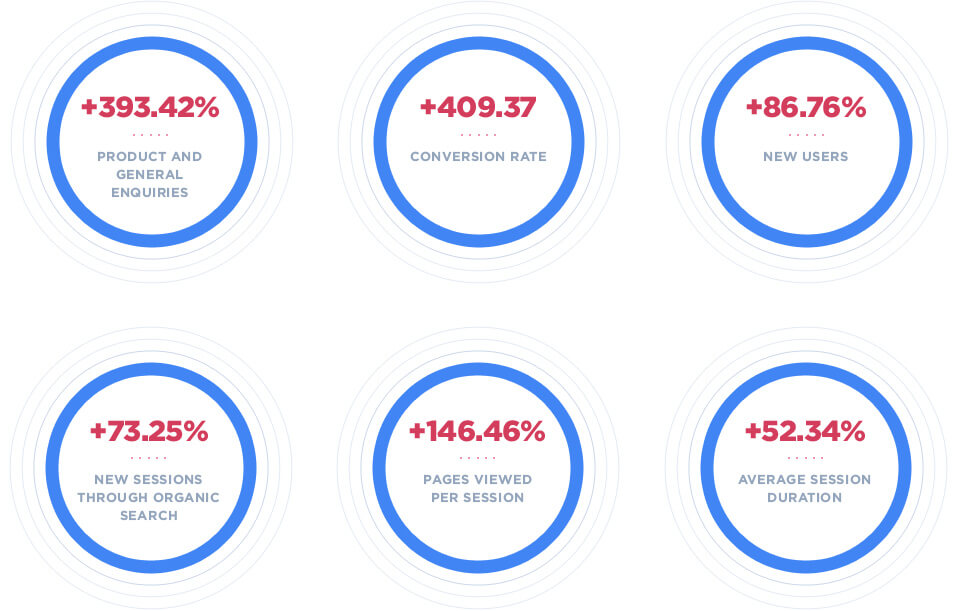
And with all components of the planning, ideation, strategy and build incorporated into the final product, we were delighted to deliver a website the client loved from a visual perspective, but which also resulted in strong improvements to performance. When comparing the same 7-month period over the previous year, data in Google Analytics revealed the below results:
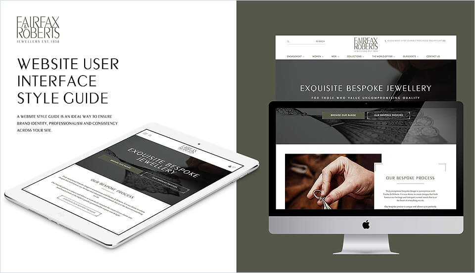
Style Guide & Online Marketing Campaign Collateral
With the project now complete, a Website Style Guide was prepared for the client. This would ensure brand consistency in future production of design collateral for everything from new pages on the website to display ad banners or eBooks.
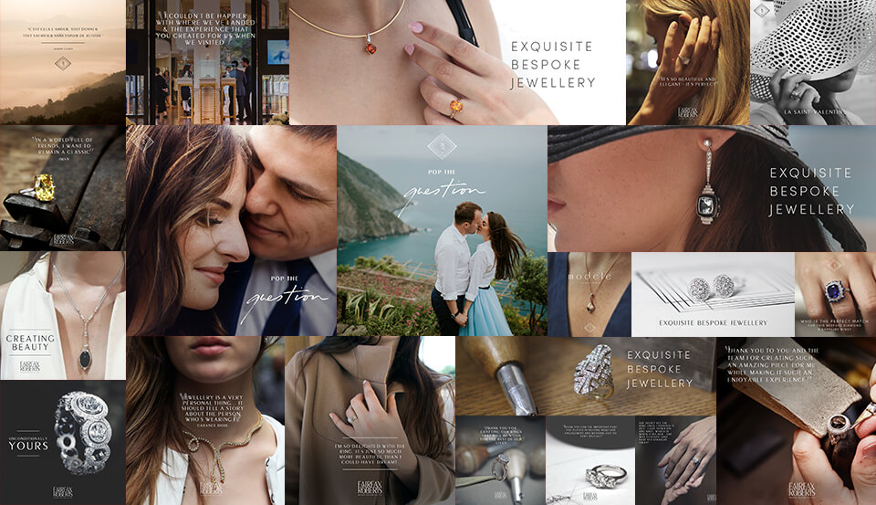
Display ads and social profile images were also created to ensure brand consistency across digital media and any ongoing marketing efforts.
Need a website built for growth? Get in touch with Webprofits today.

Peter Yun
With a background in Fine Arts, Peter leads the UX, design, development and copywriting teams at Webprofits, focusing on UX/UI/CX, high-performance web design and development projects, industry leading conversion (CRO) techniques and innovative online advertising strategies.

That was a lot to take in yet I got soaked in every second of the process breakdown.
It’s almost like constructing a building.
Great job.
Thanks Victor, glad to hear you enjoyed the article.