Dominos vs Pizza Hut – Who has the better website?
I like Pizza.
So when one of my team suggested I review the top Pizza sites in Australia, I had to take a look.
It’s actually a perfect case study because of the sheer number of people who get home delivery pizza.
And I had to review the top 2 pizza companies in Australia – Dominos and Pizza Hut – because you’d expect that they would have optimised their online sales process to maximise sales.
Here’s a quick look at the number of people who search on Google for each brand:
- Dominos (640,500 searches per month)
- Pizza Hut (334,100 searches per month)
Just keep in mind that these are people searching on Google for the brand – it doesn’t include people who go directly to the site (which means they have a lot more traffic than that).
So how do they compare?
Well, one brand certainly stands out as really nailing the entire online sales process… but the other also has some interesting features as well.
So in this review, I compare the Dominos and Pizza Hut websites including what they’re doing well, what they’re getting wrong and what they can improve.
Let’s get into it.
Who has the better home page?
Let’s assume that I’m coming to the site to order a pizza. How easy is it to find what I’m looking for and start the ordering process?
Let’s compare…
Dominos Home Page
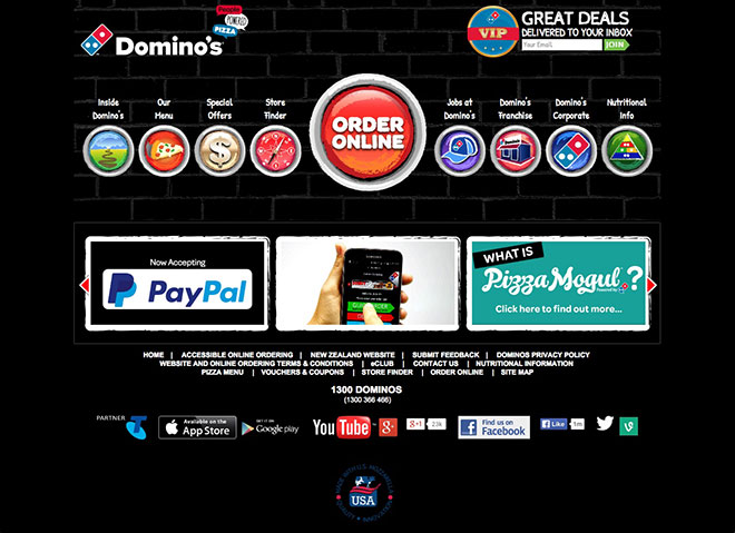
It’s quite easy to see where to order, but the rest of the site is quite confusing to look at.
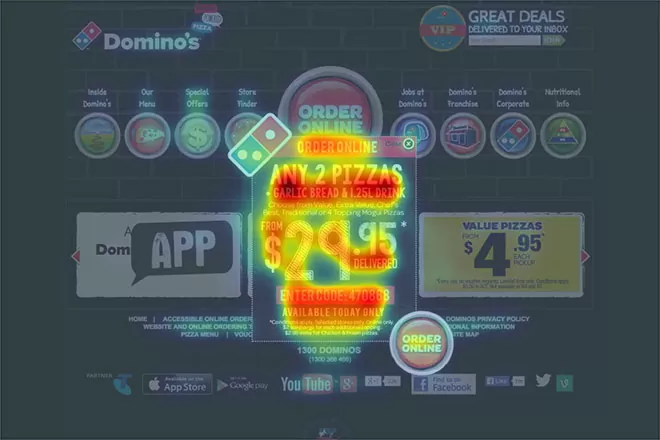
Let’s run a predictive eye tracking analysis to see where the visitor’s focus in drawn to:

Interestingly, the visitor’s focus is drawn to the footer navigation.
It’s not that the ORDER ONLINE button is hard to see, but it’s not the first thing that a visitor sees when they land on the page.
If I were optimising the site, I would move the footer navigation to to the bottom of the page (below the App and Social icons) and move the ORDER ONLINE button to the centre of the page. And then split-test that layout against the current version to track which one produces more orders.
Now I know what you’re probably thinking – the ORDER ONLINE button is easy to see so how much difference could such a small change make?
When you have a lot of traffic, small changes to the design can make a big impact on sales, like when Google generated an extra $200m by testing 50 shades of blue for their text links.
So I would definitely be testing a different layout to make it easier for customers to start their order.
And as a side note: aside from the ORDER ONLINE button being easy to see, it’s not as easy to find the Menu (which I would expect would be the second highest clicked link on the home page). So there’s definitely opportunity to improve there as well.
Pizza Hut Home Page

It’s not as easy to see where I can start my order on the Pizza Hut home page.
There are many images of Pizza but most of them are special offers. Importantly, the ORDER NOW button is not the main focus of the page.
Here’s a predictive eye tracking analysis of the Pizza Hut home page:

As you can see here, the visitor’s eye is drawn to the two specials at the bottom of the page – and the main banner (the most important part of the page) doesn’t have enough contrasting colours to draw the eye and get the click.
Worse still, the ORDER NOW button doesn’t get any attention at all when a visitor first lands on the site.
The additional challenge that Pizza Hut has is their colour scheme. Because their main background colour is red, they need a strong contrasting colour for calls-to-action (ie buttons) to draw visitors’ attention on what they want them to do.
Unfortunately, the green they’ve chosen doesn’t do the job and, as you can see from the predictive eye tracking analysis, the green ORDER NOW buttons are barely visible.
Home page winner: Dominos
Reason: better use of contrasting colours + easier to start the ordering process
Who makes it easier to sign up?
Both Dominos and Pizza Hut ask you to enter your details before you can start your order.
I’m assuming it’s because they’ve tested this process and found that they get more sales by asking people for their address details before they make their order.
But if they haven’t, then I would definitely test when to ask for personal information – and if their reasoning is that they need a location to present special offers, then I would have a popup when someone first lands on the website asking them to enter their postcode, and only ask for personal information at the end of the process rather than the beginning.
So let’s take a look at which company offers the easiest sign-up process…
Dominos sign-up process
1. When you click on the ORDER NOW button, you’re taken to this page. The 3 options are really easy to see individually. Nice.
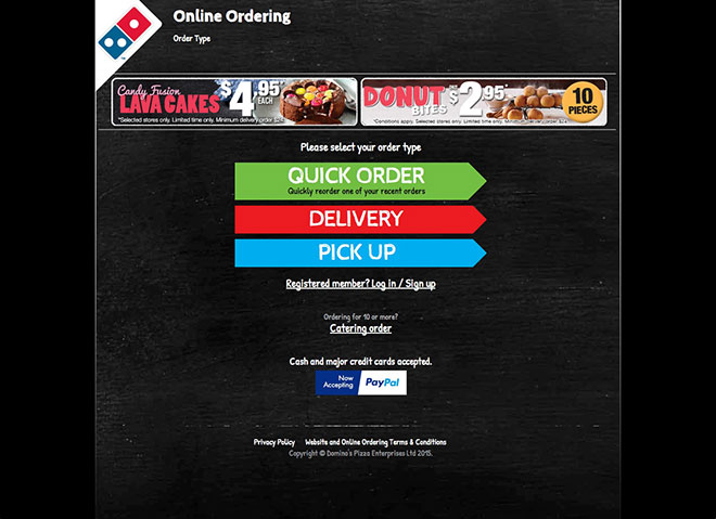
Here’s a predictive eye tracking analysis that shows you where a visitor’s attention is focused when they land on the page:

2. I clicked DELIVERY and was then taken to this page. Very clear. Nice call-to-action. And really easy to use.
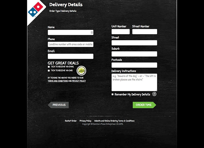
Here’s a predictive eye tracking analysis of the Delivery Details page – as you can see, the attention is in the right spots.

Dominos uses best practice form design by using inline validation (where it shows you if you’ve entered the right information when you click out of a field) and adding the field names outside of the field (ie so that visitors always know what field they’re on, even if they’re halfway through it). Really nice.
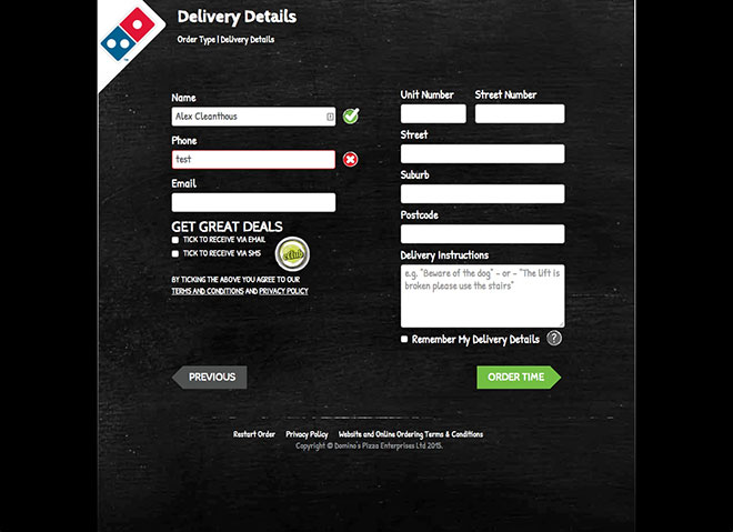
3. When you click on ORDER TIME, it pops up an option asking ‘would you like to save your delivery details on this device?’.
This is great because it’s a simple YES or NO question that makes it easy for people to answer. Dominos is really good at offering visitors the right options at the right time (which you’ll see more of shortly).
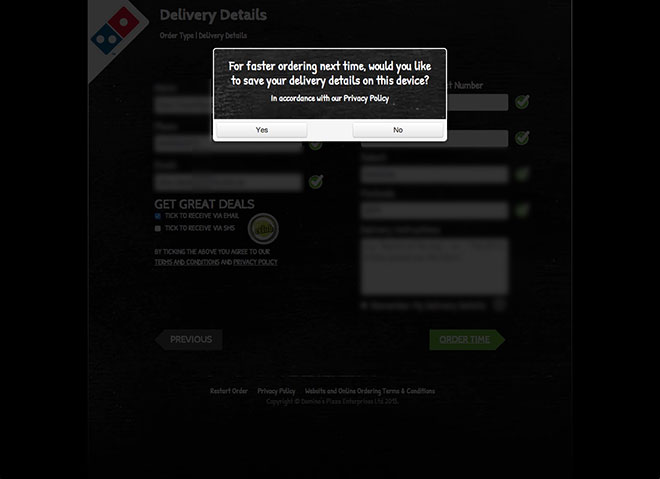
4. When you click through to the next page, they give you two options for when you want your pizza delivered.
Obviously the most popular option is ASAP, which is why it’s the biggest button on the page and stands out from everything else.
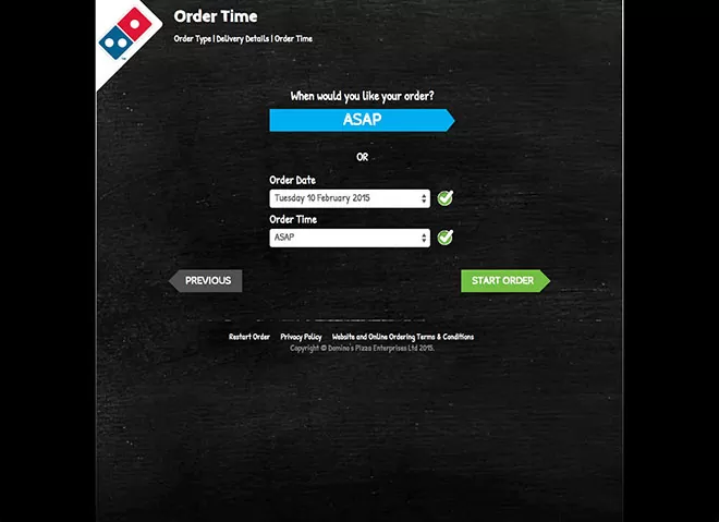
We’re now ready to order our food.
Now let’s take a look at Pizza Hut’s sign-up process.
Pizza Hut sign-up process
Pizza Hut has a single step sign-up process. This is what you see after you click ORDER NOW.

Everything is on the same page but it’s a lot harder to figure out what to do – they really make you work to figure out what fields need to be filled out and which can be skipped.
Let’s take a look at a predictive eye tracking analysis of this page:

The visitor is drawn to the selection of DELIVERY or PICK UP, which is good. But the biggest focal point on the page is the $4.95 special – in my opinion this is a mistake, as they are showing this offer at the wrong time. It would be far better to show this offer after they’ve signed up, not before (plus, when you click on it, it takes you back to the sign-up form – which can be frustrating for customers).
Where Dominos used inline validation to let you know if you’ve filled out the fields correctly, with Pizza Hut you only know if you’ve made a mistake after clicking the FIND MY STORE button. Again, this is another area that can frustrate customers.
Sign-up process winner: DominosReason: easier to understand what you need to do next + inline form validation (note: even though Dominos has more steps in the sign-up process, it’s a lot easier to use that the Pizza Hut sign-up process)
Who makes it easier to order?
Okay, so now we’ve signed up on both sites and we’re ready to order. Let’s see who makes it easiest to order…
Dominos ordering process
1. When you click START ORDER or ASAP, you’re taken to a page that shows you 2 offers with one pre-selected.
You can click YES to add the order to your cart, and continue moving forward. Or you can add them both, or none at all.
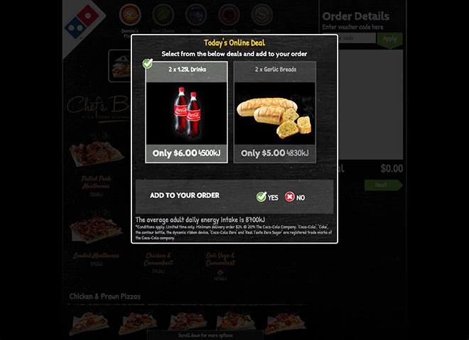
This is far better timing for making an offer than what Pizza Hut did in their sign-up form.
2. Next you’re taken to the menu page where you can order your pizza.
It’s nice and clean and you can scroll through all the pizzas on one page. It’s also really easy to see your Order Details on the right.
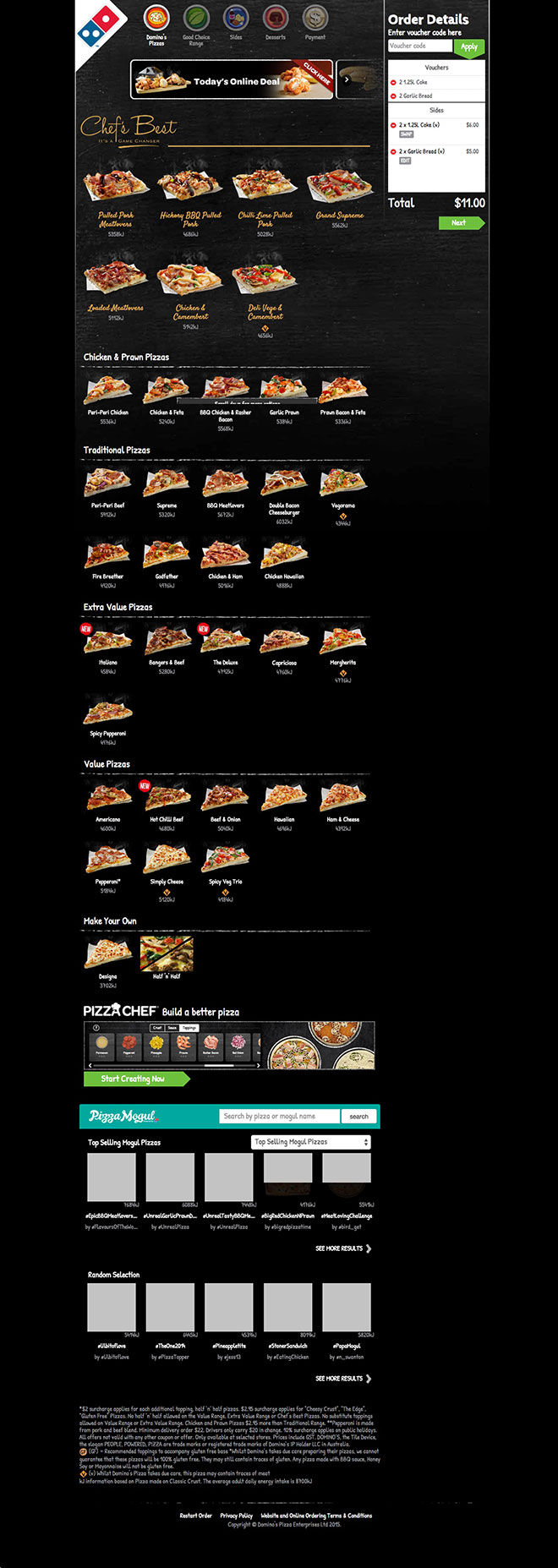
Here’s a predictive eye tracking analysis of this page:

As you can see, the focus in on the right place – first the offers, then the pizzas and then the Order Details.
3. When you click on the pizza you want, it takes you to a page about that pizza (I like the Margherita).
The page is laid out well with the pizza in focus, and the call-to-action easy to see.
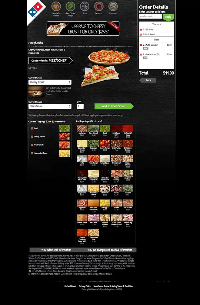
Here’s a predictive eye tracking analysis of the pizza page:

As you can see, the focus is on all the right areas. Nice.
4. When you click ADD TO YOUR ORDER, they popup an upsell offering an upgrade to the ‘Cheesy Crust’ for $2.95.
Again, it’s all about timing and this is excellent timing for an upsell.
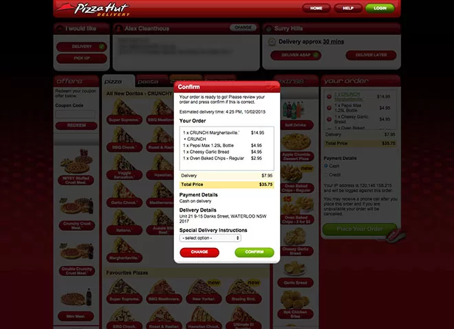
5. When you click YES or NO, you’re taken back to the menu page, with your ORDER DETAILS updated on the side.
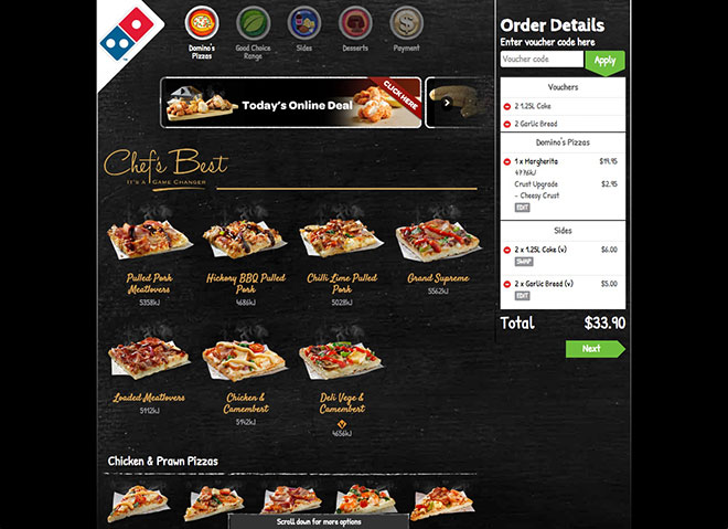
6. I clicked NEXT to checkout and was taken to this page. This confused me.
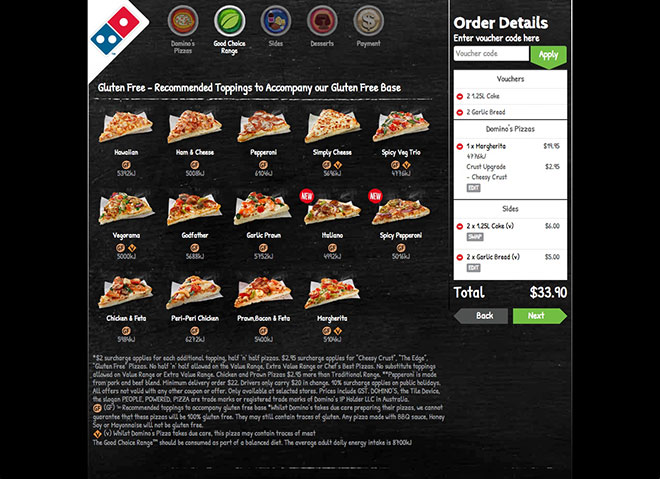
I was expecting to be taken directly to the checkout but I was sent to a page that looked very similar (too similar?) to the previous page. I was confused (and you never want to confuse a customer when they’re on your site).
7. When you click NEXT again, you’re taken to the Sides menu.
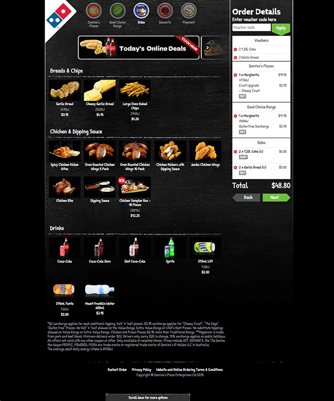
8. This follows the same process as selecting a pizza.
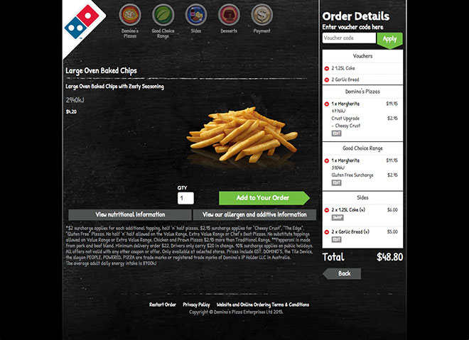
9. When you click ADD TO YOUR ORDER you are then taken back to the Sides menu.
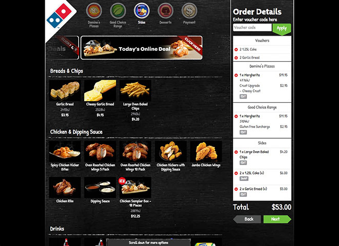
10. When you click NEXT again, you’re taken to the Dessert menu.
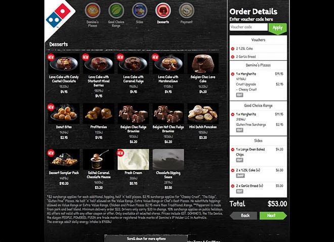
11. Again, this follows the same process as the previous menus.
20big.jpg”>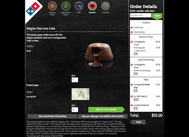
12. When you click NEXT, you’re taken back to the Dessert menu again.
21big.jpg”>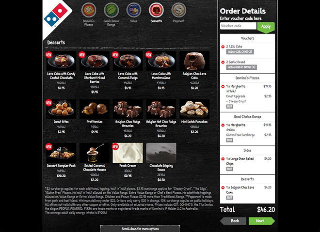
13. When you click NEXT again, you’re taken to the checkout page, at which time you can choose your payment option and finalise your order.
24big.jpg”>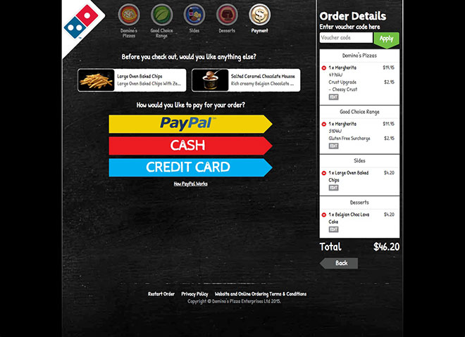
The Dominos ordering process was pretty good, but there are definitely improvements they can make around ordering / upselling Sides and Desserts.
I’m sure that one part of maximising average order sale is showing the best looking Sides and Desserts at the top of the page, but it was a bit confusing at parts. And if I was a bit confused, I’m sure that others would be as well (and that means a lot of potential sales are being lost).
Now let’s take a look at Pizza Hut’s ordering process.
Pizza Hut ordering process
1. When you click FIND MY STORE you are taken straight to the menu page.
The interesting thing about Pizza Hut’s ordering process is that you can see everything on one page.
03big.jpg”>
But while I do appreciate being able to see everything on one page, it did take more time than Dominos to figure out what to do.
Again, there’s a lot of use of red (maybe too much). I know it’s their brand colours, but there are better ways to leverage contrasting colours to make it easier for customers to find what they’re looking for.
The other downside is that the pizza names are squashed into the red buttons. I’d like to see more space around the pizza but I get why they’re doing it – to fit as much information as possible as close to the top of the screen.
Here’s a predictive eye tracking analysis of this page:
eyequant/03big.jpg”>
As you can see here, the customer’s focus is on the pizza (which is where it should be).
2. When you click on the pizza you want, it pops up the pizza with all the options available. You can select what you want and then click ADD TO ORDER.
04big.jpg”>
The biggest downside I see on this page is the CANCEL button stands out more than the ADD TO ORDER button.
But I do like that I haven’t left the page to update my order.
Let’s take a look at a predictive eye tracking analysis of this page:

My fears have been confirmed. There’s a lot more focus around the CANCEL button (including the amount of KJ in the pizza) than there is on the ADD TO ORDER button.
It’s not the end of the world but it’s certainly something that can be improved.
3. When you click ADD TO ORDER it updates the YOUR ORDER section on the right. You can then continue with your order.

4. I wanted to get a bottle of Coke as well. It took me a little bit of time to find where it was – not that long but more than I wanted to spend (which is no time at all).
Can you see where it’s at?

It’s on the right hand size of the pizza.
Here’s a predictive eye tracking analysis to show you the issue:

Notice how the drinks are barely visible in comparison to everything else on the page?
5. When you click on the drinks menu, it just updates that section until you find what you’re looking for.

It would be far better to have a popup that allows you to choose your options, rather than just updating the same page (especially as the text is cut off).
Definitely something to test.
6. When you select your drink, it’s added to YOUR ORDER.

7. When you click PLACE YOUR ORDER, a popup appears confirming your order.

Again, the CHANGE button is the one that stands out most, whereas the CONFIRM button should stand out more.
Sign-up process winner: Dominos
Reason: more intuitive process + timely upsells
Who has the better mobile experience?
With the growth of mobile (and the assumption that ALOT of people will be ordering pizza from their smartphone) I’ve also reviewed their mobile optimised websites.
Let’s take a look.
Dominos mobile experience
1. Here’s the home page. It’s easy to see the ORDER ONLINE button, which is good. But I would have preferred the video to be placed below the big menu, not above it.
I would also suggest that they use horizontal buttons instead of round ones, so it matches with the rest of the pages in the flow and makes it easier for visitors to click.

2. You’re then taken to a page where you can select what type of order you want. Nice big buttons that are easy to see. Good stuff.
I also like that they suggest you install their mobile app – another good feature.

3. You’re then taken to a form where you enter your delivery details.

Again, it uses inline validation, which is ultra important for mobile devices – just think about how frustrating it would be to enter wrong information, then click submit and then be taken back to the page to enter it all again (especially as it’s a lot harder to type on a smartphone than on a desktop).

And there’s a nice big button to press when you’re done.

4. You can then select if you want Dominos to remember your delivery details.

5. And then click ASAP or START ORDER to continue.

6. This step is different to the desktop version because it gives you a selection of menus to choose from.

7. I clicked Good Choice Range and was taken to this page.
I really like how I can see a picture of the pizza and the click area is big enough to make it easy to select on a smartphone.

8. You’re then taken to the pizza page where you can see how the pizza looks and make your selection by clicking ADD TO YOUR ORDER.

9. You’re then taken to the ORDER DETAILS page where you can either checkout by clicking PLACE ORDER or continue ordering by clicking ANYTHING ELSE.

10. I clicked ANYTHING ELSE so I can order a drink as well.
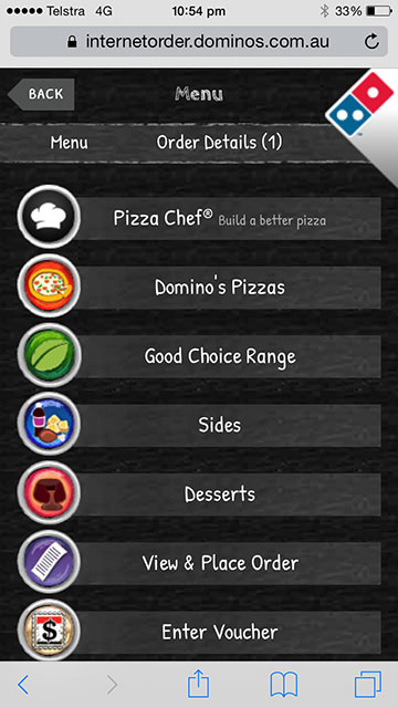
11. After clicking SIDES I am presented with different options, similar to the Pizza menu.
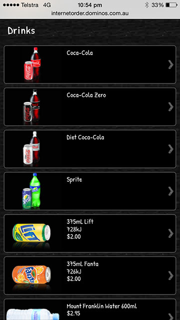
12. I selected a bottle of Coke.

13. And then clicked ADD TO YOUR ORDER.

14. I am then redirected to the ORDER DETAILS page again.
To finalise the order I clicked PLACE ORDER.

15. And then selected the method of payment to finish.

The Dominos mobile experience is a lot more seamless than the desktop experience.
All of the issues I outlined with their desktop experience are not visible on the mobile experience.
I would highly recommend updating the desktop experience to match the mobile one (or at least experimenting with the sales flow).
Now let’s take a look at Pizza Hut’s mobile experience.
Pizza Hut’s mobile experience
1. This is the home page. At first I thought there was an issue with the design, but it’s just how the Pizza Hut mobile site looks (note: the US site looks much better).
I find it very interesting the order of their menu. I would have thought that Delivery would be above Pick Up but I guess Pick Up is more popular than home delivery?
I clicked on Delivery.

2. You’re then taken to a page where you enter your delivery details.

I also note the that green used on their mobile site has a lot more contrast than the one on their desktop site. I’d recommend using this green on the desktop site instead of the lighter one.
3. You can then either select ORDER NOW or FUTURE ORDER.
Dominos did a better job here because they made the buttons different colours and they made the one that most people click (ie ORDER NOW) stand out more.

4. You’re then taken to the menu page where you can select the menu you want to order from. I selected Pizza.

5. I was confused on this page because I didn’t know what each of the categories meant.
Note: I don’t order from Pizza Hut a lot, but I’m sure there are others like me who eat pizza rarely but still expect a smooth user experience.
I had to click back and forth a few times to figure out what each category meant.

6. This page was disappointing. If I’m ordering pizza, I expect to see what the pizza looks like (especially from one of the top two pizza companies in Australia).
Luckily I know what I want. But if I didn’t, then this part of the process would be super frustrating.

7. I clicked on Margheritaville and was taken to this page. Again, no photo?? And what does PERFECTO mean? Very confusing.
I just clicked ADD TO BASKET to continue (note: I would likely have dropped out at this stage and went to a competitor, but I completed the process for the purpose of this review).

8. I was then taken to the ORDER DETAILS page where I could either CHECKOUT or ADD MORE to my order.
I clicked ADD MORE to add a drink to my order.

9. I was then taken back to the main menu page, at which time I figured that drinks are in Extras. So I clicked Extras.

10. I then clicked Soft Drinks.

11. Then 1.25L Bottles.

12. Then Pepsi Max (sorry Coke!).

13. And then ADD TO BASKET.
Now that’s a lot of clicks to add one drink to the order. I’d highly recommend experimenting with reducing the number of steps it takes to add a drink to the order. Maybe add an upsell at the end?

14. I was then taken to the ORDER DETAILS page where I clicked CHECKOUT to finalise my order.

15. I then entered my details to finalise the order – although it would have made more sense if they asked me these questions in a single step instead (instead of asking for half the details in the first step, and the other half in the last step).

When you enter your details and click PLACE ORDER, the process is done.
Mobile experience winner: Dominos
Reason: better design + images used throughout
So who has the better website?
In my opinion (based on all the reasons outlined in this review) Dominos has the better website. It’s more intuitive, the design is better, and they offer upsells at just the right time.
That doesn’t mean that Dominos should rest on its laurels (because it should be constantly testing different flows, different layouts and different designs) but it has a huge advantage over Pizza Hut when it comes to converting its visitors into customers.
Disclaimer
I have not been in touch with anybody from Dominos or Pizza Hut, so I don’t have the full picture of what they are doing online, what they have already tested, and what their current challenges are. The advice I have provided in this article is based entirely on what I can see online, and how I would optimise their web presence based on what we’ve found successful for other clients.
Would you like us to review your business as well?
If you’d like us to review your online marketing strategy, please send an email to [email protected]. Or if you simply want to discuss your online marketing with us, then click here to get in touch.






all I can say is WOW. What an intense article haha. Well done. Plethora of screenshots. Glad to see you actually came to a decision with Dominos. I dislike articles that don’t choose a winner! Great job!
Great article and it’s interesting, could this be one of the big factors as to why Domino seem to be more dominant these days.
From my point of view both companies are reputed and well maintaining their business and effetely growing their customers by providing various offers and also their services are much better than each other and giving the good competition against each other.