


Canva’s Digital Growth Strategy
Few companies have experienced growth at the same scale as Canva.
In less than 7 years, they have acquired over 15 MILLION users, 300,000 paying customers, and have been valued at 3.2 billion dollars (USD) after recently closing a $125m (USD) funding round.
In the first 2 years alone, they reached 2 million users — averaging 3,600 signups a day, or 111,111 signups per month.
So, what sent Canva into hypergrowth?
Undoubtedly, their product and business model played a huge role. There was nothing like it at the time.
But like any product, they had to make sure people heard about them and knew what they did.
That’s where marketing comes in.
It started back in 2012, when one of the co-founders – Melanie Perkins – was teaching students how to use programs like InDesign and Photoshop — software that people found hard to learn and even harder to use.
At the time, the only tools on the market for graphic design were far too ‘overpowered’ and complex for most people to use.
There had to be a better way for the average person to create beautiful designs. After realising that this was a potential starving market, Melanie set out to create Fusion Books, which later evolved into a separate product: Canva.
In this growth study, we’ll dig into how Canva acquires users by analysing:
- What they do to acquire traffic
- How they turn that traffic into users
BONUS: Rather have this case study as a PDF? Click here to download it and read it whenever you're read, plus receive similar articles and case studies via email.
Behind the strategy
Canva’s acquisition strategy relies on 2 pillars:
- A starving crowd: people hungry for a better way to create beautiful designs
- Their company vision: helping everyone create beautiful designs without friction
Their vision happens to align perfectly with the needs of that starving crowd.
They use their vision as the overarching message for all campaigns using a framework called Jobs To Be Done.
It’s based on the idea that your customers are trying to accomplish something with your product — that’s the “Job” that needs to be done.
These jobs could be something like:
I want to design graphics quickly and easily.
Or we can dive deeper:
I want to create a Facebook ad without the frustration of using Photoshop.
These are, in essence, more specific variations of their company vision. As we analyse and dissect Canva’s growth strategy, you’ll notice that almost everything Canva does aligns to the needs of the starving crowd by showing them how they can achieve the job that they’re trying to accomplish — being able to design anything, quickly.
Website
After analysing the website, I came to the conclusion that the following pages are the highest priority for user and customer acquisition.
- The Home Page — page goal: converting highly-educated traffic into ‘freemium’ and trial users
- Product page — page goal: converting cold and warm traffic into trial users
There’s another page which I was tempted to analyse: the Canva Pro product page, but decided against it as we’re under the impression that its main purpose is to upsell free users into Pro users, not for acquiring new users.
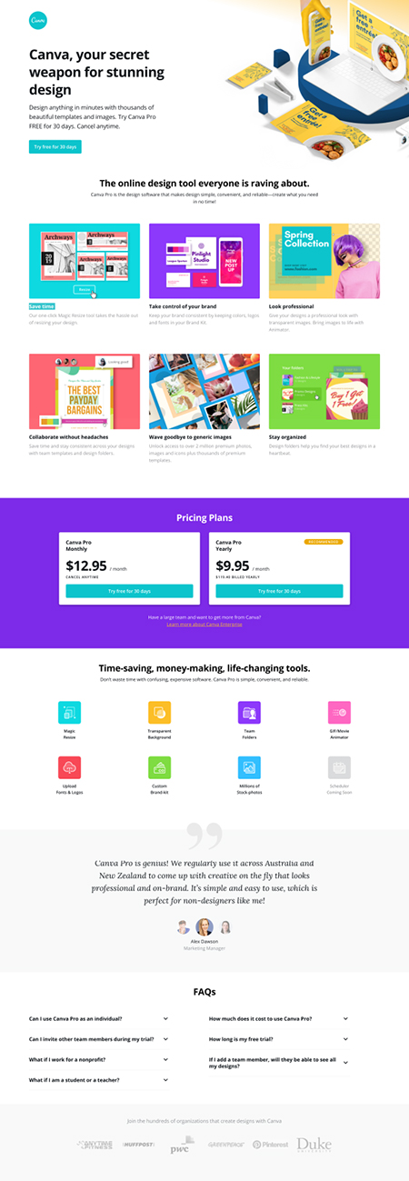
Home page
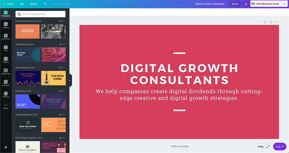
The first thing you notice about the home page is the simplicity. It’s not a common strategy. But with Canva being so intuitive, powerful and quick to use, they’d prefer to lead with the product rather than spend a lot of time explaining with text.
They keep it simple by letting the screenshot of the desktop and mobile app provide some – but not much – context about the product.
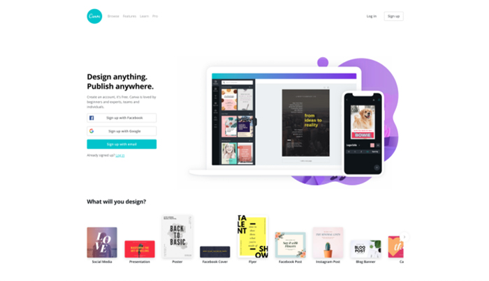
Having a lot of information on the homepage will steal attention away from what’s most important to their business goals: signups and product usage.
They make it super easy to sign up.
- 1-click options with Google and Facebook
- Or your email address
And to encourage product usage, they show a row of design ideas based on user jobs:
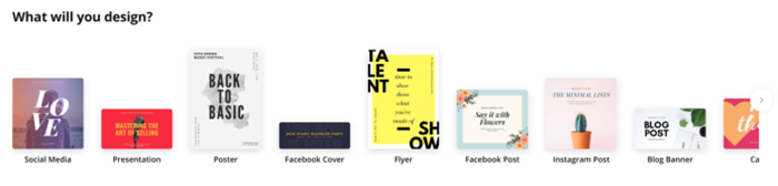
Once you choose what you want to design, you get pushed into an action-to-onboard flow to get users to see create a graphic before they get the chance to sign up with details:
- Step 1: Design
- Step 2: Sign up to publish
- Step 3: Success
Canva’s homepage hasn’t changed much over the years. This was their homepage in 2015:
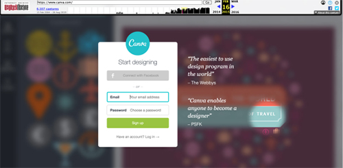
The look has changed, but the overall strategy and messaging haven’t.
These homepages provide very little information around the product — the only information you can find on the company is from vague statements like “The easiest to use design program in the world” “10 million people designing on Canva” and “Design anything. Publish anywhere“.
All are great statements – when there’s enough context – but by themselves they are almost meaningless. Because there’s no more information on the page, it suggests that the user needs to have context around the product BEFORE they get to this page (otherwise no one will sign up).
Which is likely when you consider the paths people take to get to this page:
- Branded traffic and direct traffic — these people know what Canva is, and what you can do with it. They either want to learn more about the product (in which case they’ll navigate to the correct page), sign up, or log in.
- Or through the various conversion paths on the website which explores the specific functionalities and jobs that you can accomplish using the product.
Because of these factors, there’s no immediate need to go in-depth with a sales pitch.
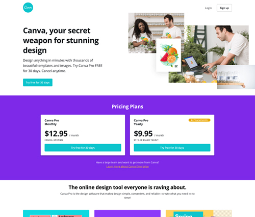
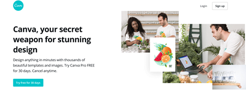
Product Page
The majority of the ads that Canva runs goes to a product page that targets cold traffic:
However, if you have visited their website before, that page will dynamically switch to this page instead:
This warm traffic page is not very different from the cold traffic page. It simply shows the pricing table in the second section, which will be more relevant to people who already know a lot about Canva as they are more likely to be ready to sign up.
Everything else is almost the same, so let’s take a look at the cold traffic version page.
Value proposition (headline)
The value proposition is arguably the most important part of any page. It’s the first thing you see after landing on a page, and it provides the context you need to instantly understand if the product does what you need it to do.
This landing page has a relatively strong value proposition:
It answers the 3 critical questions that someone first asks themselves when they visit a page:
- What is this? Canva
- How does it help me? Design anything in minutes
- What makes it better than the alternatives? 1000’s of templates and images.
It’s short, value-focused, and demonstrates a tangible outcome. But it also uses a few direct response marketing principles to create a compelling hook:
- A primary promise: Design anything in minutes
- A perceived differentiator: 1,000’s of beautiful templates
- An interesting element: Your secret weapon
- Crush objections: Try for FREE. Cancel anytime
There can definitely be improvements to this value proposition (like adding in an emotional component), but the combination of the 4 elements above makes it captivating and interesting enough for you to want to continue reading.
Messaging hierarchy
A web page should present a story as to why the visitor should take the action you want them to take.
The outline of this story is your messaging hierarchy, which consists of 3 elements: what you say (message), when to say it (order), and where you say it on the page (layout). Only after you know your hierarchy should you focus on how you say it (text).
This landing page has a very simple messaging hierarchy.
Section 1: Value proposition:—Design anything in minutes with thousands of beautiful templates and images. Try Canva Pro FREE for 30 days. Cancel anytime.
Section 2: Canva’s advantages, benefits, and how it works — Canva Pro is the design software that makes design simple, convenient, and reliable—create what you need in no time!
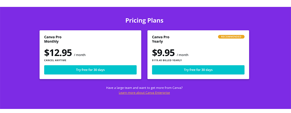
Section 3: Pricing —Choose your plan and try for free for 30 days.
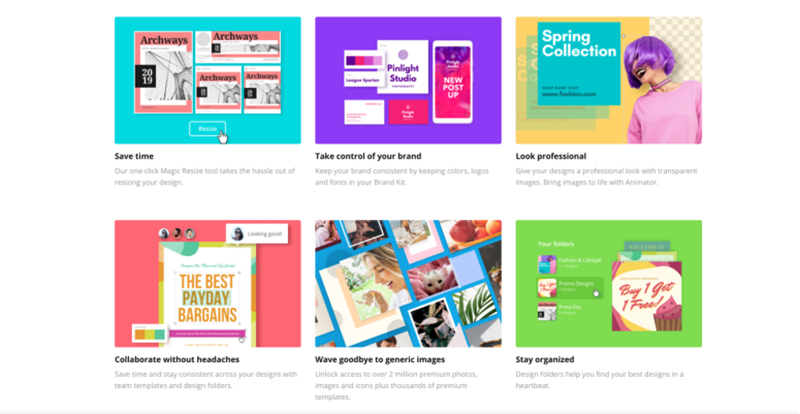
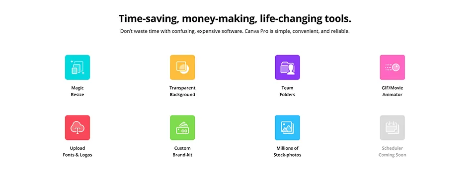
Section 4: Important features you may enjoy — Time-saving, money-making tools. Problem: Don’t waste time with confusing tools. Solution: Canva Pro is simple, convenient, and reliable. (4-column feature grid)
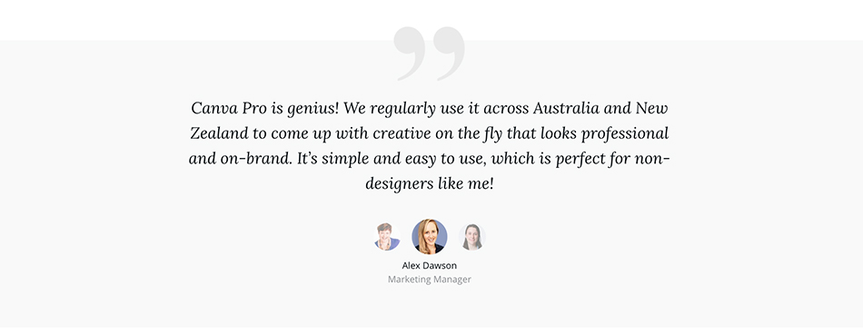
Section 5: Social proof (testimonials)
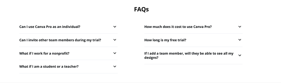
Section 6: FAQs
Section 7: Social proof (who else is using Canva Pro)

This hierarchy isn’t super strong – which is fine because Canva has a freemium acquisition model and a product that is easy to activate in. It doesn’t show them how they can design anything in minutes because it only takes seconds to sign up and try it.
All it does it tell you the benefits of each feature.
However, the biggest weapon in a marketers’ inventory is your customers’ imagination — with a product as simple, versatile and visual as Canva, getting the reader to imagine themselves designing anything they want should be easy.
Here are 4 other ideas they could try:
- A more explicit and visual story arc for the page (Value proposition > social proof > big competitive advantage > how you see success in the product > features & benefits > social proof > CTA > FAQ)
- Explicitly laddering out how you’d see success in the product, with visuals for each step (example: 1. Choose a template. 2. Design anything. 3. Publish your design anywhere)
- Showcasing the relevant features underneath each of the steps outlined above
- Adding a design row on the page to push people into the product:
Those changes would evidently make the page longer, but it’ll create a much clearer showcase for the product’s value.
Design and layout
The Pro landing page uses a similar visual strategy as the rest of the site:
The use of multiple vibrant, yet not-overly powerful colors gives the page a cheerful, energetic and hopeful feel – all emotions that the reader wants to feel during this decision making process.
These colors, combined with the shapes, patterns and image selection, helps implicitly communicate values like creativity, individualism, and fun.
All are values that align with the creative process which Canva facilitates.
But whereas this page excels at colours and emotional design, it doesn’t stick to best practice principles.
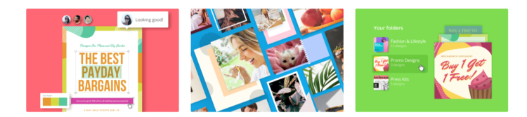
Rather than sections with a single big, beautiful and clear image, accompanied by copy for each feature/benefit – which is a very scannable and common design pattern – they instead opt to use a 3-column, 2-row section:
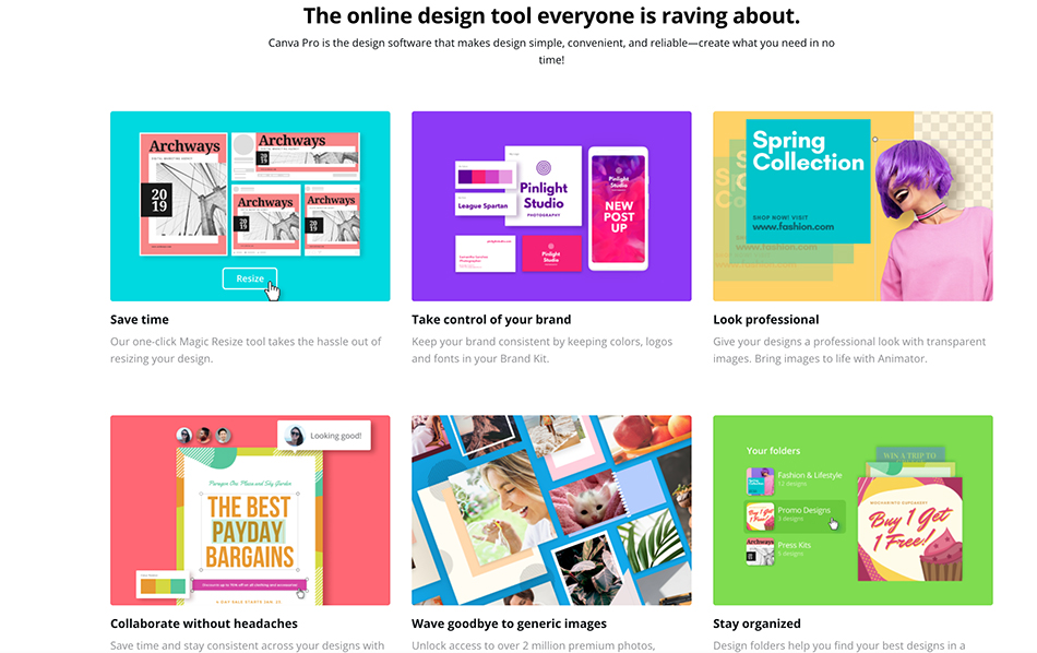
As a general rule, it’s good to be careful about having several columns or elements visible on the page at once.
For example, a 3-column section could be similar to having 3-people trying to speak to you at once — it’s distracting and hard to choose who to focus on.
Combine that distraction with the 6 extremely bold, bright, and visually captivating images in this section, and you could end up with a reader who has no idea what to look at, or read, first.
With no clear message per section, you risk there being too much friction — it’s distracting, not scannable, steals focus away from the words, and somewhat fails at getting you to want to read the copy.
That being said, I believe the images reflect the copy very strongly and, with Canva being a tool that allows you to build things to communicate visually, I think it works for the brand.
They’ve taken a chance on not following best practices and, in my opinion, it’s turned out well!
The real proof is in the numbers though, and only Canva can know how well this page converts (my guess is that it does pretty well).
Key takeaway: Canva don’t necessarily adhere to best practice principles when designing web pages, but what they have built works well (visually). Their product page takes the user on a journey and is pretty compelling as a result.
Paid Search
Canva takes a standard approach to Google Ads. Which is not a bad thing, because it’s likely effective.
Through SEMRush, we identified that Canva uses 3 main keyword targeting strategies:
- Branded keywords
- Goal keywords
- Solution keywords
Goal campaigns
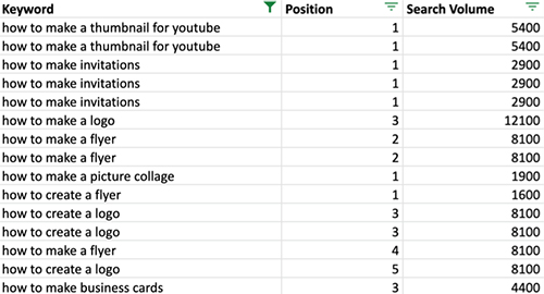
A big part of Canva’s targeting strategy is goal-related keywords — keywords that narrow in on the goals that the user wants to accomplish. According to SEMrush, they’re targeting at least 270 goal-related keywords.
Each of these keywords outlines a job that you can accomplish inside their product.
Like creating business cards:
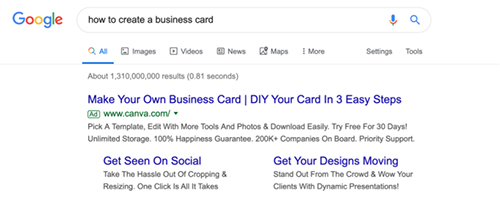
The ad that Canva uses is incredibly simple.
Headline 1 — Make your own business card
A close variation of my search query to ensure that I know this result is relevant to my intentions, which helps it to stand out and will ensure the CTR is high, and the CPC is low.
Headline 2 — DIY your card in 3 easy steps
Outlines how easy I can make my business card: 3 steps. Fantastic. The headline also mentions DIY, which speaks to a quick and cheap solution. Just the kind of thing Canva was made for.
Description — Pick a template, edit with more tools and photos, and download easily. Try free for 30 days!
This expands on the 3 steps they mentioned in headline 2 (template, edit, download). It also reframes Canva as a product you have to pay for — this could weed out only people interested in a free product, and pre-qualify those ready to pay for a good service.
Where they can improve:
Sitelinks
This feels like a lost opportunity for Canva as they link out to pages that aren’t relevant to user intentions. Instead, they should create ad group or campaign sitelinks that are tailored towards creating business cards, by either linking to the landing page they use or to one of their other relevant pages, like a product page or an advertorial.
Message matching
The messaging in the ad is loosely relevant to the messaging on the landing page. It shows that I can design a business card (great), but it’s missing a critical message from the ad: “Create your card in 3 steps”.
By clicking on the ad, you would expect a page that gets youimagining yourself creating a business card in 3 steps, not a page that only talks about a product and its features.
Mismatched ad / landing page messaging can decrease your ads quality scores – driving up cost per click – and also has the potential to increase visitor bounce rates.
Why create a goal campaign?
This strategy is perfect for Canva because it positions the product as a means for the user to accomplish their goals, or a way to solve their problems — which is fundamental to any purchase decision.
Targeting keywords higher up in the funnel is also a great way to lower CPC costs:
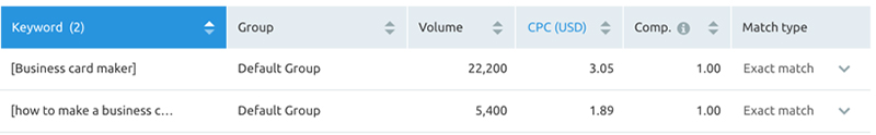
Solution: Business card marker | Goal: how to make business cards
Goal-related campaigns are often too high up in the funnel for a lot of businesses to target via Google Ads. That’s not because they’re ineffective – they can be very effective – but because they require a more comprehensive funnel, resulting in needing more resources to build them.
When someone searches for a term like “How to create a business card”, this dictates that they haven’t found a lot of tools that can do it for them. They’re likely looking for information around how to accomplish that goal, which presents opportunities for tactics designed to guide people through the buyer’s journey, such as a lead-magnet and email sequence, a long-form sales page, or an advertorial that shows you how to create a business card inside of Canva.
Yet, Canva doesn’t take this approach. Having a simple product, with a freemium acquisition model, they can get away with sending people to a short, product-focused landing page and still experience very high conversion rates:
Solution campaigns
Canva targets high-intent users with their solution campaigns. These campaigns target people who know what they want to accomplish, and have a pretty good idea of how they’re going to accomplish it: with software.
These are high-value campaigns that focus on keywords that relate to a specific solution — often by adding nouns such as software, platform, tool, maker.
For instance: Flyer Maker
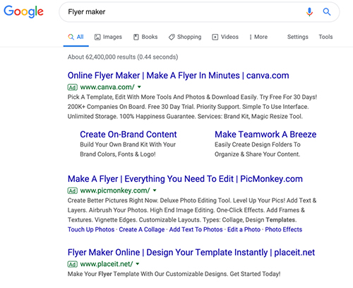
Headline 1 — Online Flyer Maker
Explicitly mentions my core search term to ensure it’s relevant to me. They mention that it’s online, which also tells me about the mechanism of how I’ll make my flyer – through an online platform – to calm any concerns I may have regarding how I’ll make it.
Headline 2 — Make a flyer in minutes
This is great because it highlights that I can accomplish a lengthy and complex job in minutes. The key benefit here is saving time while aligning itself to the company vision.
Description — Pick A Template, Edit With More Tools And Photos & Download Easily. Try Free For 30 Days!
This description walks me through how easy it is to create a flyer (template, edit, download). This messaging appears throughout their website and on their ads for other campaigns.
Once you click on the ad, you get taken to a very simple landing page that showcases their flyer templates.
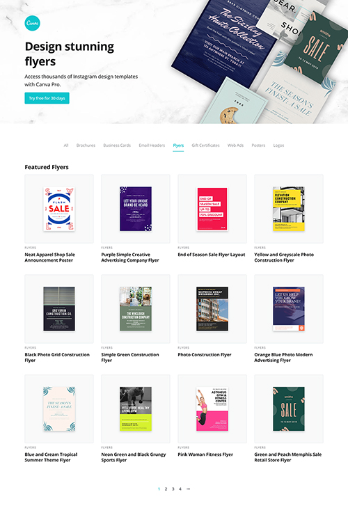
The landing page is good for the purpose it serves — driving visitors into the product by showing off the flyer templates.
Though there is a lot they could have done to improve this campaign: they haven’t matched a lot of the messages from the ad onto the landing page. You don’t see any mention of designing a flyer in minutes, nor any mention of the 3 steps it takes to design a flyer.
The page is good overall, but they could probably improve the conversion rate with a few small tweaks.
Key takeaway: Canva use paid search at two different stages of the funnel very well. The ad copy does a great job of speaking to the search term as well as the unique benefits that their product brings. While the landing pages look great, they could be improved by having the page copy match the ad copy.
Social media ads
Facebook is one of Canva’s biggest channels. In this section, we’ll dissect the creative, copy, and overall messaging behind Canva’s social ads.
Ad teardown
The team at Canva are testing a lot of different angles — not just the images or the copy, but also how they communicate the overarching story they’re trying to convey.
As expected, they have great, eye-catching visuals, and copy for their ads:
But what stands out is that the majority of their ads focus on a single, core message:
You can design anything, easily.
It shows that they really understand the value that they bring to their audience. Let’s dive deeper into that.
Facebook ad 1: On-brand designs
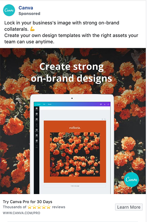
Image:
Ad imagery is possibly the most important part of a social media ad. It’s the part of the ad which is most likely to grab the attention of someone scrolling through their news feed.
When looking through their ads, we noticed that many of their images in their ads follow a similar pattern: they have a high-quality, aesthetically pleasing image.
And they contain a clear, snappy value proposition that narrows in on the singular jobs that a user is trying to accomplish.
In this case:
— Create strong on-brand designs
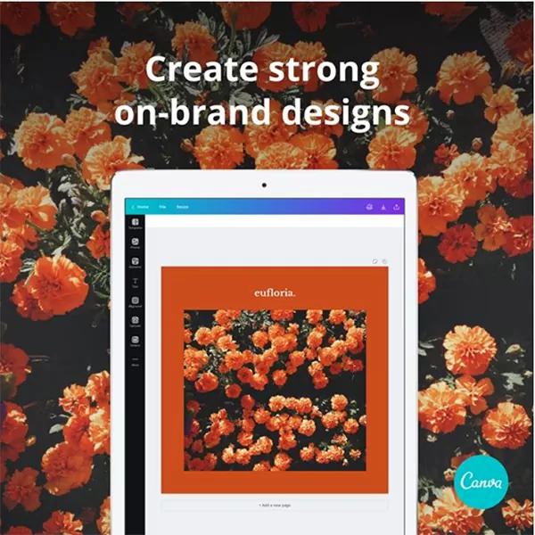
By adding some text to the image, you make the ad more eye-catching, while allowing the reader to instantly understand your core message by explicitly stating it.
This ad also contains a screenshot of the app with a design template to showcase what you can design inside the product, and how easy the UI is to use (and in turn, the product functionality).
However, there’s more to the marketing imagery than having a nice image while explicitly showing your product, and how it helps you. You need to consider the messages you implicitly communicate.
Canva does this well.
With warm and welcoming colors, it creates a perception that Canva is a friendly, authentic, and down-to-earth brand. The flowers in the background gives a tangible feel, and might be there to help implicitly communicate messages like art, individuality, and creativity.
These are all messages that resonate with people who are looking for a product like Canva; they want to feel like they are able to let their creativity shine and make beautiful graphics — despite that traditionally being a tough and daunting process for most people who need marketing graphics.
Copy
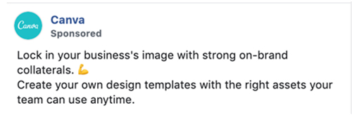
You need great copy in your ads, and Canva does this well. The copy is fun, concise, and most importantly, communicates that you can design what you need to in Canva.
If we break it down further, Canva’s ad copy tends to focus on variations of the following core messages:
- The job you’re trying to do: Create strong on-brand collaterals
- The benefit/advantage it gives you: Lock in your business’s image
- How you do it (Features + Canva Pro): Design templates and assets that your team can use anytime
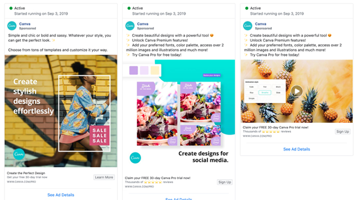
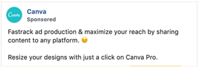
Facebook ad 2: 30 day free trial
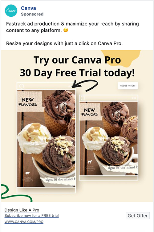
Image:
The use of friendly colors and fun shapes is designed to draw your attention while implicitly communicating codes like individualism, creativity, spontaneity, and ease — all messages designed to appeal to creative types, as well as those who are frustrated by their current design process. This somewhat alleviates that frustration WITHOUT stating it:
And this ad also contains an example design template – or screenshot of the app with a design template – to showcase what you can design with it, and how simplistic it is to use:
Copy:
I’m a big fan of the copy used in this ad. It’s concise, spaced out, easily readable, and outlines 3 different goals that you can accomplish with Canva:
- Speed up ad production
- Share content to any platform
- Resize designs
If you’re a marketer, these outcomes and jobs are no doubt very desirable for you — no one wants to wait a week for some ads to get back to you. This ad is likely to be targeting existing canva users in an effort to upgrade them and so the key selling points are different compared to the ads targeting cold traffic.
Facebook Ad 3: Video ads
Video is a big part of their ad strategy, and it makes sense why; Canva is a tool where it’s biggest advantage comes from ease and speed.
An image will find it hard to convey how fast or how easily you can create a brand guideline, a social media graphic, how someone transformed their entire design process — but a video will find it easy:
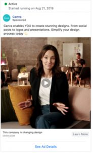
Video: Canva uses a few video formats; walkthroughs, case studies, and product overviews. But what I found the most interesting is that they love tellings real stories with their ads:
This video brings in a real person, just like you and me, and shows how easily they solved one of their problems in order to make someone else’s problems feel like your problems.
At the end of the video, it tells you the solution to your newly realised problem — all while demonstrating how easy and fast their product is to use.
This is a classic and highly effective marketing tactic that’s great for targeting audiences who’ve yet to realise they have a problem that needs to be solved.
Copy:
The ad is well written and narrows in on 2 psychological triggers: ease and empowerment, in order to punch up the copy and connect with the readers on a deeper level.
By tapping into ease with the message: Simplify your design process, they let the reader know they’ll save time and headaches.
And by stating that Canva enables YOU to create stunning designs, it shows that Canva empowers you by elevating your ability to design graphics.
Regarding the copy structure, it becomes clear that they also use a similar structure to the ad we tore down above. Here’s how it goes:
- The job you’re trying to do: Create stunning designs
- The benefit/advantage it gives you: Simplify your design process
- How you do it: Canva enables YOU, from social posts to logos and presentations
Key takeaway: As you’d expect, Canva’s social media posts are visually brilliant, but that would only play a small part in their success. Their ad structure works well to convey their value proposition, and their experimenting of multiple messages and ad types ensures they are always optimising for the best results.
Organic Search and SEO
SEO is a huge channel for Canva!
From smart onsite strategies, building entirely new databases and a lot of link building, it’s clear that they invest heavily in it.
It’s a big operation for them — and it’s paying off. SEMrush estimates that Canva now gets over 5 million people visiting their website a month in the United States alone:
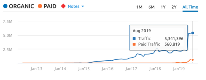
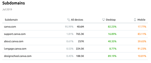
And 40-60 million page views if you count their subdomains and logged in users:
Every SEO strategy is based on 2 high-level functions: Offsite SEO, and technical SEO. (Content also plays a huge part but I’ve given that it’s own section).
Offsite SEO
Canva gets more than 50% of their traffic from branded terms.
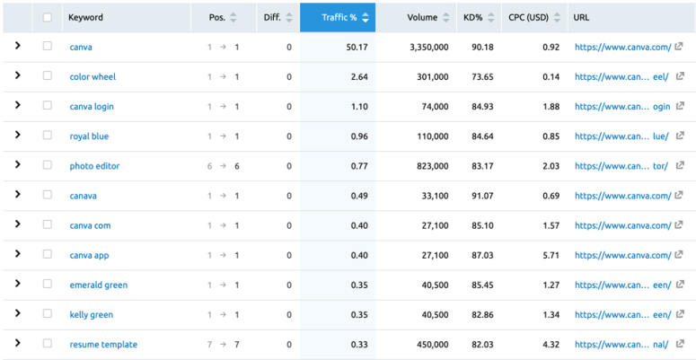
(USA traffic only. Branded accounts for over 50% of their traffic)
Which may indicate that a lot of people who land on their website have heard about Canva from external sources like their friends or from other blogs.
That becomes apparent when diving into Canva.com’s backlinks — they’ve spent a lot of resources acquiring external links to their website, almost all of them to their home page or their blog.
They launched their blog in November 2014, and simultaneously got their first guest post articles up on the 15th November 2014:
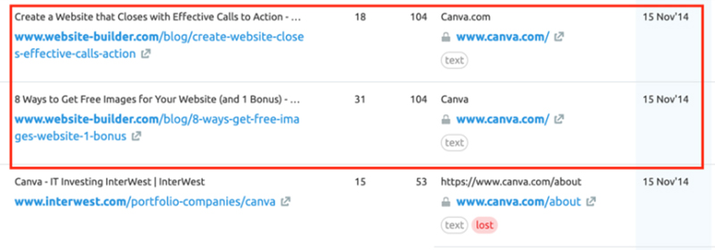
What stands out from most businesses – and what likely acted as a big catalyst for growth – is that they blanketed the internet with guest posts from day 1.
According to SEMrush, they published around 11 guest posts that day, with loads more in the following days afterward. This sudden influx of authority websites speaking about Canva would have exploded their brand awareness, website traffic, and domain authority.
In the month after launching their blog, they had grown their backlink profile by 2,200 links:
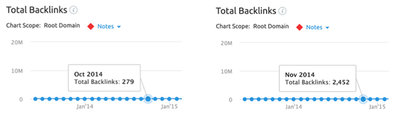
Since then, Canva has acquired over 10 MILLION backlinks (SEMrush).
Technical SEO
Most technical SEO analysis look at elements like URL structure, meta tags, heading tags and other elements for search visibility — this is all standard information. But what really makes Canva’s technical SEO strategy shine are the organic funnels they’ve created through keyword targeting and a Google-approved website structure.
Regarding keyword targeting, Canva takes a similar approach to their Paid Search Strategy :
- Branded terms: Ranking for phrases that contain Canva
- Solution Terms: Ranking for phrases that describe their product, or functions of their product like Photo Editor or Free Stock Photos
- Goal-related terms: Ranking for terms that describe things you can do in their product like How to make a logo
An integral part of Canva’s overarching growth strategy is helping the average person see success in all design-related functions.
By diving into their website structure and search rankings, it’s clear that they don’t stray from this vision. They split up their main website into 4 core categories that centre around helping people be more successful designers — these target goal-related keywords:
- Design types: here’s how you can create [design type] in Canva
- Templates: easily make [design type] by importing these templates into Canva
- Photos: purchase these stock photos or import them into your Canva designs
- Icons: purchase these icons or import them into your Canva designs
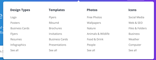
We only want to show you the big user acquisition drivers, so we won’t talk about the Photos or Icon sections — those are more in tune with revenue expansion and product development, not user growth.
Design types
Getting around 250,000 visits a month (according to SEMrush), the ‘create’ section is a major acquisition engine for Canva. The majority of these pages rank highly — Canva’s design types (URL structure: canva.com/create/…) rank in the top 10 for their 30 highest-traffic keywords:

Click here for their full sheet of keywords.
And the vast majority of their pages are ranking in the top 3 spots. I’d make a safe bet that they’re acquiring a lot of users from this strategy.
What makes these pages rank?
Ranking high on Google is a result of exceptionally relevant, clear, and valuable experiences for the user. There are many factors that contribute to your rankings, but they all distill down to one thing: do users react well to the page?
These pages contain well-thought-out content and a structure that is designed to walk the user through accomplishing their goal.
We can illustrate this with the Business Card Maker page:
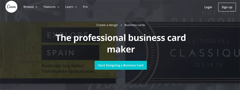
This page ranks in the top 10 for the keywords: create business cards, business card design, make your own business cards — all very high traffic.
And the page follows SEO best practices.
The H1 headline communicates the benefit of using Canva to create posters, while containing the main keyword; business card maker.
From there, the content walks you through a well thought out structure that answers basic questions, reads easily, inserts relevant keywords contextually, and is broken up into basic thematic subsections.
The article has 961 backlinks with 261 referring domains, according to SEMrush. This makes it an authoritative page in the eyes of Google.
How do these pages convert users?
A lot of traffic is nice, but if it doesn’t convert, then it’s not contributing to your bottom line.
So how does Canva convert this traffic? To answer that, let’s put ourselves in the shoes of prospect looking for a way to make posters.
I’ll begin my search with a query:
How to make a business card
And I’d end up with this search engine result page (SERP):
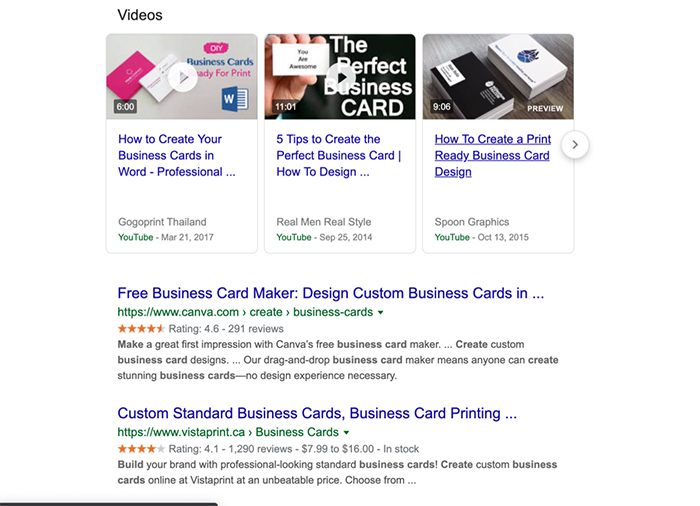
Canva comes up as the 1st search result after Youtube videos and featured snippets — so naturally I’m going to read the description to see if it’s for me:
Free business card maker? Yes that’s what I’m looking for.
Design custom business cards in minutes? Awesome — now I know how long it’ll take me.
And it’s rated 4.6 stars by 291 people? It must be pretty good.
There’s no singular optimal formula for writing meta tags, but this search result is enticing and matches my needs, so it stands to reason that I’m going to click on it.
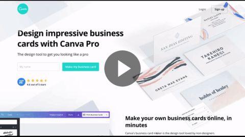
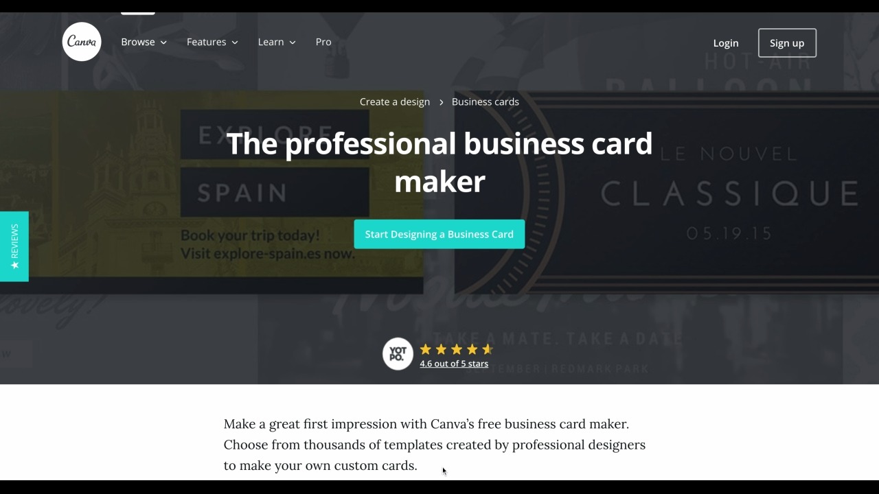
I land on a sales page that walks me through how easy it is to create a business card on Canva:
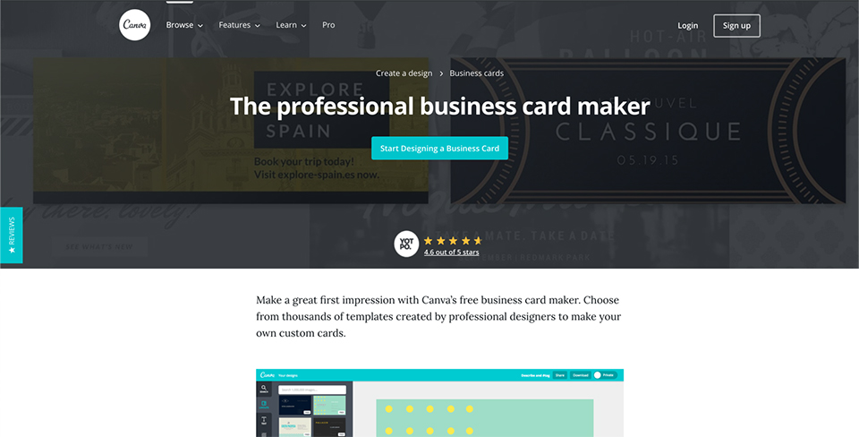
Then if I click on the Call To Action: Start designing a business card, I’ll be taken to the signup page.
And after a short registration process, Canva redirects me to the screen where I can create a business card:
In 2 minutes (at most), Canva has helped me sign up and achieve success (self-activate) using the product.
Templates
Canva’s design templates are also a great acquisition engine for them, at an estimated 280,000 page visits a month in the United States.
They use a strategy similar to their design templates, the only difference is the mechanism of action — rather than written content, these visitors just they want to see a range of templates to choose from, so the growth team would have built a dynamic showcase page which automatically imports templates from the product database:
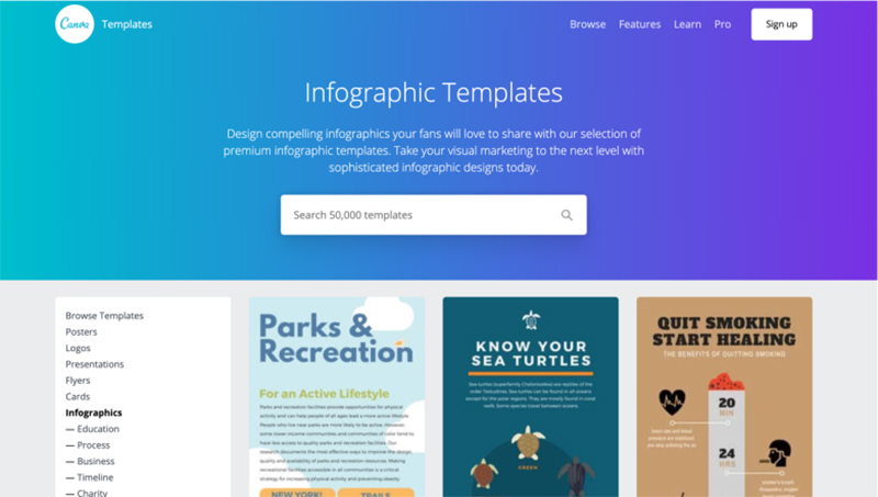
These pages follow SEO best practices – Keyword in the H1, keyword in the introduction, and provides a clear user experience that makes it easy for someone to find a template that matches their needs.
Key takeaway: Canva have implemented a very successful SEO strategy both technically and through links. They pushed for links from the first day that the blog went live, and have created pages that not only rank well for terms high up the funnel, but actually push visitors through the funnel and turns them into users
Content marketing
There’s no doubt in my mind that content drives a lot of user growth and retention for Canva. It’s the 3rd pillar of their SEO strategy, but deserves its own section.
Their content strategy is well planned out and executed — even after 100’s of blog posts, tutorials, and videos, Canva has rarely strayed from the path of helping people succeed with design.
What’s important to point out, is they don’t have much, if any, consideration-stage or gated-content on their website. This is common amongst product-led companies, as it’s often more effective to generate leads by pushing them straight to a free plan or a trial.
When looking at their content efforts, we can chalk their success down to 3 areas:
- Blog structure
- Article structure
- Design school
Blog structure
Canva’s blog structure is incredibly clear, and immediately states their purpose: achieve your design goals.

They dedicate specific pillar categories on their blog page to showcase 4 high-level use cases of their main product: Canva Pro.
The majority of Canva’s articles are awareness stage content, like Free Minimalist Fonts, but many of them take it a step further and showcase how easily you can use the product to create designs inside the product, such as the article Stepping up Instagram Stories with Canva; a decision stage content piece.
They choose content topics that are relevant to each pillar and the user’s interests – a very fundamental strategy – like How to launch a popular newsletter. But when investigating further, you’ll find almost all articles centre around the design elements of the topic. For instance, the article Your ultimate guide to twitter marketing doesn’t contain much information regarding marketing on twitter, it’s mostly about creating good twitter designs.
Regardless of the topic, or if the article is awareness stage or conversion stage, one thing is certain – the content is always more relevant to using the product, rather than the general topic being discussed.
Article structure
From their content topics, it’s clear that the content team is focused on results. That means paid signups. And to a lesser extent; trial signups and free signups.
This results-first attitude becomes even more prevalent when we read their articles — every page has 2 consistent elements:
- A sidebar Call To Action
- And a call to action in the footer
Both of these are common elements on a blog that’s optimised for conversions. But what makes Canva stand out is their relentless use of advertorials.
An advertorial is a sales-oriented informational piece. It’s often an article which heavily promotes a product with the intention of turning readers into customers.
Most of their articles are advertorials.
They don’t mess around — their team has purposely structured, and written, their articles in a way that’s not only very informative (high quality), but in a way that gives them specific reasons to add inline call-to-actions within the posts:
All their content topics help you do something, like market on Facebook better, choose better fonts and colour schemes, etc — essentially, they all help readers accomplish specific design goals.
But then they take it a step further, and say:
“Hey, our product also helps you accomplish [goal], check out this template and see for yourself”.
A lot of businesses would find this too “salesy” but as Canva has a free product it’s not as much of an issue. It’s a great way to push their readers to take that next step, while still being contextually relevant to their interests.
Key takeaway: Canva has created content that is not only search friendly, but provides a ton of valuable information to potential and existing users. They also don’t shy away from using their blog/content to drive new users at every possible opportunity.
Summary
An exceptional product, an over-served market, and a vision that everyone can design anything they want.
But they haven’t rested on their laurels and let it grow organically. They have made a conscious effort to not only drive growth but to do so at a speed that most businesses could only dream of.
They’ve understood their users’ needs and then used each digital channel to attract and convert those users.
These all come together to form the foundation of a world-class marketing and growth strategy.
Canva has grown a lot over the last 7 years, and they aren’t showing signs of slowing down.
DISCLAIMER: I have no association with Canva or their founders (yet). This review has been completed using publicly available information on the Internet. If you would like to get in touch with me, click here.


Beautiful article Tam. Well done
Thanks, I’m glad you found it valuable
My dear god, Tam that is one of the best case studies I’ve read since 2012. Lots of takeaways. Thank you.
That’s very kind of you to say, thank you
Great read mate
Cheers, Luke
Amazing insights, thanks mate
excellent article. very thoughtful insights served up.
john
A very big fan of Canva and I really liked how you analyzed their success.
Tam, I had a blast reading this. Really well-done analysis!
I generally use Canva to design pictures for my blog. But I never knew they applied such strategies to outstand the competitors. This article helped a lot and I will try to accomplish some of them to improve me internet hold. Thanks!
It is really an amazing company with a great marketing strategy. The other competitors like MockoFun, BeFunky, PicMonkey and so on, have basically no chance.
Wow, a really great article on growth strategy. We are already using some of them on our product, but definitely a lot o learn and fine tune to improve. Thank you Tam!
This confirms in my mind that, once you nail your service or product offering (whether it be making bacon, growing organic vegetables, producing honey or helping people with designing stuff) your business MUST become a “marketing business” if you want exponential growth. Otherwise, you risk remaining the best kept secret on the planet!
Canva has changed the promotion industry. In previous time if you know about graphic designing only you will be able to make an eye catching design, but now if you have creativity then you have the better option like Canva. Subscribed your blog for updates, I like this article.
Canva is something which gives flexibility in my graphics works. It really helpful to everyone. Thanks for this informative post.