


Quick Wins & Long-Term Success: How to Kickstart Your Landing Page Optimizations
The landing page: underutilized, underappreciated, and oft-forgotten. Do you really need one for each campaign you have running?
Conventional wisdom tells us it’s easier and cheaper to just send all traffic to a generic page like a home page. That way, visitors can simply navigate to whatever product or category they’re interested in. Multiple traffic streams, one easy arrival point.
Easy? Yes. Effective? No. Do that, and you’re waving goodbye to hundreds or thousands of conversions.
“The NSAMCWADLP principle: never start a marketing campaign without a dedicated landing page.” ~Oli Gardner, Co-founder of Unbounce
Whether it’s paid traffic, content giveaway, lead capture, or a special promotion, a tailor-made landing page helps generate better results because it’s designed to deliver exactly what visitors are looking for and need in order to convert (purchase, download, sign up, register, etc.).
Visitors don’t want to waste time looking for whatever it is they clicked to bring them there. They don’t want to wonder whether they’re in the right place.
A basic but effective landing page needs to show some
social proof, a bit on the product or service itself, a friction-free sign-up form, and a straightforward headline.
One page, one goal, one call-to-action. That’s a landing page. It should be specifically chosen or created to reflect the point of origin and what you’re trying to accomplish. It is not any page that someone “lands” on when arriving at your website.
“Instead, a landing page is a webpage that is designed to take web traffic, and convert visitors in a particular way, for a particular reason.” ~Leadpages
To that end, landing pages come in all sorts of sizes (short vs. long-form), colors, and formats. There isn’t just one correct way to create them, although there are battled-tested best practices that you’ll probably want to follow.
It sounds simple, right? It should be, but a recent survey of over 10,000+ internet users found that 85.9% of people don’t understand what a landing page is or does.
To determine whether your page – home page, product page, or otherwise – is actually a landing page, Instapage suggests asking just 2 basic questions:
- Does the page have one single objective?
- Does the page have one conversion gateway (the CTA button)?
If you can answer ‘yes’ to both questions, then congrats! You have a landing page. But identification or creation is just the first step. It’s not a matter of ‘if you build it, they will come’. You need to optimize.
A Few Stats: How Good is Good Enough?
How do you know it’s time to optimize your landing pages? The short answer: there’s always room for improvement. The long answer: you crunch some numbers, compare, and aim for the top results comparable sites are seeing.
Examining your industry benchmarks and average conversion rates (CVR) is a worthwhile exercise in this regard:
- An Unbounce study of 74.5 million visits to over 64,000 lead capturelanding pages in late 2016 found pages with a Flesch-Kincaid readability score of 6th grade had a median average CVR nearly double those with a university or graduate score. Simpler copy typically converts better. Check your text with a free readability test tool.
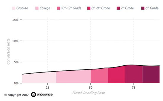
Image Source: Unbounce
- Pages with 800+ words had a 33% lower CVR than those with fewer than 200 words. Keep it short and concise.
- Median average CVR ranged from a low of 2.6% (higher education) to a high of 6% (vocational studies and job training). Consider the whole range.
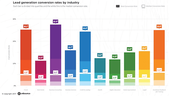
Image Source: Unbounce
- A “good” CVR depends on your industry and what you’re counting as a conversion. According to Leadpages, webinar registration pages see a CVR around 30%, 20-25% for opt-in pages, and 10-15% for sales pages. A large e-commerce platform visitor-to-customer CVR? 1-3% is considered excellent.
- Across all industries, Wordstream found anaverage CVR of 2.35%. The top 25% of pages were converting at 5.31% or higher, while the top 10% saw a CVR of 11.45% and up. According to them, anywhere between 2-5% is pretty standard and par for the course.
“Even if you compare conversion rates of sites in the same industry, it’s still not apples to apples. Different sites have different traffic sources (and the quality of traffic makes all the difference), traffic volumes, different brand perception and different relationship with their audiences.” ~Peep Laja, founder of ConversionXL
Industry benchmarks and averages are all well and good to give you some basic context, but don’t rely on them too heavily. Looking at how well a competitor is doing can give you a ballpark idea, but it’s not an even comparison: different channels, different audience, different strategies. It may be apples and apples, but it’s the equivalent of comparing Granny Smith and Red Delicious. Same, but different.
Most experts agree that a “good” conversion rate is one that’s higher than the month before. Use that as your guideline.
Emerging Trends
Before we look at the parts of the whole, I wanted to mention a few emerging trends in the landing page game.
The general makeup of a landing page hasn’t changed much over the years – if it ain’t broke, don’t fix it – but we are starting to see a few new ideas pop up. Not major overhauls, but complementary additions and twists to the standard recipe.
Interactive opt-ins, expressive background images or videos, entrance pop-ups (like Sumo’s Welcome Mat), scroll box CTAs that only appear after a user hits a certain page depth, simple, numbered steps to explain a complex process, experience-based CTAs (like Buffer’s ‘Schedule Your First Post Now’), and more.
Leadpages has a great list of 12 emerging and developing trends that you may want to use on your next landing page. Pick one to try, and test it against a version without it. Go with the page that converts best.
The Anatomy of a Landing Page
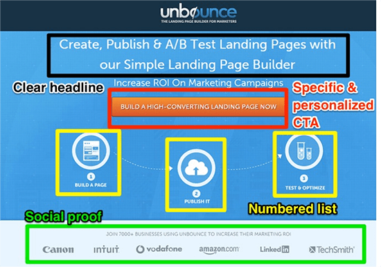
Image Source: Unbounce
So, what makes a landing page a landing page? We’ve already mentioned that a true landing page has only ONE goal and ONE conversion gateway. That’s the main criterion.
And while there is no definitive template on what should and should not be included beyond that, there are a few elements that almost everyone can agree on:
- Headline. You want something clear – not clever – and attention-grabbing. It should be at or near the top, larger than the rest of the text, and match the message of the post, tweet, ad, or email that brought the traffic in. A statement or thought-provoking question works well.
- Sub-headline. This should appear directly below the headline, and can be longer. It should provide evidence or support for the main idea presented in the headline.
“On the average, five times as many people read the headline as read the body copy. When you have written your headline, you have spent eighty cents out of your dollar.” ~David Ogilvy
- Trust indicators. Modern consumers are savvy and sceptical shoppers. You have to earn their trust…and quickly. Awards, testimonials, industry ratings, customer reviews,social proof, privacy policy, trust seals, media logos, client lists, and so on show them that they can trust you and your business. Just don’t overdo it.
- Unique value proposition. What makes you better than your competitors? How will your product or service benefit your customers?
- Call-to-action. What do you want visitors to do? Your CTA needs to be compelling. It needs to stand out. And it should be a button rather than just a link, with or without a form.
- Visuals. Use high quality and relevant images or videos to support your conversion goal.
There are lots of “best practices” out there, both common and uncommon. Must you follow them all? Not really. Cherry-pick the ones that best apply to you, your business, and your goal.
Once you have the landing page created, don’t forget to A/B test each element and tweak over time. A different word, a different color, a new headline, or a bulleted list instead of a few sentences can often provide a huge boost in conversions. You’d be surprised. Test, test, test.
Even if you have low traffic, you can still compare variations to find the version that most appeals to the traffic you are getting.
Test, test, test. Yes, I said that twice. It’s that important.
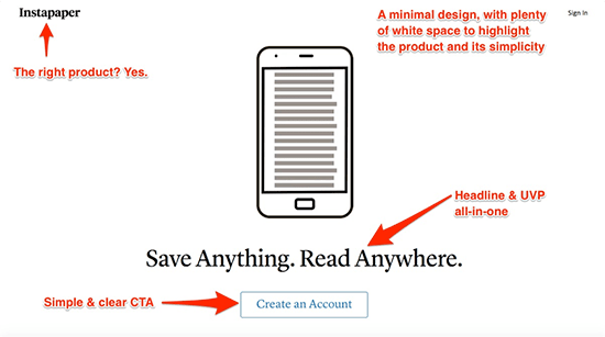
Image Source: Instapaper
Quick Intro to Design Elements
Designing a successful landing page is as much art as science. You might opt for a tool like Unbounce, Instapage, or Leadpages and do it yourself, or you could outsource to a professional web designer.
Either way, you should at least understand some of the more important design elements like color, layout, white space, and framing. Whether it’s a splash page,
capture page, sales page, or click-through page, you want it to look fantastic, and you want it to convert.
Color choice is important. You want complementary colors, and you should look into color psychology so you’re selecting those colors that convey what you want to convey. Your CTA button should be in a contrasting color so it literally pops off the page.
The overall layout of your page could follow the popular F or Z-pattern (the pattern in which typical readers scan a page). Try to get the most important stuff above the fold, but don’t cram too much in there…readers will scroll down if you’ve convinced them to do so. Bulleted lists and/or numbers usually resonate with readers, so use them if appropriate.
White – or empty – space is crucial. When it comes to landing pages, remember that less is more. Don’t fill every inch. The smart use of white space makes the page easier to understand and helps draw attention to things like your CTA button.
Framing is another way to highlight important sections of your page. You literally “frame” it in a box, circle, or different color. It pulls focus to where you most want it.
White space, framing, and color contrasting all fall under the umbrella of
directional cues. Arrows, pointers, and other linear cues also indicate where someone should be looking. A more subtle approach is having a photo of a person looking in a particular direction – say, directly at your CTA button – because we naturally look in the direction of their gaze.
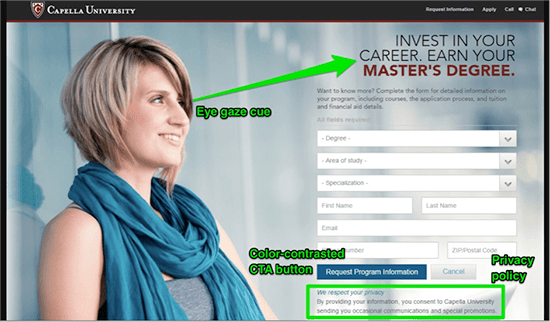
Image Source: Capella University
A landing page has just one goal and one conversion gateway, so limit or remove the navigation menu along the top. You want to reduce the exit options available to visitors aside from clicking the CTA button. Corral that traffic towards conversion. Get the download, subscription, purchase, or registration.
Design with both the user experience and conversions in mind. Take the time to
craft scorching hot landing pages, test as necessary, and keep them clear, concise, and clean. Make them mobile-friendly (the bulk of online traffic is mobile traffic these days). Teach them about the value of whatever it is you’re offering them.
Sound like a lot? It is. There’s obviously a great deal you could do…but very few of us have the luxury of time and money to do it all at once. Nothing happens overnight. So pick your battles. Outsource where possible.
And whether you’re optimizing for yourself or for a client, aim for a couple of quick wins. Optimizing is not easy. It can be long, complicated, and labor-intensive. A few quick and easy wins at the beginning get you going on that long journey.
That’s the process we use at Webprofits: we focus on generating a couple quick – but no less valuable – wins while working on projects that’ll take longer to deliver results.
Want to give it a try? In my experience, these are 6 of the lowest hanging fruit to get your own quick wins on your existing landing pages.
The Lowest Hanging Fruit
Despite its simple appearance, there’s a lot happening on a typical landing page. There are a lot of “moving parts” that need to work seamlessly together to make it both powerful and effective.
These 6 areas represent the quickest and easiest fixes that literally anyone can tackle. Ready to have a better landing page before the end of the hour? Read on.
#1 – The Copy
It shouldn’t be a novella or short story, but your landing page will have text and words. And that copy can cause problems without you even knowing it.
Make your copy too long (the more frequent of the two) or too short, and it’s silently hurting your conversion rate. It’s a major strike against it, and a very common mistake.
Luckily, though, it’s also a quick fix.
Your headline, sub-headline, main body, and call-to-action need to be clear, yes, but also concise. Your visitors don’t want to – and won’t – invest 15 minutes reading about your product or service.
And with attention spans getting shorter and shorter – some studies place it at an
average of 8.25 seconds – you need to grab hold of your audience immediately. You’ve got less than ten seconds to convince them they need to invest more time into what you’re saying and offering.
The faster they “get” it, the better. The fewer words on the page, the more likely they’ll read them. It’s that simple. You’ve probably bounced from a page yourself after seeing too much text upon arrival.
- Just over 17% of online page views last 4 seconds or less
- Only 28% of words are read on a typical web page of 593 words
- Limit your text to 111 words or less, and that figure nearly doubles to 49%
Highrise increased conversions by 35% by shortening their copy and page. Nothing else was changed.
While long-form pages do have their place, when in doubt, shorter is better. Less copy generally means a higher CVR.
“The Rules of Web Awareness: If the visitor can’t find something easily, it does not exist. If you emphasize too many items, all of them lose importance. Any delay increases frustration.” ~Tim Ash, Author of Landing Page Optimization: The Definitive Guide to Testing and Tuning for Conversions
#2 – Message Disconnect
A landing page is special in that someone chose to click a link – social media post, email, bio, ad, or whatever – because something about it appealed to them. It solved a problem, piqued their curiosity, fulfilled a need or desire, or spoke to them.
They want to be taken somewhere to get more information, but more importantly, they don’t want to have to work to find that information.
Everything on the landing page, from the headline and sub-headline to the copy and CTA, should match the message and sentiment of whatever brought them there. They should recognize immediately that, yes!, they’re in the right place. This is the page with that product or service or answer they wanted to find when they clicked.
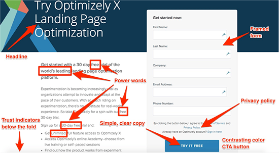
Image Source: Optimizely
If they clicked on an ad promoting invisible, hairless cats as the perfect companion, then everything on that landing page should back up and support that claim.
Don’t make them look for it. Don’t make them navigate through a few levels to find that information. Don’t whisk them to your homepage that also talks about singing toads, flying pigs, and poker-playing dogs.
They clicked for invisible, hairless cats and only invisible, hairless cats.
If you have plenty of traffic arriving to your page, but a low conversion rate and a high bounce rate, you’ve more than likely got a message disconnect. Fix it.
Ensure that everything on that page – and especially your headline and copy above the fold – exactly matches the message, sentiment, and offer of the source bringing in the traffic.
#3 – Lack of Context
There’s a lot of stuff people can chose to buy, with new products and services emerging all the time. Yours might be the perfect and best solution to a need, desire, or want they don’t even know they have yet.
So why should they care about your offer at this particular time?
You’ve got to put your product/service/claim into proper context for your visitors. Why do they need it now?
Testimonials from past and present customers are very helpful for this one. Potential customers want to hear from existing customers. They want to read or see first-hand experience from “regular” folks just like them. Visitors want to hear how easy, fast, and reliable it’s been for your customers.
That’s the kind of context that delivers big results.
To give it to them, start with a big, bold statement. That’s your headline. Next, explain how people can leverage that big, bold statement in your sub-headline. And finally, provide social proof of people doing just that in your testimonials.
Context. Delivered.
In my personal experience both creating and optimizing for the web, I know that landing pages with ONLY those three elements can not only convert, but convert very well
. They check all the boxes.
#4 – Trim the Fat
As mentioned when discussing your copy, the biggest issue I see with landing pages is too much unnecessary “stuff”: text, images, videos, graphs, and on and on and on.
If there is a Golden Rule when it comes to landing pages, it’s that less is more. I’ve said it before, and I’ll definitely say it again.
So, minimize or remove sections as necessary. Make sure that everything you decide to include on that page is absolutely crucial to getting that conversion. If it’s not, cut it. Be merciless.
And if you’re using a long-form landing page –
they do have their place – ask yourself: does everything showcase the narrative of what you actually do, or is it just noise? Are you telling a story that will compel people to click, download, submit, register, or purchase, or are you just filling space?
Trim the fat. And test, test, test.
“Store windows are like landing pages on the website.” ~Angela Ahrendts, Senior Vice President, Apple Retail
#5 – Navigation
Navigation is important but often overlooked.
The rule of thumb for landing pages is to remove the top navigation menu completely. You want to provide one and only one exit option: conversion.
But it’s essential that you consider your customer – who are they? – and what you want them to do.
A simple, one-time purchase, for example, requires less than an Enterprise software solution with a 12-month purchase cycle.
The bigger the commitment and the higher the cost, the more information they may need in order to click that button. They’ll probably want to see case studies, white papers, ebooks, video testimonials, and more.
In that case, you may opt to include a nav menu to help them get those details and that information. Keep it to a minimum, though, and ensure that everything supports your conversion goal.
A link to a video testimonial? Sure. A link to your blog? Probably unnecessary. A link to your homepage? No. Completely counterproductive.
The nav menu might take them elsewhere to potentially capture a lead, or a jump link to something supportive further down the page. If you do include it, make it clean, make it simple, and avoid drop-down menus.
Only about 16% of landing pages are nav menu-free, but study after study shows that removing it increases the conversion rate in most cases. AmeriFirst Home Mortgage
increased conversions by 30-40% by removing the nav bar and streamlining the text.
Hubspot saw a conversion lift between 2- 28% after removing the nav menu for several of its landing pages. They also noticed that pages in the middle of the sales funnel had the higher conversion lift (between 16% and 28%), while those at the top had very little or none (0- 4%). Food for thought.
It’s not an ironclad rule. There are pros and cons for including and excluding navigation. Consider the page’s location in your funnel. Think about who your customers are, and what you’re asking of them. Test, test, test.
#6 – Call-to-action Button
A landing page is about getting them to click that CTA button (remember, buttons typically convert better than links alone). The entire page is working to get that click.
So spend some time optimizing the button itself. It’s the key component. A few suggestions to spruce it up:
- Simplify. Remove distractions around the button (frame it in white space).
- Highlight. Promote the button with directional cues and a contrasting color.
- Check. Look at your button on various browsers and screen sizes to make sure it looks great in every circumstance.
- Ask. Are auto-play videos, popups, and intercom chats helping or hurting your conversions? Do they enhance or detract from that button and click? Consider moving them to the “thank you” or other page.
- Personalize. Don’t use the cliché Sign Up, Download, Purchase, or the dreaded Click Here. Make it about the actionandthe customer.
- Be precise and specific. Use Purchase for X Dollars, Schedule Your First Post, or Start Your Free Trial.
- Include. Use the action, problem, or solution in the CTA button copy itself.
- Choose power words. Copy that includes words like now, today, quickly, easily, simply, effortlessly, free, affordable, at no cost, cheap, or guaranteed appeals to readers.
The button copy alone can make a huge difference. iMPACT increased conversions by 78.5% by changing the button copy from Free Download (blah, blah, blah) to Show me how to attract more customers! (specific, precise, and personalized) with zero additional changes.
How’s that for a quick but valuable win?!
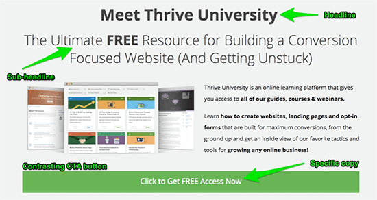
Image Source: Thrive Themes
Need some inspiration? Check out these 16 great examples. Not enough? Here’s another 30 to get your creative and optimizing juices flowing. Still not enough? Then consider these 100 fantastic examples. There’s no better way to increase your understanding than looking at powerful examples and applying what you learn from them to your own pages.
Landing pages are relatively easy to grasp, but tricky to master. It’s a long game that takes time and consistency. You can create them with services like Unbounce (or any of the comparable services and tools) and test them with tools like Optimizely (or an equivalent).
Or you can hand it all off to an expert. Webprofits has expertise in both designing and optimizing landing pages. We can help. Quick wins, and long-term success.
Optimization is not a quick fix, but it is a crucial part of online success. Optimize your homepage. Optimize your landing pages. Optimize your blog, product pages, and more.
Optimize, optimize, optimize. And test, test, test (did I mention that already?!)
What does your optimization process look like? What tools, services, and tips can you share? Leave your comments below:
Image: Pixabay


Very well researched and written. Kudos to you.