


A review of Dollar Shave Club’s $140m online marketing strategy
The Dollar Shave Club has been the focus of many case studies since it launched in 2012 with a revolutionary viral video that generated 12,000 new customers in the first 48 hours, growing to 330,000 customers by 2013, and on track to generate $140 million this year.
Here’s the video…
Let’s see what a $140 million a year website looks like…
Note: this review is on the Dollar Shave Club’s Australian website.
A pure sales funnel
The entire Dollar Shave Club is one big sales funnel, with every page of the website driving people to the 3-step order process.
The website is simple – only 6 pages in total (excluding pages like Blog, Privacy, Terms etc) – with a singular focus… get the visitor into the 3-step order process wherever they are on the site.
Dollar Shave Club’s website is a shining example of how to convert visitors into buyers. Let’s take a look at the website in detail to see why…
Home page

What’s interesting about the Dollar Shave Club’s home page is that every section of the home page links to the same page – Step 1 in the Order Process.
This is a great way to promote different sales points without distracting the customer from buying.
The only frustrating part of this site is that the ‘Free Blades For Life’ banner in the header area links to Step 1 of the Order Process, even though the information on how to get free blades for life is in the banner at the bottom of the home page. I recommend fixing this to reduce the friction that is caused when visitors don’t receive the information they’re looking for after clicking this element.
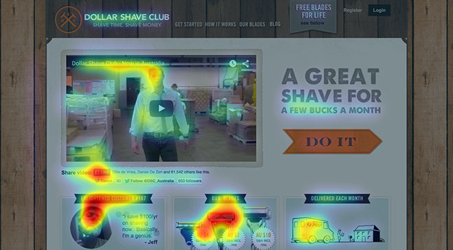
Let’s take a look at a predictive eye-tracking analysis of the home page…
As you can see from the heatmap, attention is focused on the video and the 2 sections below the video, with the main call-to-action ‘Do It’ barely visible on first glance.
But that doesn’t really matter, because every section on the page (except the video) directs the visitor to Step 1 of the Order Process.
Let’s take a look at a perception map to see which sections are instantly visible when a visitor lands on the site…
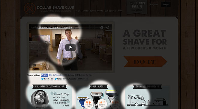
One of the first things a visitor sees when they land on the site is a testimonial of how much a customer has saved with Dollar Shave Club. What’s great about this is that it’s a customer who is saying how much they saved, not Dollar Shave Club.
After seeing the testimonial, the visitor’s eyes are drawn to the ‘Our Blades’ section that quickly shows the visitor how much the blades cost, which is excellent.
When a visitor has seen the video and the 2 main sales points, they are likely engaged with the site and will continue to engage with the rest of the home page and either click the main call-to-action ‘Do It’ or one of the 3 sections.
Either way, it doesn’t matter because the visitor is taken to Step 1 of the Order Process regardless of what they click.
Love it.
Order Process
This is a classic online sales funnel where a visitor is already in the checkout before they even know it.
Let’s take a look at each step…
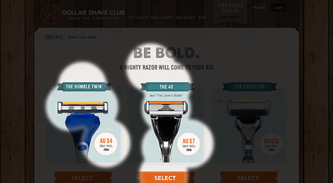
Step 1
Nearly every link on every page of the site links to this page.
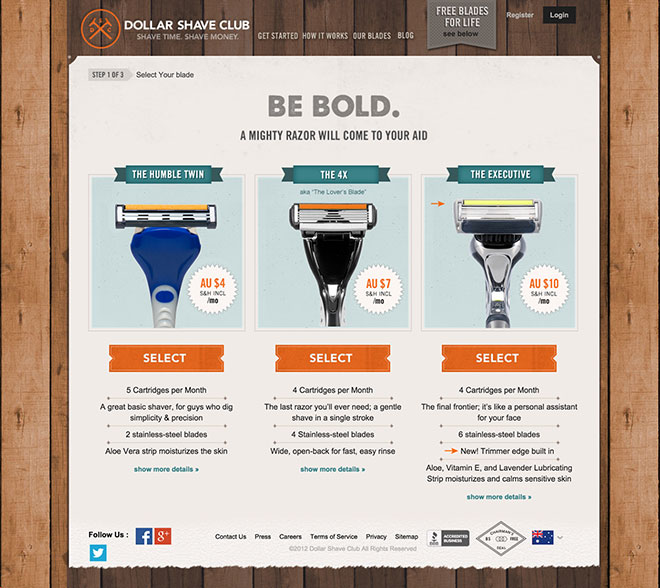
The headline ‘Be Bold’ talks to an emotion rather than to a feature, which connects with visitors on a deeper level than a feature would. It’s also a fun play on words (ie bold vs bald).
The sub-headline then personifies the razors and continues the emotional connection with the visitor.
The layout is excellent, with all 3 options visible above the fold, and pricing clearly visible on the product image.
Details of each subscription are listed below the ‘Select’ button for each product, with an option to ‘show more details’. I’m not sure why they made this clickable, as there isn’t a lot of information there and it would make sense to show all the features without clicking. It might be because fewer features are easier to scan, to make it easy for someone to browse and then expand upon if they’re interested.
Let’s take a look at a predictive eye-tracking analysis of Step 1 of the Order Process…
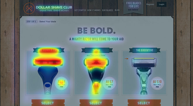
All of the important parts of the page are instantly visible, which is great. I also really like that the sub-headline gets some attention as well, as the word ‘mighty’ suggests that the razors are sturdy.
Let’s take a look at a perception map to see what sections are visible when a visitor lands on the page…
The headline, sub-headline, call-to-action, and 2 products are instantly visible. Great work.
Step 2
Once a visitor selects the razor subscription they want to purchase, they are taken to this page…
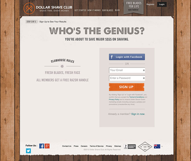
I love this page. It’s clear, simple, and you can either sign up with Facebook (which is awesome) or with an email + password.
I would always give users the option of signing up with Facebook and ensure they don’t need to enter a password once they have (I can’t tell you how many sites I try to sign up with Facebook, only to have me select a password once I’ve connected… very frustrating).
We already know this is a well laid-out page, but let’s take a look at a predictive eye-tracking analysis anyway…
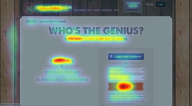
Nothing more to say on this page.
And here’s a perception map…
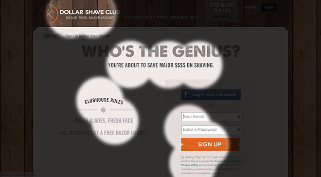
Great work.
Step 3
Once a visitor has signed up, they’re taken to the payment page (the last step in the process)…
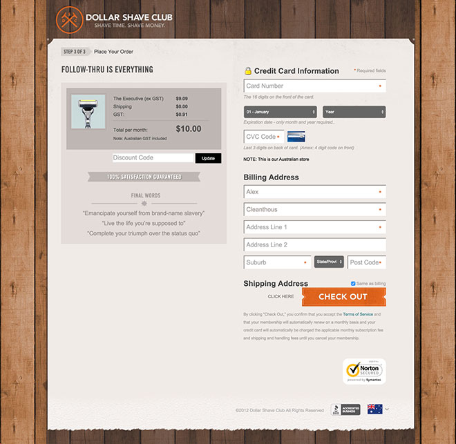
This is a really well-designed page, for a number of reasons:
- The product being purchased (and its price) is clearly visible
- The 100% Satisfaction Guarantee is right next to the price
- They connect with their customers on an emotional level with the 3 inspirational quotes
- The Credit Card section includes a lock symbol to show the buyer that the checkout is secure
- They ask for the minimum amount of information to complete the purchase
- The call-to-action ‘Check Out’ is clearly visible
- They include the Norton Secured badge near the Check Out button to give the buyer extra comfort with entering their credit card information
- All links are removed from the page (ie header navigation, footer navigation etc) so the buyer can do nothing else but complete their purchase.
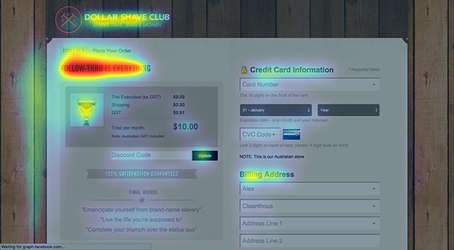
Here’s a predictive eye-tracking analysis of the payment page…
And here’s a perception map of the page…
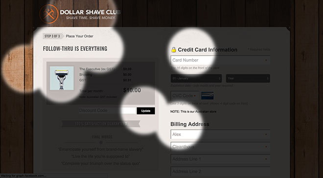
As with the rest of the website, the page is designed and laid out well, making it easy for the buyer to complete their purchase.
Viral Loop
A viral loop is a marketing mechanism where customers are used to bring in more customers by sharing Dollar Shave Club with their friends in exchange for something of value.
Dollar Shave Club offers their customer a free month of razors for every referral that signs up for their service, and they include this offer in a number of points after purchase to encourage sharing.
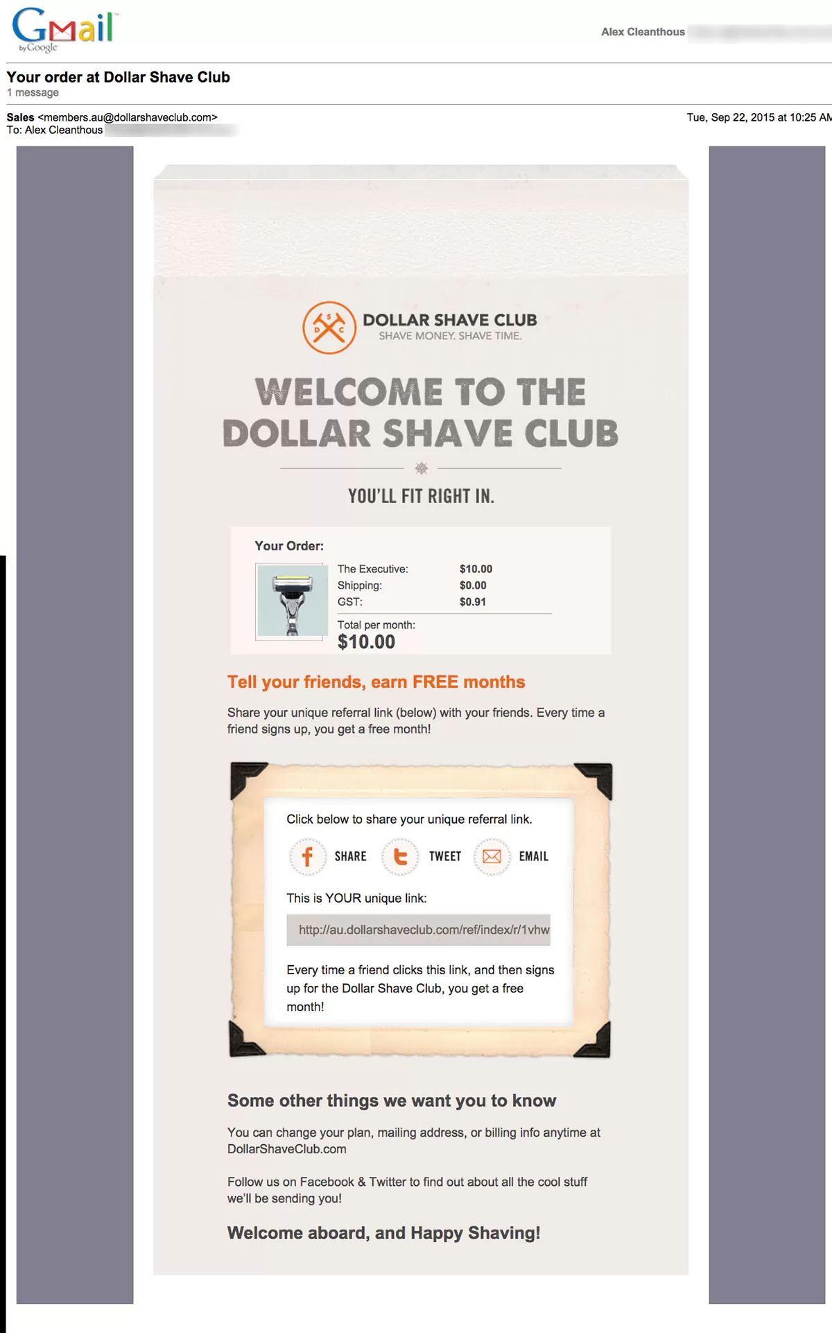
Thank You page
On the page after the order is completed, customers are presented with the option to share on Facebook, Twitter and by email to get free razors…
Email receipt
The message is repeated in the receipt that is emailed after the purchase is completed…
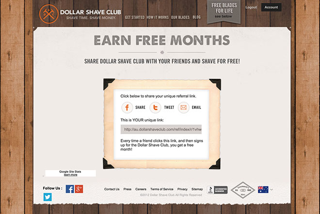
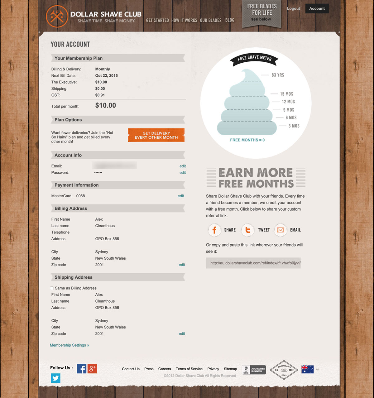
Account page
And it’s a big focus of the Account page, where customers can manage their subscription.
They’ve even gamified their referral program with their Free Shave Meter…
This is growth hacking at its best.
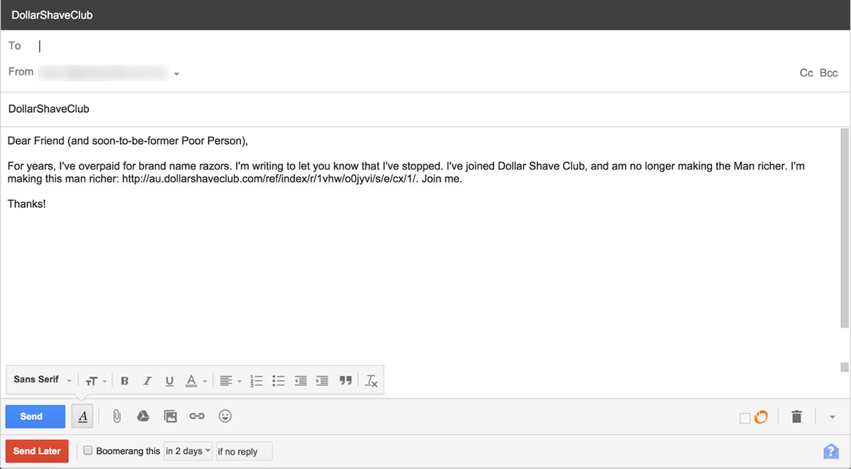
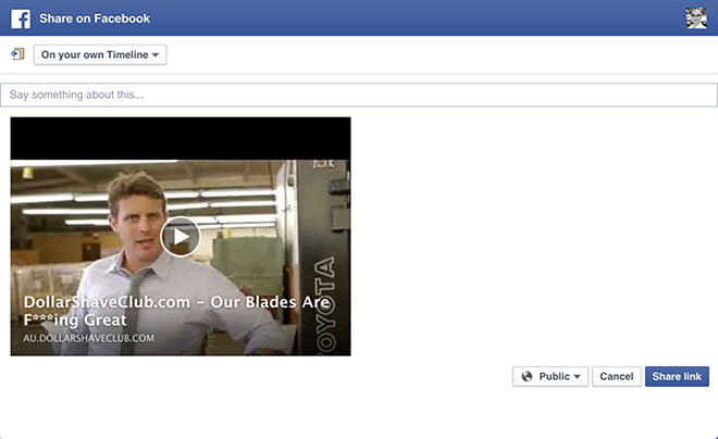
The viral messages
Here are the viral messages that are auto-populated when you click on the share icons…
Email share message
Facebook share message
Twitter share message
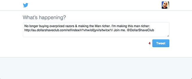
All of the messages are in line with their brand, and they leverage their most successful viral video for customers who want to share on Facebook (to maximise engagement).
Cancellations
Another really important part of Dollar Shave Club’s success is their Cancellation process.
Why?
Because every customer you prevent from cancelling is additional revenue in your pocket… without the cost of acquiring that customer again.
Here’s the Membership Options page (notice how they don’t call it ‘Cancel Membership’?)…
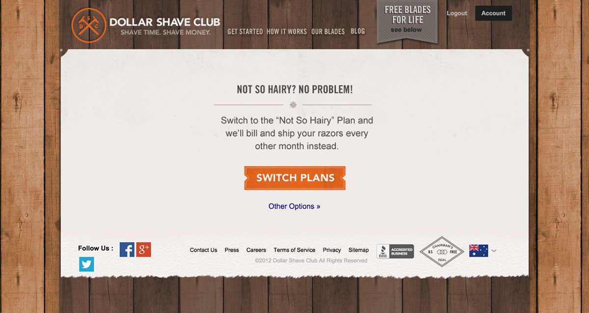
Instead of just taking a customer to the cancellation page, Dollar Shave Club gives the customer the option to reduce their subscription to once every 2 months, rather than monthly. Great thinking.
And if the customer still wants to cancel, they click on ‘Other Options’ and are taken to this page…
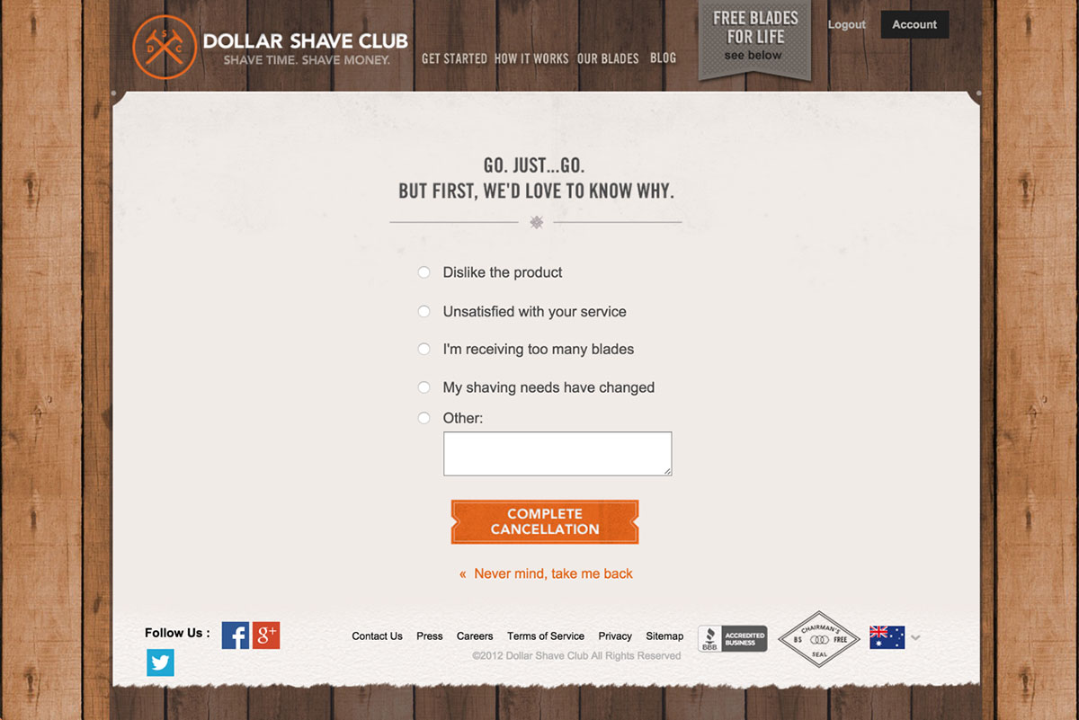
I really like how they have continued the emotional wording in the headline (ie ‘Go. Just… Go). And then ask for feedback on why the customer is cancelling.
One point of improvement (there aren’t many in this review) is that when someone selects one of the options (eg unsatisfied with your service), Dollar Shave Club should try to answer their objection and give them another offer – say for example ‘Why not give us a call at xxx-xxx-xxxx? We’d love to talk this through with you’. Or giving them a bigger discount to stay. Definitely something to test.
I also like that it’s not really easy to find where to cancel. You can definitely find it with a couple of clicks, but they make it a little hard to find out how to cancel, which is good for reducing the cancellation rate.
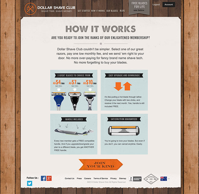
How It Works page
I really like how the ‘how it works’ page uses imagery to explain how the service works, rather than text. It’s a lot more engaging and keeps the visitor clicking.
Our Blades page
I wanted to include this page as it’s essentially the same as Step 1 in the Order Process, but in a vertical layout rather than horizontal.
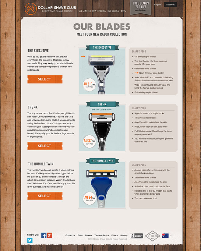
I wonder why they chose to include this page when it’s so similar to Step 1 of the Order Process. Maybe it’s to test a different layout. Maybe they want to show all the information about each product on a page that isn’t directly part of the sales funnel.
If anyone from Dollar Shave Club is reading, I’d love to hear why in the comments section below.
Not mobile-friendly!
I was really surprised to see that the website was not mobile-friendly.
Here’s how it looks on an iPhone 6…

I had to triple check that I wasn’t missing something here, especially because of the phenomenal success (and traffic) that they receive from social media… and the fact that most people access social media via their smartphone!
I’m not sure how they missed this, but it’s definitely something to fix urgently.
Note: if you’re from Dollar Shave Club, get in touch with me via LinkedIn and I’d be happy to design you a mobile / responsive website in exchange for a lifetime supply of razors 🙂
The marketing
Dollar Shave Club has been the focus of many different case studies on how to leverage video and social media to drive massive growth for a business.
When they first launched, their viral videos were the reason they grew so quickly. They have tried to replicate the success they generated from that first video but haven’t been able to yet.
That doesn’t really matter though, as they are now valued at $615 million in their fourth year of business, with more than 2 million customers who receive something from Dollar Shave Club at least every other month.
Interested in learning more about Dollar Shave Club’s success? Then check these articles out:
- How a Dollar Shave Club’s Ad Went Viral (entrpreneur.com)
- How Dollar Shave Club got started (fortune.com)
- Riding the Momentum Created by a Cheeky Video (nytimes.com)
- How Dollar Shave Club Rode a Viral Video to Sales Success (inc.com)
- Dollar Shave Club Is Valued at $615 Million (wsj.com)
Would you like us to review your business as well?
If you’d like us to review your online marketing strategy, please send an email to [email protected]. Or if you simply want to discuss your online marketing with us, then click here to get in touch.


This is brilliant, thank you so much Alex. I have been looking for something like this and will be using it to model the layout of my own membership sales page. I hope DSC gets in contact with you and you get your lifetime supply of razors. 🙂
Great article, Alex! When I went to the DSC website, I was surprised to see that I was viewing a different homepage. Turns out, I was on the American homepage (as opposed to the Australian that you reviewed).
Excellent article. Eye tracking and perception maps were intriguing, how did you extrapolate that?
[…] one video put them on the map (a bit like the video that Dollar Shave Club used to launch their […]
[…] the success of Dollar Shave Club there are now hundreds of subscription-based websites out there. The reason it’s such a […]
[…] you don’t think humour in marketing works, check out Dollar Shave Club. They have literally built their whole business on the back of funny videos and marketing messages […]