


A review of THE ICONIC’s online marketing strategy

I’ll give you a quick heads up that The Iconic is doing things pretty well when it comes to online marketing.
For those of you who don’t know The Iconic, it’s one of the biggest online retailers in Australia. Launched in 2011, it has received more than $78 million in funding.
So what kind of online marketing does $78 million buy? That’s what I break down in this review.
Note: for the purpose of this review, I have reviewed the site as myself, looking to buy a hoodie and shoes – plus I don’t know that much about women’s clothes (aside from marketing them :))
The Website
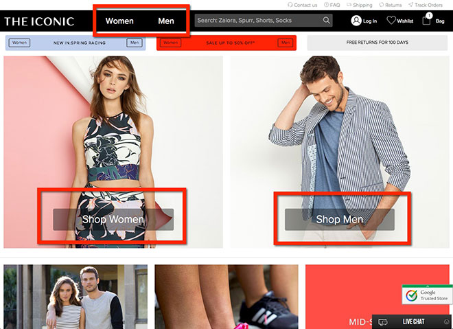
Home Page
The home page does well at keeping things simple. When you land on the site, there are essentially two options above the fold – Shop Women and Shop Men – which means that the home page is all about directing the visitor to the section of the website that applies to them.
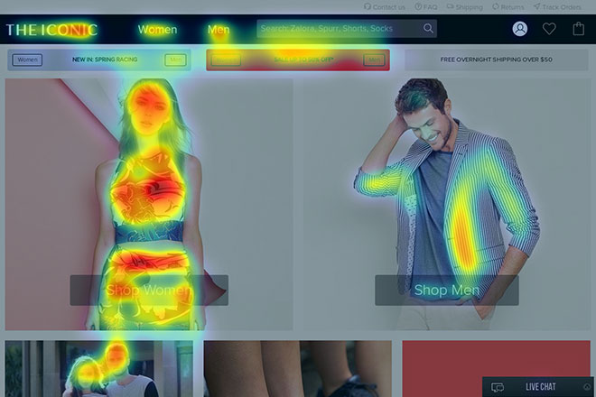
Here’s a predictive eye tracking heatmap of the home page:
And here’s an predictive eye tracking attention map:
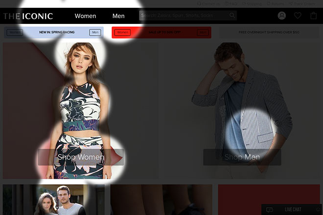
As you can see from both of these analyses, the focus is on women (as it should be with a online fashion retailer) but it’s easy for men to find what they’re looking for as well. They have prioritised their visual hierarchy well.
Gender-Specific Home Page
The home page is almost like a splash page, directing visitors to select their gender so they can be redirected to the gender-specific home page. The real shopping experience starts once you’ve selected your gender. Here’s the gender-specific home page:
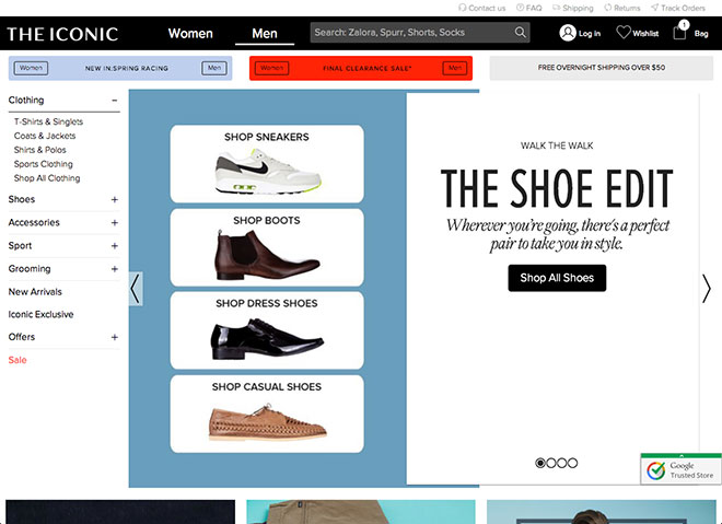
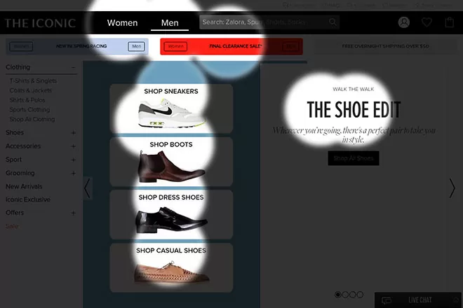
What’s interesting here is that the main banner focuses the visitor on the different shoe categories, rather that promoting specific products. The Iconic likely knows (via analytics and sales metrics) that shoes are the most popular category for men, so they feature the category in the first banner that appears. Here’s a predictive eye tracking heatmap to show you how effective this is:
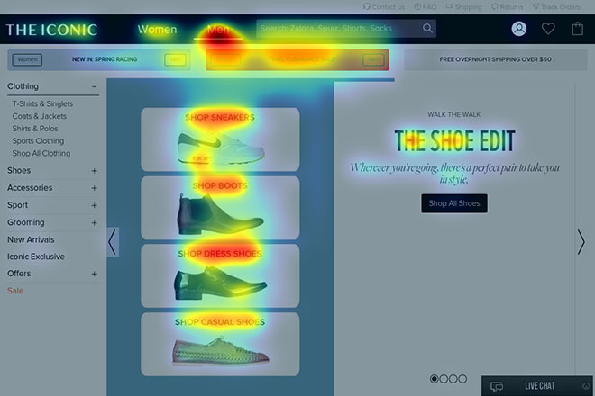
And here’s a predictive eye tracking attention map:
What’s also interesting is that the rest of the gender-specific home page promotes special offers, new arrivals, and latest trends, rather than showing any products (eg Best Sellers).
The Category Page
The best part of the shopping experience is the Shopping Filter, which is consistent across the gender-specific home page, category pages and product pages, allowing you to quickly filter through all of their products to find exactly what you’re looking for:
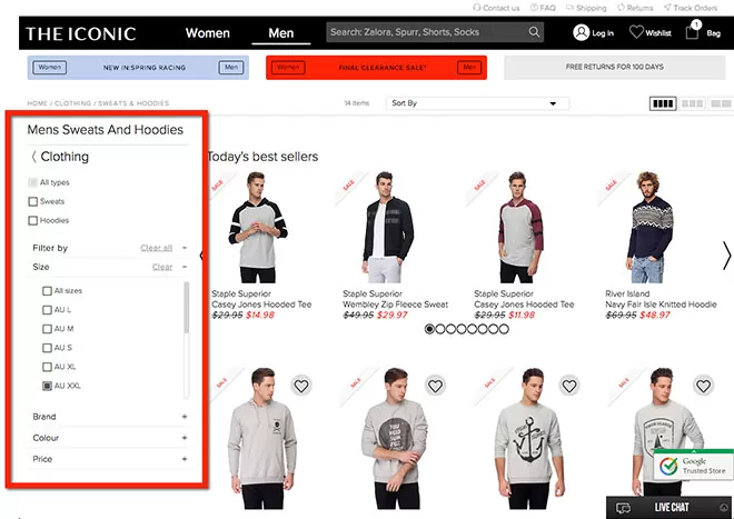
All category pages also include a line of best sellers within that category, with the ability to scroll sideways through them.
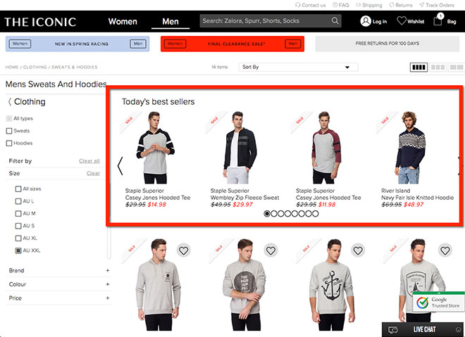
Best sellers are best sellers for a reason, and promoting them at the right time (ie when a visitor has landed on the category of clothing they’re after) is a great way to drive more sales. The other key features to The Iconic’s seamless shopping experience is the ability to sort (by popularity, price, alphabetical order etc), the ability to show 2-4 items per line, and displaying nearly 100 products on a single page before breaking the category page up into multiple pages (ie pagination). RECOMMENDATION: Give the user the ability to show all products on a single page, and using infinite scrolling to pre-load additional pages if required.
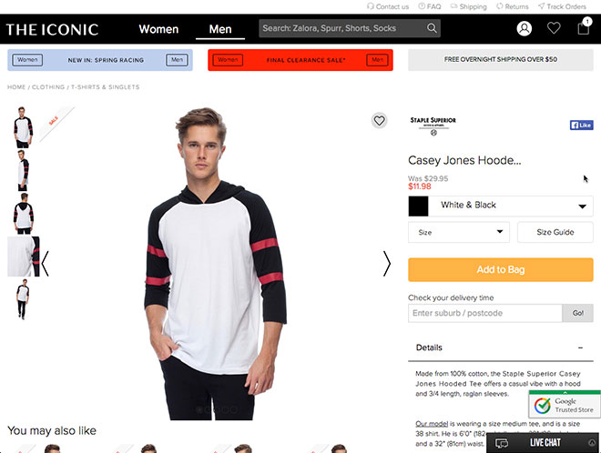
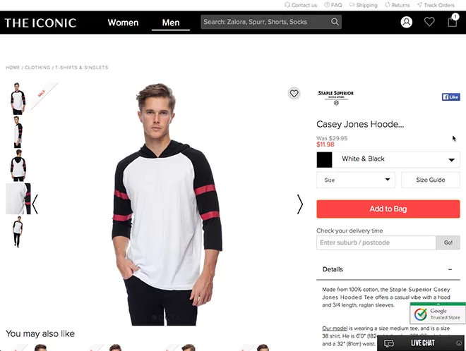
The Product Page
The Iconic’s product page is one of the best I’ve seen for a long time, but it can still be improved (like anything online).
The biggest issue I found with this page was the 3 promotional banners at the top of the page. So I ran a predictive eye tracking analysis on this page. Here are the results:
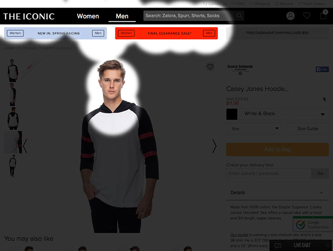
As I suspected, the promotional banners take away the attention from the Add To Bag button. So I tested removing those 3 banners and running it again.
Here are the results:
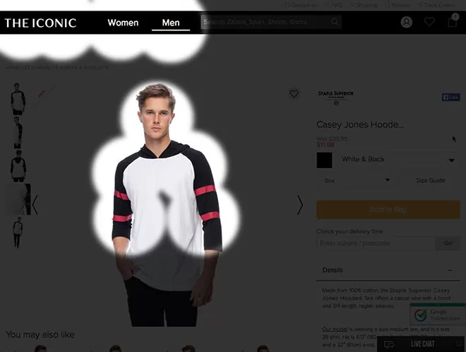
It’s better, but the issue still remains – the Add To Bag button isn’t instantly visible to visitors when they land on the page, likely because the colour of the button doesn’t have enough of a contrast to the rest of the colours on the page. So I tested changing the colour to red.
Here are the results:

Boom! This is what I want to see from a predictive eye tracking analysis of a product page – the product image and the call-to-action instantly visible. Note: the colour of the button doesn’t need to be red. It just needs to have enough of a contrast to the rest of the page to draw the eye to it. The rest of the page has everything a visitor needs to make the decision to buy the product, including:
- Multiple high-quality product images with zoom functionality
- Size guide
- Shipping & returns policy
- Product details
- Delivery cost & timing (including auto-suggest drop down, which is great)
The other great feature they have is within the Size selection drop down:
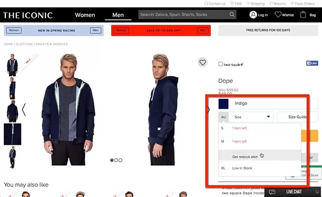
By showing you how many items are in stock, they use scarcity tactics to help make the sale. And when you click the ‘Add To Bag’ button, a huge popup appears making it completely obvious that the product has been added, with clear options on what you can do next:
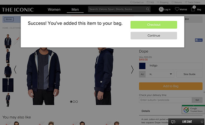
This point is huge, because you’d be surprised at how many websites add a product to the cart without clearly letting the visitor know about it… which causes frustration and lost sales revenue.
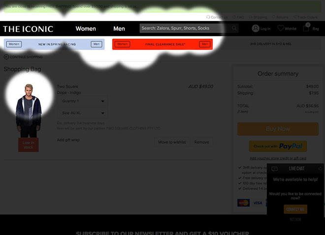
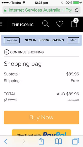
The Shopping Cart
Everything up to this point has been about helping the customer find what they’re looking for, presenting the product in the best possible light, and making it as easy as possible to add the product to their cart. Now it’s all about converting the sale, and the shopping cart is the first step of that process. Let’s take a look at The Iconic’s shopping cart.
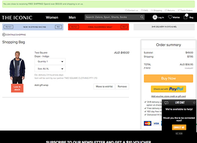
The Iconic is doing a number of things well in their checkout:
- It’s easy to update the quantity and size directly in the checkout
- You can move the product to a Wishlist instead of buying it
- There’s a message at the top of the page letting you know you could get Free Shipping if you spend over $50
- The main benefits are restated below the Buy Now buttons
- All payment options are visible
- Live Chat automatically pops up asking if you need help (this is a great strategy to help close sales online)
But there are a few big improvements they should make (or at least test):
- Remove the 3 promotional banners at the top of the page
- Remove the newsletter subscription that offers a $10 voucher for subscribing (the biggest issue here is that buyers are likely to leave the cart to get the discount coupon, and might get distracted and not come back)
- Change the location of the Free Shipping upgrade offer to somewhere more obvious, or add a one-click upsell on a product that matches what they already have in their cart
Here’s a predictive eye tracking attention map of this page:
See the issue?
The Checkout
Here’s The Iconic’s checkout page:
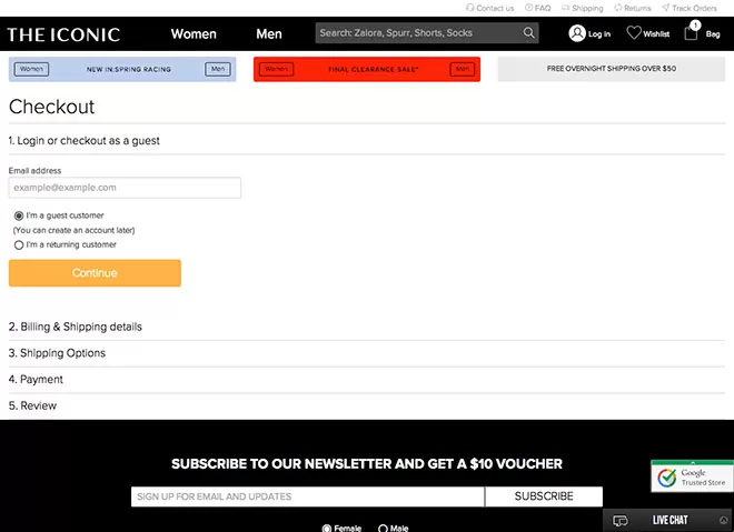
Here’s what they’re doing right:
- You can checkout as a guest – you’d be surprised at how many sites require you to create an account to be able to checkout (which loses a lot of potential sales)
- The entire process is on one page
- It’s simple
But there are a number of things I would change (or at least test) on this page:
- Remove the 3 promotional banners at the top of the page
- Remove the navigation from the header bar (but keep the logo)
- Remove the Newsletter Subscription box and footer links
- Add a floating summary of the order (and main benefits) so the customer remembers what they’re entering their details for
RECOMMENDATION: I entered my email address and clicked ‘continue’ (but didn’t purchase) and didn’t receive a follow up email about my order at any stage within 24 hours of entering my email. A cart abandonment email strategy has been proven to recover lost sales from cart abandonments, and should be implemented ASAP on The Iconic’s website.
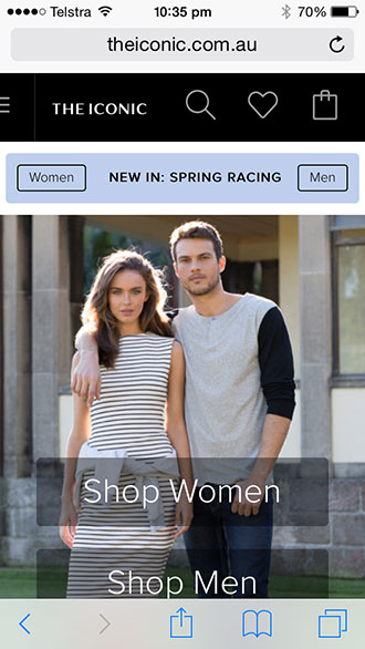
The Responsive (Mobile) Website
It seems that The Iconic’s website was a MobileFirst design. How can I tell? Because the user experience on the mobile version is far more intuitive and much easier that the desktop version. Maybe I’m wrong… you tell me. I won’t go into all the details again as it’s essentially the same website I reviewed above, but you can see the difference in usability between the desktop and mobile versions.
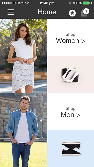
Home Page
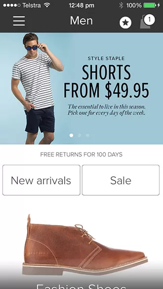
Gender-Specific Home Page
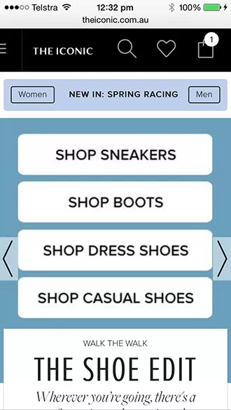
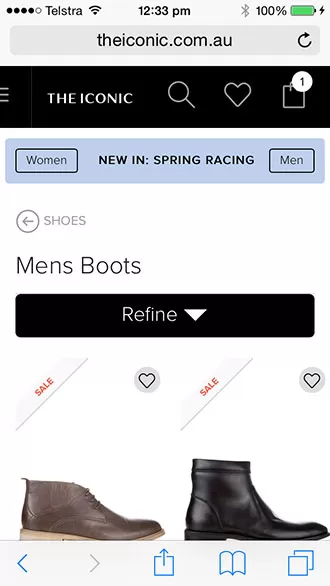
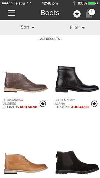
Category Page
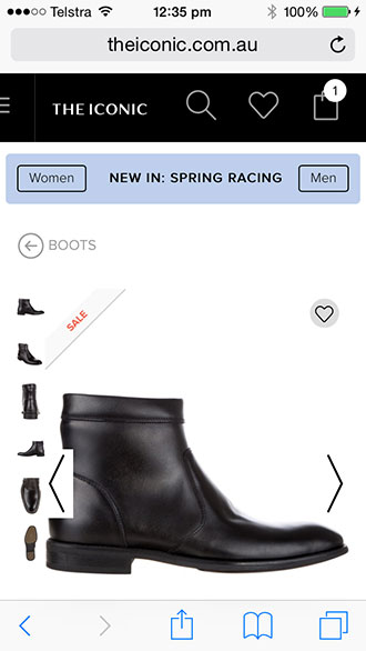
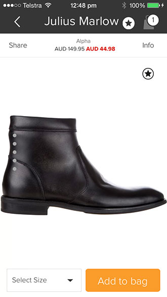
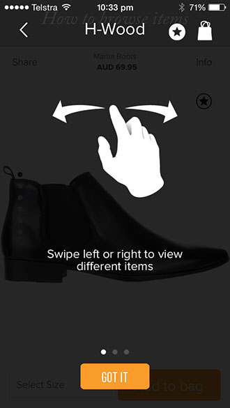
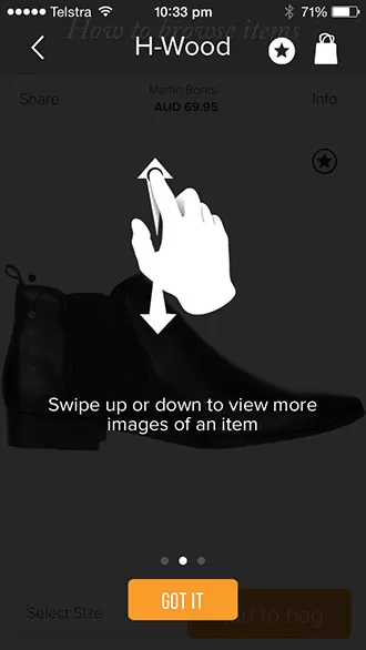
Product Page
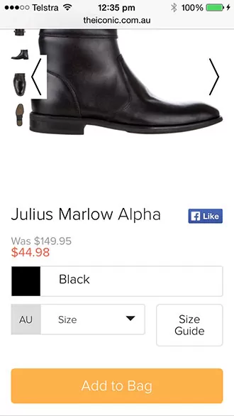
Add To Cart Button
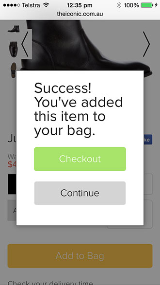
Add To Cart Success
Shopping Cart
Checkout

The Mobile App
The Iconic has a smartphone app for both iPhone and Android. As I have an iPhone, this article has been limited to the iPhone app. The iPhone app is a better version of the mobile site (much better). It’s more intuitive, there’s less clutter, and overall the experience is superior. Again, I won’t go into detail on all the steps again, but you can see for yourself how it’s different compared to the mobile site.
Home Page
Gender-Specific Home Page
Category Page
Product Page
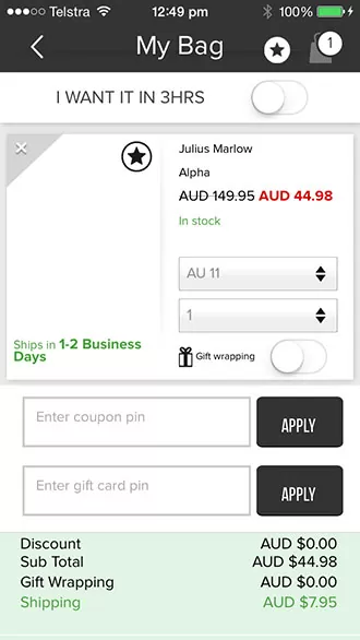
Shopping Cart Page
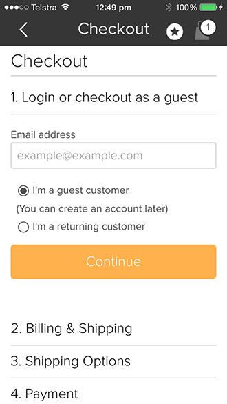
Checkout Page
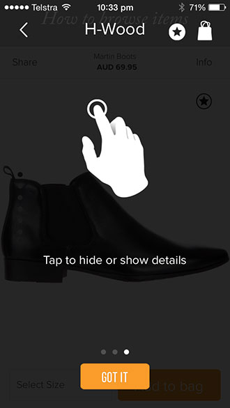
App Instructions
RECOMMENDATION: The biggest downside to the mobile app is that when you click on Add To Bag, there’s no message (like on the mobile or desktop site) and you aren’t redirected to the Shopping Cart. This should be updated as a matter of priority.
The Marketing
The Iconic are marketing themselves well online. Here’s a breakdown of what they’re doing (and what every online retailer should be doing as well)…
Dynamic Remarketing
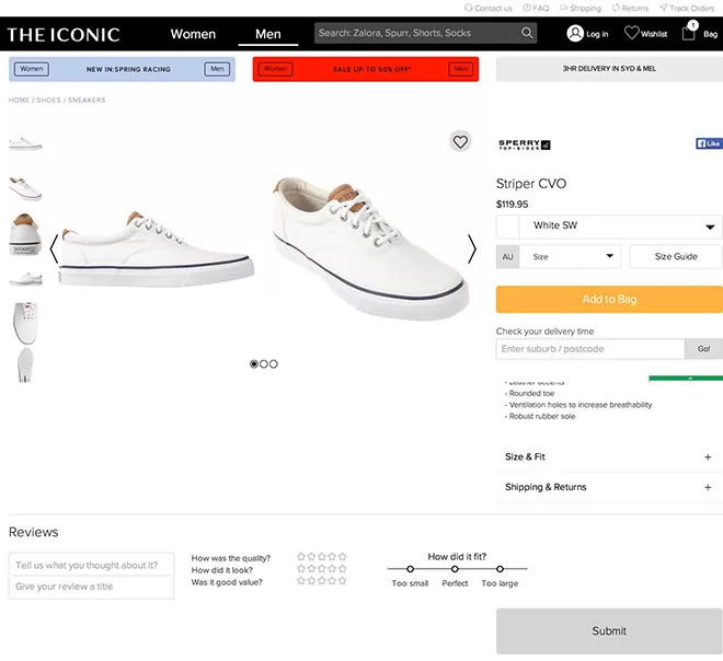
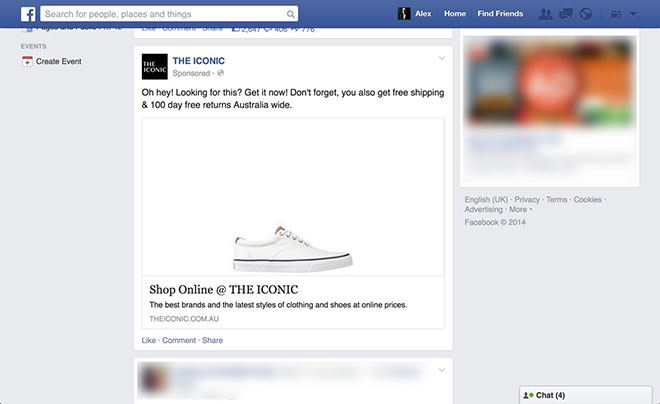
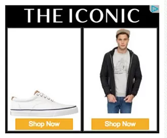
Dynamic remarketing is when an online retailer advertises the product a visitor has viewed on their website, around the web. In Australia, that essentially means advertising that product to your prospective buyer on Facebook and Google’s Display Network (there are others, but Facebook and Google are the biggest by far). Here’s an example of dynamic remarketing in play… I viewed this product on The Iconic’s website:
Then when I visited Facebook I saw this ad in my feed:
And then when I visited Search Engine Journal (a website about online marketing), I saw this ad:
Here’s one of the banners I saw, in more detail:
Dynamic remarketing is powerful because you’re advertising the product that a prospective buyer has shown interest in, whereever they go on the web. And when you combine dynamic remarketing with a cart abandonment strategy, you maximise the number of sales you generate from your marketing efforts. Remember, people are busy and often get distracted before making the purchase. Or they need to think about their purchase a bit more. By keeping the product front-of-mind, you give your store every possible chance of making the sale.
SEO
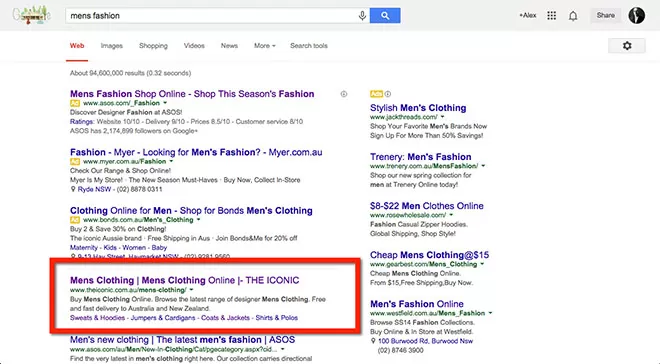
Here’s a quick review of The Iconic’s SEO strategy (a full review will take an in-depth article of its own). They rank well for a number of very competitive keywords, including ‘mens fashion’ where they rank #1:
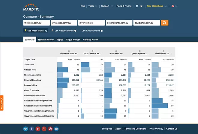
They have a good number of incoming links to their site, although the quality of those links (ie TrustFlow) isn’t as high as their top competitors.
Note: A full review of their backlink profile will be required to fully understand how they have acquired links to their site. What’s interesting is that while they rank for top level category keywords (like ‘mens fashion’ and ‘womens fashion’) – they aren’t ranking as well for their individual product pages. If we take the Striper CVO Sneaker for example. The product name is ‘Striper CVO’, and an auto-suggest from Google comes up with ‘Striper CVO sneakers’. But when I search that keyword in Google, I don’t see the product at all (even through I do see The Iconic’s Product Listing Ad on that product):
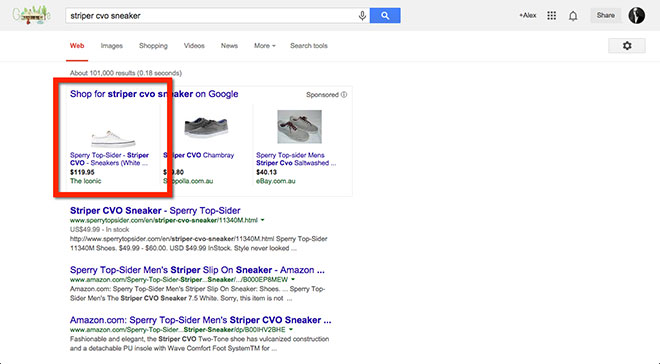
I know the search volume isn’t high for this keyword, but when you add all of the potential traffic they could be driving by ranking for product searches across all their products (not to mention the higher conversion rate of these types of searches) then this is definitely something to improve. RECOMMENDATION: Improve the website’s internal linking structure to ensure that all pages are getting enough SEO ‘juice’ to rank highly.
Google Adwords
There’s not much to say here except that they’re doing it well. The Iconic has a robust Google Adwords strategy incorporating:
- Search Ads
- Remarketing Ads
- Product Listing Ads
They’re not in the top spot every time, which means they’re focusing on the cost-per-sale (which is a good thing). And they’re appearing for a broad range of keywords.
Social Media
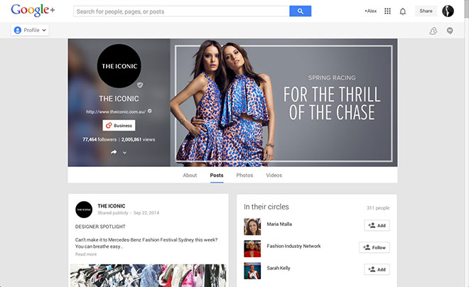
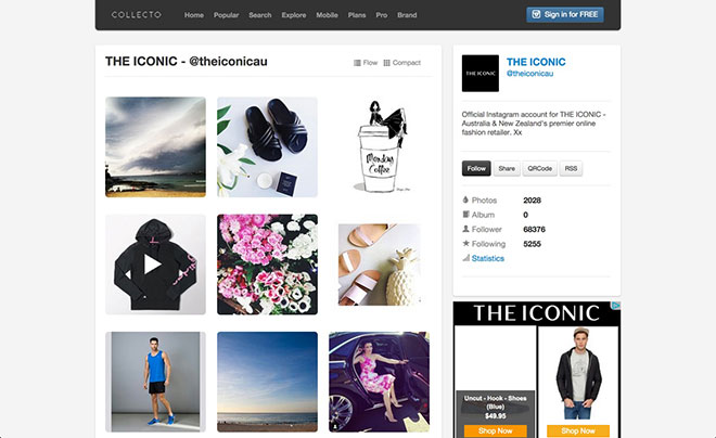
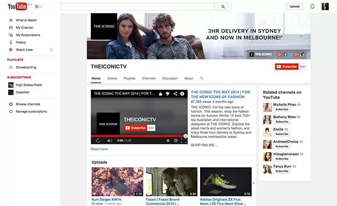
The Iconic has a huge social media following across all of the top platforms. I won’t go into detail about their social media strategy at this stage, but on the face of it, it looks good. Here’s a list of their social media profiles (notice the consistency in the message across all platforms)…
Google Plus
Collecto
YouTube
A good benchmark for online retailers
The Iconic is essentially the benchmark for how an online retailer should setup their website and market it online. Are there areas for improvement? Of course. But that’s how online works. The Iconic is a leader in the online retail space and you can see why. If you currently run an online retail store, then use The Iconic as a guide to what you should be doing online.
Disclaimer
I have not been in touch with anybody from The Iconic, so I don’t have the full picture of what they are doing online, what they have already tested, and what their current challenges are. The advice I have provided in this article is based entirely on what I can see online, and how I would optimise their web presence based on what we’ve found successful for other clients.
Would you like us to review your business as well?
If you’d like us to review your online marketing strategy, please send an email to [email protected]. Or if you simply want to discuss your online marketing with us, then click here to get in touch.


Fantastic !!
How would you suggest they improve their internal linking structure to improve product page rankings? What is a technique to use for this?
Awesome breakdown. Didn’t know about ‘Collecto’ before 🙂
Guys,
Do you have a specific theme you use (or based) your website on?
ps.. how good are those SumoMe apps 🙂
The Iconic CTO here.
What a great writeup, and thank you for covering our site! I can tell you that many of the assumptions behind why we’ve placed things in certain places are bang on. We put a lot of effort into capturing and analyzing metrics so that we can provide the best possible user experience for our shoppers.
@Ralph The ecommerce platform is home grown so the ‘theme’ was developed by us in-house. As Alex pointed out, we do follow a mobile first responsive strategy as our design principle for the website.
Thanks for commenting Gavin.
Fantastic breakdown of the site!
Would’ve been great if you had some real data. I think eye tracking should be used alongside observation and interview to get the whole picture.
good review and analysis and this is can be learning for me, great post
Hi @Alex, I second @Eric question “How would you suggest they improve their internal linking structure to improve product page rankings? What is a technique to use for this?”
@Eric and @Todd,
By internal linking structure they likely mean:
a) Silo-ed website structure
b) interlinked, crawl-able keyword text from higher up the silo structure to the pages below
Cheers,
Richard
Brilliant Analysis Alex! We have our own e-commerce website and your article is full of insight and awesome ideas about how to design a good online shopping portal. Thanks a lot.
Glad you enjoyed it Ashwin.
Hi Alex, with regard to the request from your newsletter. The most valuable part for me was eye-tracking predictive analysis and your conclusions about behavioral aspects of visible banners.
Thanks for the awesome content.
Cheers!
What CRM/Email Marketing Platform do the Iconic push their newsletters out on? The mobile scalability is on point!